
A giclee print is a high-resolution inkjet print made from a digital file, usually on archival paper or canvas and often with pigment inks. In practice, that resolution means a source file of at least 300 DPI, against 72 DPI for a typical digital image, printed with pigment ink rather than the dye ink inside a home machine.
That last detail is where the confusion starts. Two sheets can both carry the word giclee on the invoice and behave nothing alike on a wall, because the label describes a process, not a grade.
You'll hear it pronounced zhee-clay, usually with a small pause, as if the accent settles the question. It doesn't. The useful conversation starts with three materials: which ink, which paper, and what testing the seller can name.
What a Giclee Print Actually Means
Think of a giclee as the fine-art cousin of the photo print you make at home. Both send a digital file through an inkjet head onto a sheet. The difference sits around the ink: a wider printer with more ink channels, pigment instead of dye, a heavier buffered paper, a color-managed file, and a person who checks the sheet before it ships.
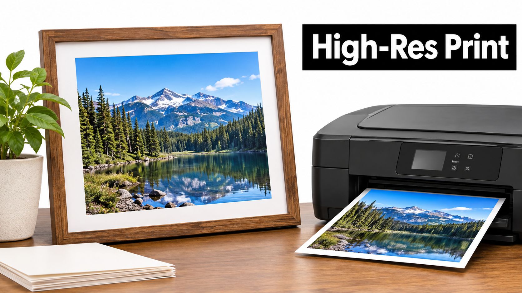
The word is recent. Giclee entered the printing vocabulary in the early 1990s to separate fine-art inkjet output from ordinary computer printing, and printmaker Jack Duganne is generally credited with introducing it around 1991 while working with the IRIS continuous-flow inkjet system, as Castle Ink's history of the giclee print records. The hardware wasn't designed for artists at all. Iris Graphics introduced its IRIS printer in 1985 for commercial prepress, and the large-format IRIS 3047 was later adapted to art production.
The moment the medium became credible has a date attached. On July 1, 1991, musician Graham Nash and R. Mac Holbert founded Nash Editions in Manhattan Beach, California, with collaborators including Duganne and color engineer Dave Coons. The studio demonstrated that a digital file could produce collectible, exhibition-quality art rather than a commercial proof, and its original IRIS printer now sits in the Smithsonian's National Museum of American History.
What the label does not promise: the term is not legally standardized, and it does not by itself guarantee a particular ink, paper, resolution or lifespan.
Read it the way you'd read hardwood on a furniture tag. True, useful, and nowhere near enough on its own. A gallery that can name its ink, its paper and the test results behind them is telling you something the word cannot.
How Giclee Prints Are Made, Step by Step
Strip the branding away and a giclee is a simple physical event. An inkjet printer deposits microscopic droplets onto paper, canvas or another coated surface, normally from a high-resolution digital image, which is why Kiln Ink's guide to archival inks and giclee longevity calls it a process category rather than a single quality grade. Fine-art versions use pigment inks because pigment particles sit on the surface of the paper and resist fading far better than dye, which soaks into the fibers and breaks down under light.
Here's the whole journey in four moves, from file to finished sheet.
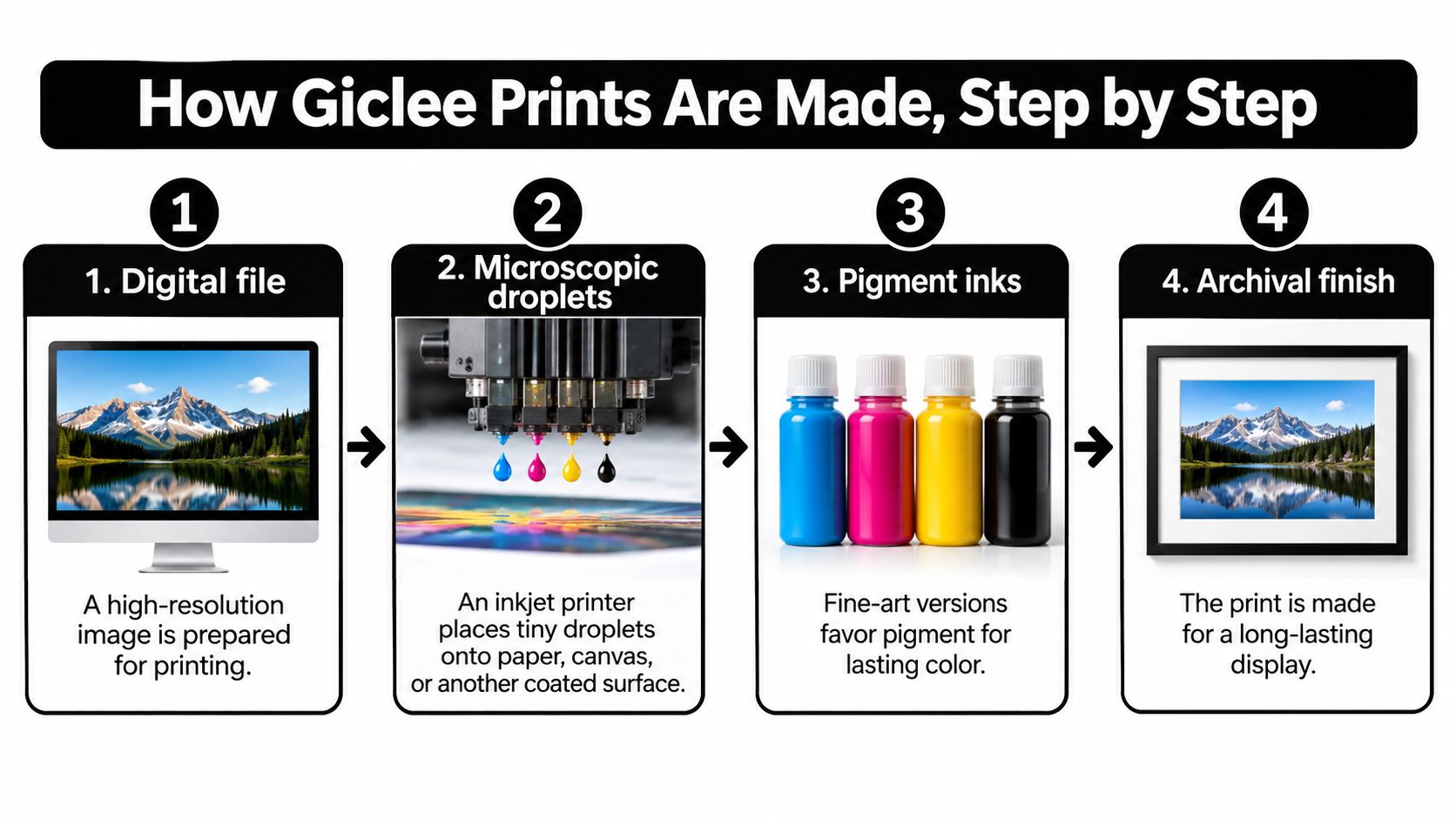
The gap between a poster and a print worth framing opens in the preparation, not at the print head. Most of the hours go into the file: removing dust specks you can't see on a painting but can see on a print, matching a scanned canvas to the artwork under neutral daylight, and deciding how much contrast the paper can carry.
If you'd rather watch the process than read it, this short walkthrough follows a file from screen to finished sheet.
- Capture or scan the original at high resolution. A source file of at least 300 DPI is the usual benchmark, against 72 DPI for a typical digital image, as Today You Should Know's overview of how painting prints are made explains. A flatbed scan is precise but throws shadows across raised canvas texture, while a camera with two lights at 45 degrees handles texture and hot fluorescent pinks better. The common slip is starting from a phone snapshot and expecting the printer to rescue it.
- Correct color on a calibrated monitor, then choose the printer profile. Soft proofing, previewing the file through the exact paper and ink profile before a single sheet feeds through, shows you which bright oranges and deep blues will land outside what the paper can hold. The usual error is judging color on an uncalibrated laptop screen and then blaming the print.
- Pick the ink set and the substrate together. An acid-free cotton-rag paper or a prepared canvas is the archival support, and the pairing decides how the surface reads: matte and painterly on rag, lightly textured on canvas. Choosing a paper for its on-screen texture while ignoring weight and pH is the mistake that ages fastest.
- Print in a stable, controlled environment using that profile. Temperature and humidity change how droplets land and dry, and a head that hasn't been cleaned leaves banding in a smooth gradient. Run a nozzle check rather than a guess.
- Inspect the sheet against an approved proof. Compare the first print with the proof under the same light, looking for color shifts, scratches and stripes in open skies. Catching it here costs one sheet. Catching it after the edition is signed costs the edition.
- Dry, then sign and number if it belongs to a limited edition. Graphite on the bottom border, title to one side, edition number and signature to the other, handled by the edges in clean gloves. Pigment on soft paper scratches easily, so the print goes straight into a sleeve or an acid-free folder and never into a stack.
A well-made sheet looks even in daylight, holds detail in the darkest shadows, and shows no banding when you tilt it. If you can see stripes across a smooth sky, the head needed a clean, not a better label.
Giclee Compared With Other Print Methods
| Method | How the Image Is Made | Typical Run Size | Lifespan Notes |
|---|---|---|---|
| Giclee (pigment inkjet) | Inkjet deposits pigment droplets from a digital file | Short runs or one-off pieces | Archival pigment ink and paper can reach test-based ratings of up to about 200 years |
| Offset lithography | Inked plates transfer the image to paper | Large runs, often hundreds or more | Ruled by the ink and paper chosen, so ask before you assume |
| Screen print | Stencils force ink through a mesh | Medium runs | Ruled by the ink and paper chosen; built for bold flat color |
| Chromogenic photo print | Light exposes photographic paper, then chemical processing | Single prints or small runs | Shorter than pigment inkjet, because the color dyes are the fragile layer |
Read the table by run size first. Offset lithography pulls the image from inked plates and gets cheaper with every copy, which is why it owns the museum gift shop poster wall. Screen printing forces ink through a stencil mesh for bold, flat color with real physical presence. A chromogenic print comes from light exposing photographic paper followed by chemical processing, a different craft entirely from ink resting on a coated sheet.
That's the case the William Tucker Fine Art Zebra Print on Paper fits: an 11x14 print on paper taken from an original painting by William Tucker, with a zebra rendered in vivid color against deep blue water and green grass. At that size it frames easily for a hallway or living room wall, which is how many begin collecting prints.
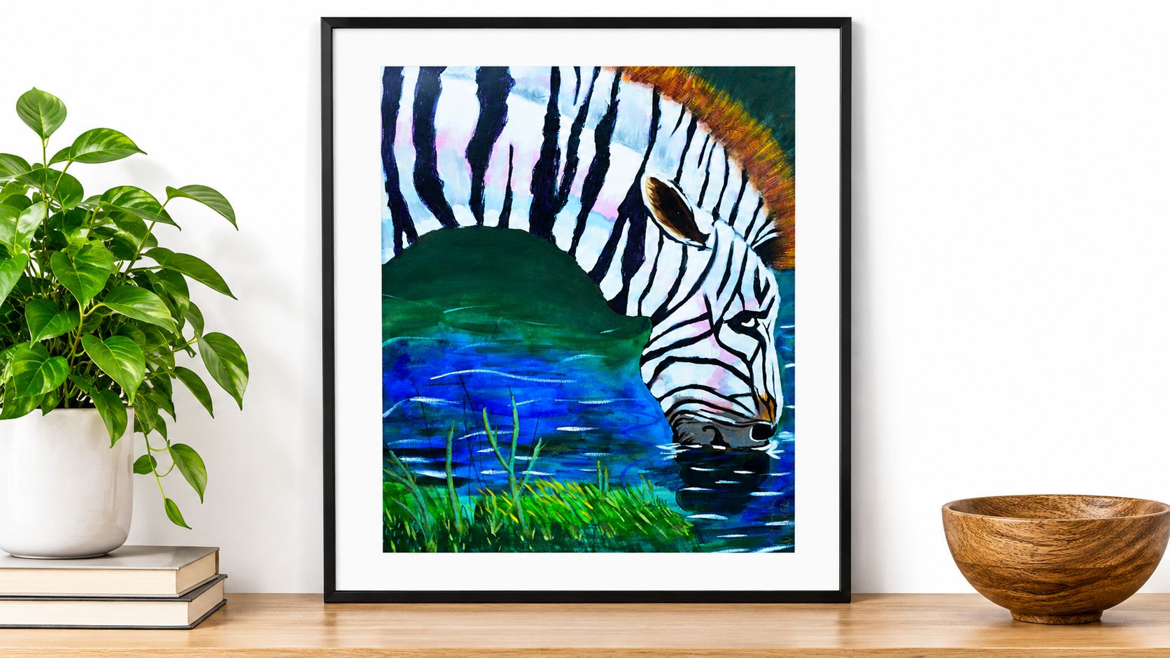
Giclee's advantage is the opposite of cheap volume. It excels at tonal range, fine detail and short or one-off runs, so it suits paintings and photographs where a cloud holds a hundred barely-there grays. A poster-grade inkjet can look close to a pigment print under gallery lights for a week, so don't judge with your eyes on day one. Ask which ink and which paper, because the method name alone settles nothing. Collectors weighing a reproduction against the painting it came from can read more on art prints versus originals before deciding where the money goes.
For one collectible image in a small edition with fine detail, a pigment giclee is usually the strong choice. For several hundred identical posters, offset is the practical route, and nobody will study the difference on a wall.
How Long Giclee Prints Last and What Shortens Them
Longevity belongs to the whole system: ink chemistry, paper, light, ozone, temperature, humidity, framing and storage. The word on the back of the frame is the one part that never appears in the test.
Wilhelm Imaging Research reports that pigment-ink prints achieve substantially longer display life than dye-based prints, with Epson UltraChrome HD/HDX pigment prints receiving display-permanence ratings up to 200 years while selected black-and-white combinations have reached ratings up to 400 years or significantly beyond, as set out in its report on fine art print permanence. Those are test-dependent estimates for specific ink-and-paper pairs. They are not a warranty attached to any sheet that says giclee.
| Factor | Recommended | Avoid |
|---|---|---|
| Light | Dark storage; UV-filtering glazing for display | Direct sunlight and bright spotlights |
| Humidity | Relative humidity of 30% to 50% | Damp rooms such as bathrooms |
| Temperature | Stable room temperature | Heat sources and hot attics |
| Ink and paper | Pigment ink matched to the manufacturer-designated paper | Dye ink on unrated coated paper |
| Handling | Acid-free backing and sleeves; store flat | Stacking prints or contact with rough surfaces |
The same report notes that the Library of Congress advises matching pigment inks with the manufacturer-designated paper and storing prints in darkness at room temperature and 30% to 50% relative humidity. Display is where most of the damage happens. A pigment print kept flat in a dark, acid-free enclosure will outlast the identical print hung in a sunny hallway, and it isn't close.
Anybody who works with printed goods learns this lesson quickly, and this DTF durability guide from Raccoon Transfers makes the same point about wear and washing shortening a print's life far sooner than the ink itself does. Paper is not armor. Pigment prints on soft fine-art stock can scratch with a fingernail, so handle them by the edges and keep them sleeved until they're framed.
Conservation framing does much of the protective work, and a walkthrough of how to frame art prints covers backing boards, mats and glazing choices in detail. The short routine: check the label for named ink and paper, frame behind conservation-grade glazing with a UV filter, and keep the piece out of bathrooms, kitchens and direct sun.
Giclee Myths That Lead Buyers Astray
Three beliefs cost buyers real money, and each one fails for the same underlying reason. The term has no governing body, standardized definition or mandatory quality requirements, as Raphael Macek's notes on archival pigment prints point out. In principle, a consumer inkjet using dye inks on coated paper could carry the label.
Myth one: every giclee is archival. Archival isn't a property of the process name. The Northeast Document Conservation Center identifies three determinants of digital-print life: the quality of the materials, the interaction between the colorant and the paper, and the storage or display conditions afterward. Only one of those happens at the printer.
Myth two: giclee means museum-grade. "Museum-grade" is a marketing phrase with no gatekeeper behind it. Two prints labeled identically can differ in color management, ink chemistry, substrate quality and expected durability, which is exactly why the material list matters more than the noun.
Myth three: a higher price proves permanence. Price tracks framing, marketing, edition size and gallery overhead as much as it tracks paper. An expensive print on a brightened sheet can yellow while a modest one on buffered rag holds steady.
Say a pet owner commissions a portrait and assumes the premium-sounding word guarantees decades of stability, then discovers the paper contains optical brighteners that yellow over time. The question that would have caught it is plain: which specific ink and which specific paper, and have those two been tested together?
A claim of long life usually cites accelerated-aging tests run on one ink-and-paper pair. A seller who names that pair gives you stronger evidence than a seller who repeats the word.
The label tells you less than the documented materials do.
What to Check, What to Pay and Which Print to Choose
Ask these seven questions in this order before money changes hands.
- Confirm the ink is pigment, not dye. Pigment particles are the ones built to resist fading. If the seller can't say which, that silence is the answer.
- Ask for the printer and the ink set by name. A brand and model number can be verified. A phrase like high-quality giclee inks cannot.
- Confirm the paper or canvas by name, in grams per square meter. The Fine Art Trade Guild's print buying guidance recommends paper weighing at least 250 gsm with a pH between 7 and 9 to reduce discoloration. Ask too whether the stock is acid-free and lignin-free, and whether it contains optical brighteners.
- Ask whether the file ran through a color-managed workflow and a checked proof. A printer profile plus a signed-off proof is the difference between a reproduction and a color gamble.
- Request a lightfastness figure rather than the word archival. The same Guild guidance points to relatively lightfast colors reaching at least Blue Wool Scale 6 or an equivalent rating. A named test result outranks an adjective.
- Check the edition size, signature and numbering. A numbered edition of 50 means something a print run of unlimited copies does not, and collectors should understand whether limited edition prints increase in value before paying a premium for a number in the corner.
- Ask how it will be framed and glazed. UV-filtering glass or acrylic is not an upsell, it's lifespan. Bedrooms and nurseries are where buyers most often skip this, and a guide to hanging personalised prints in nurseries covers placement and safe mounting in practical terms.
Price deserves its own paragraph, because the numbers are smaller than many expect. Exhibo reported between 2024 and 2026 that giclee printing on archival cotton rag paper at A2 size (42 by 59 cm) typically costs approximately £25 to £70 per print at a public fine-art lab, per Exhibo's giclee overview. A very low price usually signals thinner paper or dye ink. A high price, on its own, proves nothing at all.
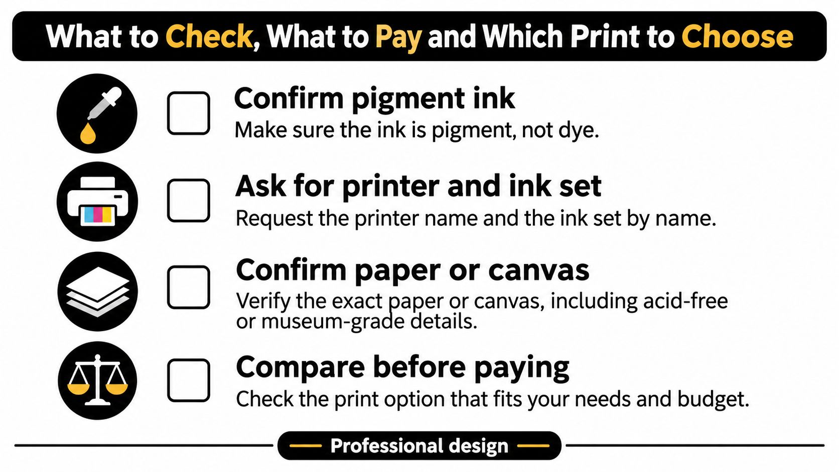
Choose the print whose seller can put the ink, the paper and the workflow in writing. William Tucker Art offers prints alongside original paintings, with pieces from the Wild Things Collection and the Bee Collection, and the Bee Collection includes the William Tucker Bee Queen Art Print – Vibrant Bee Collection, an 11x14 sheet with orange and yellow tones behind a detailed queen bee among worker bees and flowers. Ask those same material questions before you buy one, and keep looking if the only answer you get back is the word giclee.
William Tucker Art turns original paintings into prints, and every piece in the Wild Things Collection and the Bee Collection began as a painting worth reproducing properly. Browse the collection at William Tucker Art, compare a print against the original it came from, and ask us the material questions this guide raises about ink, paper and testing. We'd rather answer them than have you guess in a gallery.