
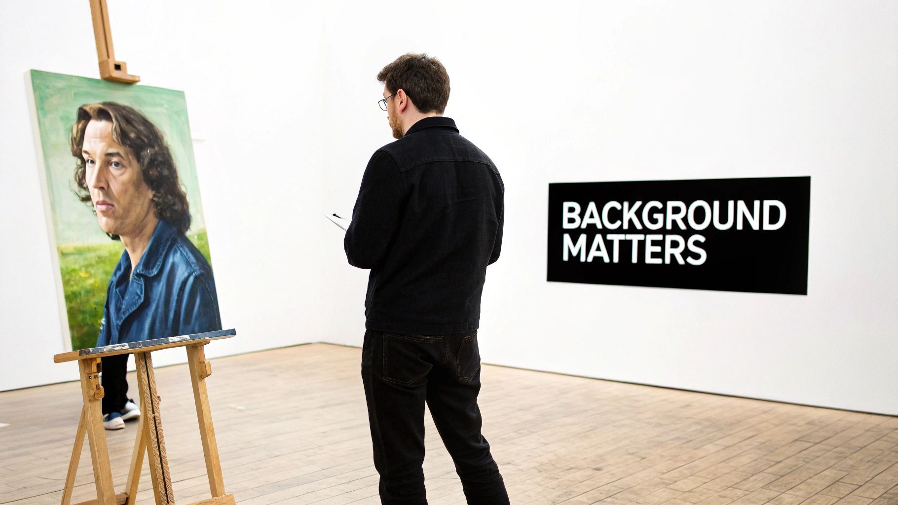
A great portrait captures a likeness, but a truly brilliant one tells a story. And what's the secret ingredient? The portrait background painting. It's the unsung hero, the stage that lets the star of the show—your subject—truly shine. A well-considered background is so much more than just filler; it sets the mood, directs emotion, and can turn a simple painting into something you can't look away from.
Why the Background Is Your Portrait's Secret Weapon
Ever notice how the music in a movie can make you feel tense, happy, or sad, even if you’re not actively listening to it? The background in a portrait works in exactly the same way. It’s the visual soundtrack for the painting, adding emotional weight and context without shouting for attention.
A dramatic, high-contrast background might amplify a subject's powerful presence. On the other hand, a soft, muted wash of color can create a feeling of calm and quiet thought. It’s this supporting role that elevates a painting from being just a picture of someone to a full-blown experience for the viewer.
Establishing Context and Depth
The way artists use backgrounds has changed dramatically over the centuries. Early portraits often featured flat, dark voids to make the subject pop. But starting in the 15th century, Renaissance painters in Italy started placing their subjects in lush landscapes and detailed rooms, making the background a vital part of who that person was.
A background anchors your subject. Without it, a portrait can feel like it's floating in space, completely disconnected. It helps answer the important questions:
- Where are they? A background can ground them in a specific, meaningful place.
- What’s their vibe? An abstract wash of color can be a window into their personality.
- How should I feel? The right colors and textures tell the viewer what emotions to tune into.
Here’s a quick breakdown of what a background really does for a portrait.
Key Functions of a Portrait Background
| Function | Impact on the Portrait |
|---|---|
| Set the Mood | Uses color and light to create an emotional atmosphere (e.g., warm, somber, energetic). |
| Provide Context | Grounds the subject in a specific environment, hinting at their life or personality. |
| Enhance Composition | Guides the viewer's eye toward the focal point—the subject's face. |
| Create Depth | Adds a sense of three-dimensional space, making the portrait feel more realistic. |
| Tell a Story | Includes elements that offer clues about the subject's identity, status, or interests. |
As you can see, the background is doing a lot of heavy lifting to make the final piece a success.
The background isn’t just behind the subject; it’s part of the subject. It completes the story and invites the viewer into a richer world, making the entire painting more engaging and memorable.
Ultimately, learning to master the background is a huge step toward creating more powerful art. Before we get into the nitty-gritty of different styles and techniques, it's vital to grasp this foundational idea. To see how this fits into the bigger picture, our guide on how to paint a portrait walks through the essential steps for tackling your subject.
Choosing Your Background Style and Mood
Think of the background in a portrait like the soundtrack to a movie. It sets the tone, hints at the story, and can make you feel something before you even fully process the main character. You wouldn't put an upbeat pop song in a somber scene, right? The same logic applies here. The background style you choose has to vibe with your subject's personality and the story you're trying to tell.
Every portrait background is a chance to make a powerful artistic statement. You've got a few main creative paths you can go down, each with its own unique way of framing your subject. These aren't strict rules, but more like starting points to get your ideas flowing. Let's dig into how each one can completely change the final piece.
Abstract Backgrounds for Emotional Depth
An abstract background is all about capturing a feeling, not a place. It’s an emotional landscape. Instead of painting a specific room or a park, you’re using color, texture, and pure energy to reflect the subject’s inner world. A blast of warm, fiery colors might scream passion and confidence, while a soft blend of cool blues and grays could whisper of quiet contemplation.
This style is less about what you see and more about what you feel. An abstract portrait background frees you from the constraints of reality and lets you create a purely expressive space. It's a fantastic choice when the subject's personality is the whole story, turning the canvas into a direct window to their spirit.
When you strip away a literal, physical setting, an abstract background forces the viewer to connect with the subject on a purely emotional level. The colors and brushstrokes become a visual language for the parts of a personality that words can't quite describe.
If you're looking for inspiration on specific color palettes, like the gentle mood you get when creating pastel pink backgrounds, checking out guides can be a great way to explore different emotional tones.
Realistic Settings for Narrative Power
Okay, so if abstract is all about emotion, then realistic or environmental backgrounds are all about the story. When you place your subject in a specific, recognizable setting—a cozy armchair by a fireplace, a windswept beach, or a favorite sunlit garden—you instantly ground them in a narrative. This approach answers the "where" and "when," giving the viewer real clues about the subject's life, passions, and history.
A realistic background isn't just a backdrop; it’s a co-star. Every little detail, from the type of flowers in a vase to the titles of books on a shelf, adds another layer to the story. This style is perfect for portraits that want to capture a specific moment in time or celebrate a deep connection someone has to a special place.
Textured and Minimalist Approaches
Sometimes, the loudest statement is a quiet one. Or one you can almost feel with your hands. These two styles offer different but equally powerful ways to make an impact.
- Textured Backgrounds: This is where you get tactile. By using techniques like impasto (applying paint so thickly that it stands out from the surface) or scumbling (using a dry brush to create a broken, scratchy layer of color), you can build a background with a real physical presence. It adds a wonderfully rustic, organic, and handmade quality, inviting the viewer to imagine what it would feel like to touch. Textured backgrounds are brilliant for portraits that feel earthy, raw, and full of character.
- Minimalist Backgrounds: On the flip side, minimalism strips everything away. A solid field of color or a super subtle gradient creates a clean, modern, and intensely focused look. This approach puts 100% of the viewer's attention squarely on the subject. It’s an excellent choice for a bold, graphic portrait where every feature and expression is meant to be the hero.
At the end of the day, the right background style is simply the one that serves your subject best. Whether you go for the emotional gut-punch of an abstract piece or the storytelling clarity of a realistic scene, that choice will define how everyone experiences your art.
Essential Tools and Painting Techniques
Creating a beautiful portrait background isn't magic—it's about having the right tools in your arsenal and knowing how to use them. The materials you choose and the techniques you master are what bring your artistic vision to life. Let's dig into the essentials you'll need to build stunning, impactful backgrounds.
The foundation of any painting is, of course, the paint itself. Your choice between oils and acrylics will dramatically shape your process and the final piece. Oils dry slowly, which is a huge advantage for blending colors seamlessly and creating those soft, atmospheric gradients. On the other hand, acrylics dry in a flash, making them perfect for layering colors without everything turning to mud.
Choosing Your Brushes and Knives
Paint is just one part of the equation; your application tools are your true partners in crime. A good variety of brushes gives you incredible control over texture and the overall effect.
- Soft Bristle Brushes: These are your go-to for smooth, subtle blending. Think of them as the key to achieving a flawless, almost airbrushed finish.
- Stiff Bristle Brushes: When you want more expressive, textured effects like scumbling—applying a thin, broken layer of opaque paint with a dry brush—these are perfect.
- Fan Brushes: Need to create delicate textures, like wispy clouds or soft foliage? A fan brush is just the ticket.
And don't overlook the palette knife! It’s for more than just mixing paint. You can use it to apply thick, sculptural strokes of color in a technique called impasto, which adds real, tangible depth and energy to your background.
This infographic breaks down some of the core background styles and the emotional tone each one helps to set.
As you can see, the style you pick—from abstract to realistic—is the very first decision you make in defining the portrait's mood and story.
Mastering Foundational Techniques
With your tools ready, it's time to play with the core painting techniques that build depth and character. Each method offers a unique way to handle paint and achieve a specific visual effect, turning a flat canvas into a dynamic world for your subject.
A great technique is like a secret recipe; it combines simple ingredients in a way that produces something extraordinary. Blending, scumbling, and glazing are the foundational recipes every portrait artist should have in their back pocket.
Blending is all about creating those buttery-smooth transitions between colors, which is absolutely essential for soft, out-of-focus backgrounds. For a more airy, broken-color effect, scumbling is fantastic. And then there's glazing, which involves applying thin, transparent layers of paint over a dry underlayer. This technique builds a luminous, jewel-like depth you just can't get in a single coat.
By combining these methods, your portrait background painting will take on a professional and captivating quality. For artists curious about incorporating modern tech for inspiration or even for digital work, it can be fun to explore AI Background Generator tools.
4. Using Color and Composition to Create Impact
A great portrait is so much more than just a good likeness. What really makes it sing are two things: color and composition. These aren't just technical details for artists to worry about; they're the secret ingredients that guide your eyes and make you feel something when you look at a painting.
Think of it this way: color sets the mood, and composition tells you where to look. When an artist gets both right, a simple portrait can transform into a story.
Harnessing the Power of Color
Color is pure emotion. It’s a language we all understand without needing words. A splash of yellow feels joyful, while a deep blue can feel calm or melancholic. In a portrait background, the artist’s color choices are deliberate, designed to shape how you perceive the subject.
Want the subject to pop right off the canvas? An artist might use complementary colors—think a fiery orange dog against a cool blue background. Because they're opposites on the color wheel, they create a visual energy that makes the subject feel incredibly vibrant and present.
For a softer, more peaceful vibe, analogous colors are the perfect tool. These are colors that sit side-by-side on the color wheel, like a palette of gentle greens and blues. The effect is calming and unified, creating a sense of total harmony. If you're curious to learn more, we break it all down in our guide on color theory for artists.
Color isn't just decoration; it's psychology. Warm colors like reds and yellows feel energetic and seem to advance toward the viewer. Cool colors like blues and greens are calming and tend to recede into the distance.
Let's look at how different color schemes in a background can influence the mood of a portrait.
Table: Color Schemes and Their Emotional Impact in Portraits
This table gives a quick overview of how artists use color to create a specific feeling in their work.
| Color Scheme | Typical Mood/Feeling | Best For |
|---|---|---|
| Complementary | Dynamic, Energetic, High-Contrast | Making the subject pop; creating visual excitement |
| Analogous | Harmonious, Calm, Serene | Gentle, peaceful portraits; creating a unified feel |
| Monochromatic | Sophisticated, Subtle, Moody | Elegant and dramatic portraits; focusing on form |
| Triadic | Vibrant, Playful, Balanced | Lively and cheerful portraits; often used for children |
Each choice tells a different story, which is why a thoughtful background is so critical to the final piece.
Structuring Your Portrait with Composition
If color is the mood, composition is the architecture. It's how the artist arranges everything on the canvas to create balance, direct your gaze, and tell a compelling visual story. A few time-tested principles can make all the difference.
Here are a few tricks of the trade:
- The Rule of Thirds: This is a classic. Instead of sticking the subject dead center, an artist imagines the canvas divided into a tic-tac-toe grid. Placing the subject along one of the lines or at an intersection creates a much more dynamic and natural-looking image.
- Leading Lines: Have you ever noticed how your eye naturally follows a road or a fence in a picture? Artists use these "leading lines" in the background—the edge of a chair, a shadow, a branch—to subtly point your eyes right toward the subject’s face.
- Framing: Using elements within the scene itself, like a doorway, a window, or even overhanging tree branches, can create a natural frame. This adds a wonderful sense of depth and draws you deeper into the portrait.
It's fascinating to see how this has played out through art history. If you look at older portraits, the composition often hinted at the person's social status. A simple head-and-shoulders portrait with a plain background was all about capturing the individual's character. But for grander, full-body portraits, artists often included elaborate interiors or sweeping landscapes to signal wealth and importance. It’s a powerful reminder that in art, every single detail matters.
Bringing Your Portrait to Life with Light and Shadow
If color sets the mood, then light and shadow are what breathe life into a portrait background. I like to think of light as the director of the painting. It tells your eyes where to go, carves out a sense of three-dimensional space, and pumps real emotion into the scene. A background that’s lit flatly will always result in a flat, uninspired portrait.
A seasoned painter understands that the background isn't just a passive backdrop; it's an active part of the story, constantly interacting with the subject. The way light cascades across the background—whether it’s soft and hazy or sharp and dramatic—has the power to completely transform the narrative. This beautiful dance between light and shadow is what truly creates atmosphere.
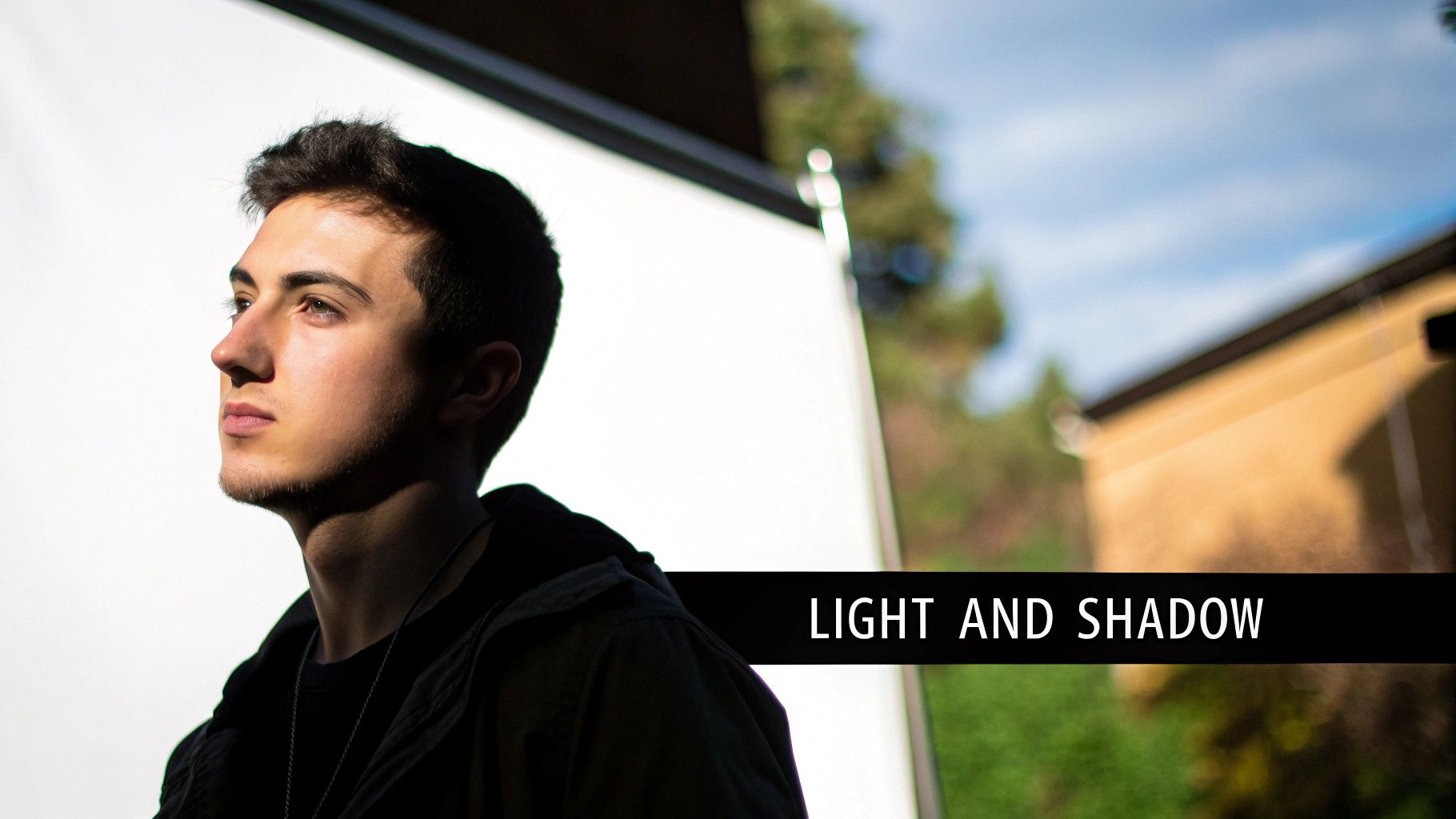
Using Contrast to Amplify Emotion
High contrast is an artist’s secret weapon for injecting drama and strength. By placing deep, velvety shadows right next to brilliant highlights in the background, we can make the subject pop, appearing more powerful and commanding. This classic technique, called chiaroscuro, essentially carves the subject out of the darkness and forces you to look.
On the flip side, a soft, low-contrast background with gentle, diffused light can create a feeling of peace, nostalgia, or quiet contemplation. This approach is perfect when you want a more intimate and serene portrait, where the mood is one of quiet reflection rather than intense drama.
Light in the background isn't just about visibility; it's about sculpting emotion. A high-contrast background highlights a subject's strength, while soft, diffused light can evoke a sense of quiet introspection. It’s the artist's way of turning up the volume on the portrait's emotional core.
Interestingly, the way artists have used light and shadow throughout history often mirrors societal values. A deep dive into hundreds of portraits found that about 75% were painted by men, and their subjects were overwhelmingly wealthy white men. These portraits frequently used dramatic lighting to project an aura of power and high status—a direct reflection of who held influence. You can read more about this fascinating study in the portrait census from the Historic New Orleans Collection.
When you start thinking about the light source in your background—its direction, intensity, and even its color—you begin to move beyond simple backdrops. You start creating environments that feel dynamic, immersive, and loaded with feeling.
Practical Tips for Artists and Clients
Whether you’re the one commissioning a custom piece or the artist standing at the easel, the secret to a great portrait often comes down to clear communication and thoughtful care. The journey doesn't just stop with the final brushstroke. It carries on through framing, display, and making sure the art lasts a lifetime.
Thinking about the portrait background painting right from the get-go is crucial. It ensures the final artwork is exactly what you envisioned and turns the whole thing into a true collaboration between client and artist.
For Clients Commissioning a Portrait
When you're talking to an artist about your portrait, communication is everything. Don't ever feel shy about sharing your ideas, even if you don't know the "art lingo." The more you can tell the artist, the closer they can get to painting what you see in your mind's eye.
To make sure you're both on the same page about the background, here are a few things to think about:
- Describe the Mood: Use words that paint a picture. Do you want the background to feel energetic and lively, or calm and serene? Is the vibe warm and cozy, or bold and dramatic?
- Share Visual References: A picture is worth a thousand words! Find photos of backgrounds you love—it doesn't matter if they're from other paintings, nature shots, or even a texture from a piece of fabric.
- Discuss Color Palettes: Be specific about colors you'd love to see or ones you'd rather avoid. Maybe you're looking for earthy tones to match your living room decor.
A fantastic tip is to focus on the feeling you want the portrait to give off. An artist can take a phrase like, "I want it to feel peaceful," and translate that into a specific color scheme and style much more effectively than a vague request for "something nice."
For Artists and Collectors
Once the painting is finished, the spotlight moves to presentation and preservation. A well-chosen frame and the right display environment can completely elevate a piece of art and protect it for generations to come. Remember, a frame should never steal the show; it's there to complement both the subject and its background.
Try a simple, elegant frame that pulls out a subtle color from the portrait background painting—it’s a simple trick that creates a beautifully cohesive look. As for where to hang it, keep it out of direct sunlight. Seriously, UV rays are the enemy of vibrant color and will cause fading over time. Gentle, indirect natural light or specially designed art lighting is always your best bet.
And finally, a little maintenance goes a long way. A light dusting with a soft, dry brush every few months is all it takes to keep the surface clean without risking any damage to the paint.
A Few Common Questions, Answered
Got a few nagging questions about portrait backgrounds? You're not alone. Let's tackle some of the most common artistic and practical hurdles people face, whether they're commissioning a piece or standing at the easel themselves.
Should I Paint the Background or the Subject First?
Ah, the classic chicken-or-the-egg debate for painters! There's no single right answer, but a few schools of thought. Many artists swear by blocking in the background first. It helps set the entire mood and color palette, ensuring the subject feels like it truly belongs in that space from the very beginning.
On the other hand, some painters dive right into the subject to nail the likeness and capture that initial spark of life, then build the world around them. A fantastic middle-ground approach is to start with a toned ground—a thin, neutral wash of color across the whole canvas. This way, you can build up the subject and background simultaneously, letting them evolve together in a more organic way.
How Do I Keep the Background from Being Distracting?
This is all about managing contrast and detail. Your main subject, especially the face, should always have the sharpest details and the strongest contrast—think the darkest darks and lightest lights. Everything else plays a supporting role.
To make the background recede, use softer edges, more muted colors, and a much tighter range of light and dark values. It’s a bit like how a camera lens works: your subject is in crisp, clear focus, while the background gently blurs away. This visual trick naturally pulls the viewer's eye right where you want it.
A successful portrait background whispers; it never shouts. Its job is to support the main character, not steal the scene. By intentionally softening its features, you guide the viewer’s eye exactly where it needs to go.
What's the Best Background Color for a Portrait?
There’s no magic bullet here, because the "best" color is completely tied to the subject and the feeling you want to evoke. That said, a great place to start is by picking a color that complements a dominant color in the subject's skin, fur, or clothing.
For instance, a portrait with warm, reddish-orange tones in the skin can absolutely pop against a cool blue or gray background. You also can't go wrong with neutrals like soft grays, olive greens, and earthy browns. They're popular for a reason—they provide a beautiful, subtle foundation that lets the subject’s personality truly take center stage.
At William Tucker Art, every brushstroke is a celebration of life, from the soul in a pet’s eyes to the untamed spirit of Louisiana's wildlife. We invite you to explore our collections and see how the right portrait can tell a story that lasts a lifetime.