
Painting a portrait that truly captures someone's essence is an incredible feeling. It's about bringing a personality to life on canvas, and that whole process starts way before you even think about mixing colors. The real first step? Getting your hands on the right gear.
Gathering Your Essential Painting Gear

Before you jump into the fun part, you need to build a toolkit that works for you. This isn't about grabbing the most expensive stuff off the shelf. It’s about being smart and choosing materials that will feel like an extension of your own hands.
Your biggest decision right out of the gate will be your paint. For portraits, it usually boils down to two main players: acrylics and oils. Each one has a completely different personality, and your choice will shape how you approach the entire painting.
Choosing Your Medium Acrylics vs Oils
Deciding between acrylics and oils can feel daunting, but it really comes down to how you like to work. Here’s a quick rundown to help you figure out which one might be your best fit for portrait painting.
| Feature | Acrylics | Oils |
|---|---|---|
| Drying Time | Fast (minutes to an hour) | Slow (days to weeks) |
| Blending | Challenging; requires extenders | Smooth and seamless |
| Cleanup | Simple; soap and water | Requires solvents or oil |
| Flexibility | Forgiving; easy to paint over | Rich, deep colors and luminosity |
| Vibrancy | Can darken slightly as it dries | Color remains consistent |
For a lot of artists just starting out, acrylics are the go-to. They dry incredibly fast, which means you can layer colors and fix mistakes without having to wait around for days. The downside? That quick-drying nature makes it a real challenge to get those soft, subtle blends you need for realistic skin tones.
Oils are the more traditional path, famous for their rich, buttery feel and the incredible amount of time you have to work with them. You can literally spend days blending and tweaking a section until it's perfect. The trade-off is the longer drying time and the need for solvents for cleanup (though there are some great solvent-free options available now).
Selecting Your Brushes and Surface
Think of your brushes as your dance partners. You really don't need a whole army of them to start—just a few reliable workhorses will do the trick. I'd recommend starting with a small round brush for all the tiny details like eyes and lips, and a medium filbert (that’s a flat brush with a curved tip) which is an absolute superstar for shaping the planes of the face. Throw in a larger flat brush for blocking in the background, and you're golden.
The surface you paint on—your "support"—is just as important.
- Stretched Canvas: This is the classic choice. It has a bit of a springy feel under the brush, and the woven texture can add a lovely bit of character.
- Wood Panels: These give you a super smooth, rigid surface. They’re fantastic for highly detailed portraits because the paint sits right on top without sinking into any texture.
A common mistake is buying a massive, pre-packaged set of brushes. In reality, most artists find they rely on just three or four favorite shapes and sizes for 90% of their work. Focus on quality over quantity.
To finish off your kit, you'll need a palette to mix your colors (a simple ceramic plate or even a sheet of glass works perfectly), an easel to keep your work at a comfortable height, and a roll of paper towels for cleanup. By sticking to these core items, you create a powerful, clutter-free setup that’s ready for anything.
If you want a more in-depth look at what to get, our guide on the top 10 must-have art supplies for beginners has some fantastic recommendations.
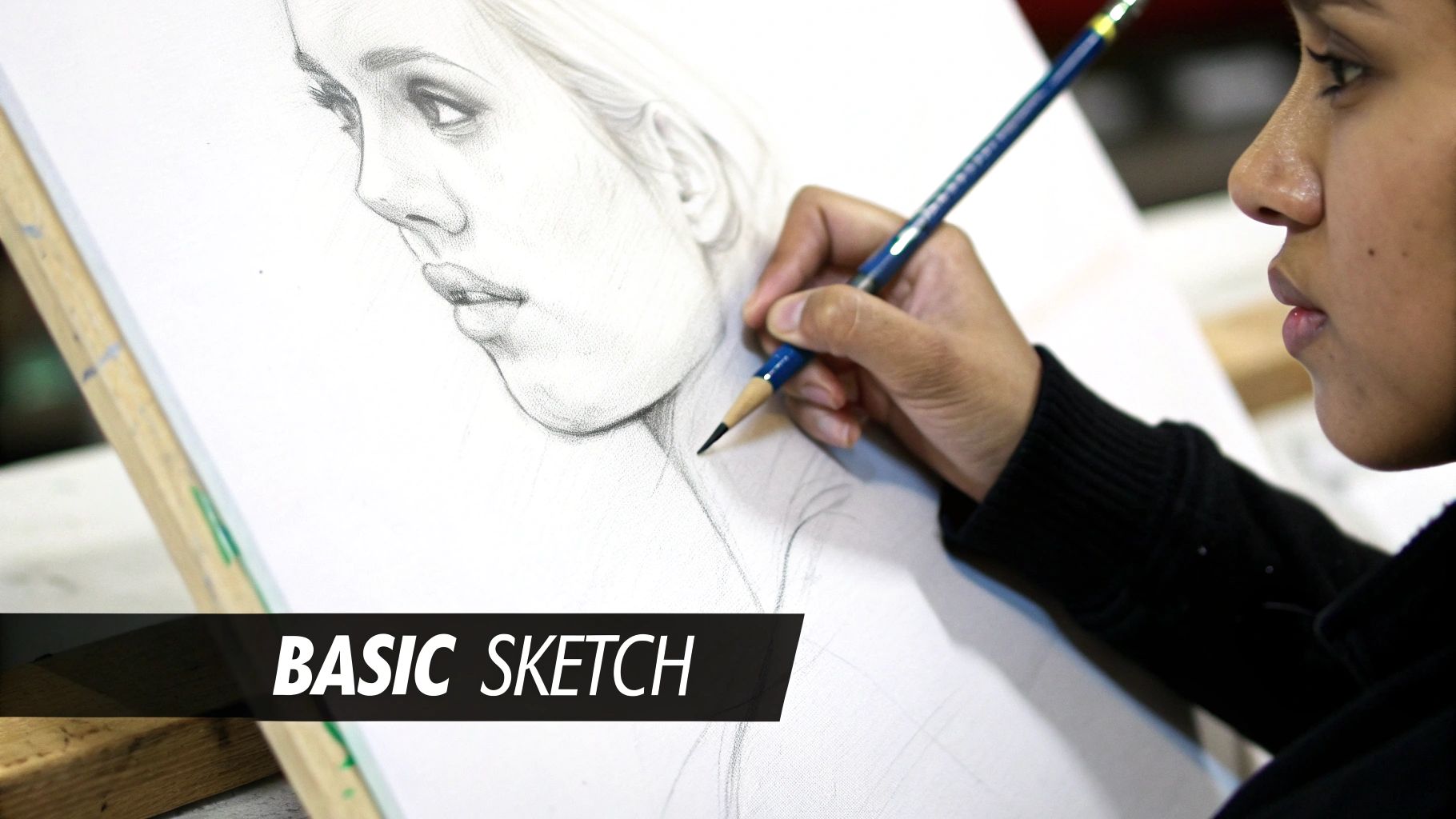
Laying a Flawless Foundation
This is where your portrait’s soul truly begins to take shape. The initial sketch and underpainting aren't just preliminary steps; they are your chance to build a rock-solid structure that guarantees a genuine likeness. Get this right, and every brushstroke that follows feels more intuitive. It’s also the best way to avoid the dreaded muddy colors that frustrate every artist at some point.
Many painters learning the ropes jump straight into color, but that's often a recipe for proportional chaos. A much smarter approach is to map out the facial features first. I'm a big fan of the Loomis method, a classic technique that teaches you to see the head as a three-dimensional sphere. It ensures the eyes, nose, and mouth land exactly where they should before a drop of paint touches the canvas.
Honestly, getting those proportions right is 80% of the battle for capturing a likeness.
This early work sets the stage for a confident painting process. The visualization below breaks down the initial planning sequence, helping you organize your approach from the reference photo all the way to the final lighting scheme.
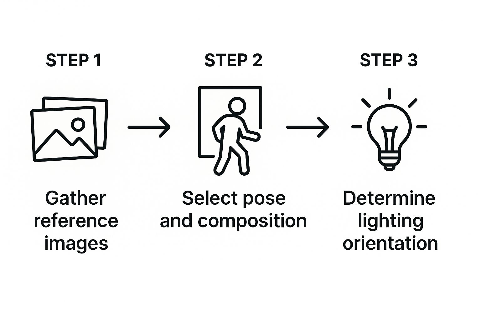
This workflow really drives home the point that a great portrait starts with thoughtful preparation. Your composition and lighting should feel intentional, not accidental. That kind of deliberate planning is the secret to a professional result.
The Power of an Underpainting
Once your sketch is locked in, the next game-changing move is the underpainting. This is where you create a monochrome version of your portrait, usually in a neutral tone like raw umber or a simple black-and-white mix. This technique, called grisaille (from the French for "grey"), is your secret weapon for mastering light and shadow.
So, why is this so powerful? By working in a single color, you simplify the incredibly complex puzzle of the human face. Instead of getting bogged down trying to mix that perfect skin tone, you can focus entirely on value—the relative lightness or darkness of every shape.
- It forces you to define your light source. You have to decide where the light is coming from and commit to where the shadows will fall.
- It builds a convincing sense of form. You're essentially sculpting the face with light and dark, creating three-dimensionality before color even enters the picture.
- It keeps your colors clean. The underpainting acts as a roadmap, ensuring your shadows stay deep and your highlights pop, preventing everything from turning into a single, muddy mid-tone.
Think of it as the architectural blueprint for your painting. You solve all the big structural problems upfront. When you finally start adding color, you're just glazing it over a form that you already know works.
A strong underpainting is the single most effective way to add depth and realism to your work. It’s a technique the Old Masters used for a reason—it builds confidence by separating the challenge of form from the challenge of color.
Here's a practical tip: I often lay down a grisaille using thin acrylics. They dry incredibly fast, so I can quickly establish all my lights and darks. Then, I can start layering my oils on top without waiting days for the base to cure. This hybrid approach gives you the best of both worlds—the speed of acrylics for the foundation and the beautiful blendability of oils for the skin tones.
Building Form with Simple Color Blocks
Alright, your underpainting is dry and you have a solid value map to work from. Now for the fun part: bringing in the color. This is what's called blocking in. Don't think about details yet—no eyelashes, no tiny wrinkles. Your only job right now is to lay down the big, simple shapes of color.
Think of the face as a landscape of planes. The side of the nose, the curve of a cheek, the little shadow under the lip—each one catches the light differently and will have its own distinct color. We're going to mix a color for each major plane and just fill it in like a paint-by-number, but one you've designed yourself.
By starting this way, you’re building a portrait that feels solid and three-dimensional right from the get-go. It creates a powerful foundation that makes all the later detail work a whole lot easier.
Mixing Believable Skin Tones
The biggest secret to realistic skin? It's never just one color. Step away from that pre-mixed tube of "flesh tint." Real skin is a beautiful, complex mix of warm and cool tones, and you can mix almost any of them with just a few essential colors.
I always recommend starting with a simple palette. You can get surprisingly far with just these:
- Titanium White: The workhorse for lightening your mixes and hitting those bright highlights.
- Cadmium Red Light (or an alternative): This is your main source of warmth.
- Yellow Ochre: A gorgeous, earthy yellow that's the foundation for so many skin tones.
- Ultramarine Blue: Your go-to for cooling things down, creating shadows, and toning down any mixes that get too orange.
With these, aim to mix three general value groups: a light for the highlights, a mid-tone for the main areas, and a shadow tone. That warm shadow under the chin? It might just be your mid-tone mix with a tiny speck of Ultramarine Blue. That cool highlight on the forehead? Your mid-tone with a bit more white and the slightest touch of blue.
For a much deeper dive into color theory, our guide on how to mix paint colors is a great resource.
Here's the most common mistake I see: blending too soon. Fight that impulse to smooth everything out. Keep your color blocks distinct for now. Think of it as a mosaic. This approach creates a much stronger sense of form that you can refine later.
Applying Your Color Blocks
Grab a medium-sized flat or filbert brush for this part. Load it up with a good amount of paint and lay down your colors confidently, right inside the shapes from your underpainting.
Here's a classic trick that works every time: squint at your reference photo. Seriously. It blurs out all the distracting details and makes those big, simple color shapes pop right out. It’s an absolute game-changer.
This process is about more than just color—you're basically sculpting with your brush. When you place a cool, darker shape for the side of the nose right next to the warmer, lighter shape for the bridge, you're building form. You’ll start to see the portrait emerge from the canvas, feeling solid and real, one thoughtful color block at a time. This is how you paint a portrait that truly feels alive.
Bringing Your Portrait to Life with Details
Alright, now that you’ve got your foundational color blocks in place, the portrait should be starting to feel solid and have some real dimension. This next stage is where the magic really happens. We're about to transform those simple shapes and colors into a living, breathing person.
This is all about patient layering, keen observation, and zeroing in on the small subtleties that capture a true likeness.
Think of this part of the process as moving from broad strokes to fine-tuning. We’re going to add the little things that make facial features pop with expression and recognition. Instead of just seeing an eye as a generic shape, you’ll start painting the soft curve of an eyelid, the gentle shadow it casts, and that tiny, crucial spark of light that makes it feel alive.
I know it’s tempting to grab your tiniest brush and start painting individual eyelashes or strands of hair right away. Trust me, try to resist that urge. The secret to realistic detail is building it up gradually, making sure every new element you add works with the light and form you've already established.
Refining the Eyes and Mouth
The eyes are almost always the focal point of a portrait. People call them the "windows to the soul" for a good reason, right? Capturing their expression is everything.
Start by gently blending the edges of your initial color blocks around the eye sockets. You want to create smoother, more natural transitions from the shadows to the mid-tones.
Next, let's look at the structure. Notice how the upper eyelid almost always casts a slight shadow onto the eyeball itself. Add this with a slightly darker, cooler version of your sclera (the white of the eye) color—which, by the way, is almost never pure white. Then, block in the iris color, but keep it a simple, flat shape for now. The final touch is the pupil and that all-important specular highlight—the tiny dot of light reflecting off the cornea.
Here's a pro tip that makes a world of difference: place the highlight so it sits over both the pupil and the iris. This one small detail instantly creates a sense of depth and moisture, making the eye look realistic and engaged.
The mouth follows a similar logic. We’re building form through light and shadow. The upper lip is usually a bit darker than the lower lip simply because it turns away from the light source. Define the line where the lips meet with a dark, soft edge, not a harsh, drawn-on line. A subtle highlight on the fullest part of the lower lip will immediately make it feel round and three-dimensional.
Sculpting the Nose and Facial Planes
The nose can be a real challenge because it doesn't have many hard edges. Its entire form is defined by how light falls across its different planes. The most common mistake I see is artists trying to outline it. Don't do that! Instead, think of it as a series of subtle shifts in value and temperature.
Place your lightest, warmest color right along the bridge of the nose, where the light is hitting it most directly. Then, paint the sides of the nose with a slightly darker, cooler mid-tone. The soft shadow the nose casts onto the cheek is what really anchors it to the face and makes it feel like it belongs.
As you work on these features, keep blending and softening the transitions between the major planes of the face you blocked in earlier. I like to use a clean, soft brush to gently feather the edges where different colors meet. This is how you get that soft, natural look of real skin.
Keep asking yourself questions as you paint:
- Where is the softest edge on the face? (It's often the turn of the cheek.)
- Where is the sharpest edge? (Maybe the glint in the eye or a crisp cast shadow.)
- Is my light source creating warm highlights and cool shadows, or is it the other way around?
This constant back-and-forth of analysis and adjustment is what will elevate your painting from just a collection of shapes into a compelling, believable portrait. Each feature informs the others, and slowly but surely, a cohesive face will emerge.
Adding the Final Polish to Your Painting
You've done the heavy lifting—the form is built, the features are refined, and you've captured a real likeness. Now comes the part I love most: the final ten percent of the work that takes a painting from good to great. This is where you add the professional finishing touches that make your portrait truly sing.
This last stage is a delicate dance between sharpening and softening. You’ll be adding the sharpest, brightest highlights, like that tiny glint in an eye or the wet shine on a lower lip. These little bright marks are incredibly powerful focal points. Use them sparingly for the biggest impact—they're the final, sparkling notes in your visual story.
At the same time, you'll want to selectively soften other areas to create depth. Think about where hair meets the background, or how the curve of a shoulder recedes into space. I like to take a clean, dry brush and gently blur these transitions. It creates a beautiful sense of atmosphere, pushing some elements back while pulling your focal points forward.
Knowing When to Stop
I swear, learning when to put the brushes down is one of the hardest skills for any painter to master. It’s so tempting to keep fiddling, but that's a fast track to an overworked, muddy mess. The real goal is to keep the energy and freshness of your brushwork alive.
My best advice? Step back from the easel. I mean literally step back. Walk across the room and look at your portrait. If it reads well and feels complete from a distance, it’s probably done.
Overworking a portrait usually comes from chasing tiny imperfections no one else will ever see. Trust your initial, confident strokes. A painting that feels 95% complete often has more life and soul than one fussed over to 100%.
The Varnishing Process
Once your painting is completely, bone-dry (which can take months for oils!), the very last step is varnishing. This isn't just about making it look pretty; it's a critical protective layer. Varnish is like sunscreen and a dust shield all in one, protecting your work from grime and the UV light that can fade your colors over time.
Applying it is simple, but you need to be careful. Lay your painting flat in a clean, dust-free space. Use a wide, soft brush to apply a thin, even coat. I usually work in one direction first, then go over it in a perpendicular direction to make sure I haven't missed any spots.
You have a few options for the finish:
- Gloss Varnish: Gives you that wet, reflective look that makes colors incredibly deep and rich.
- Satin Varnish: My personal go-to. It offers a gentle luster that's right in the middle—not too shiny, not too flat.
- Matte Varnish: A completely non-reflective finish that can give a piece a very modern feel.
This final coat unifies the surface sheen of your painting and provides archival protection. It's the last essential step to ensure your hard work will last for generations to come.
Got Questions? Let's Talk Portrait Painting
It's one thing to read a guide, but it's another to actually have a brush in your hand and a canvas staring back at you. Questions are going to come up—that's just part of the process. Think of every painting as a conversation, and sometimes you hit a tricky spot.
Let's walk through some of the most common hurdles I see new artists run into.
"Help! What if I Mess Up?"
This is the big one, isn't it? The fear of making a mistake can be paralyzing. But here’s the secret: paint is one of the most forgiving mediums out there. How you fix an error really just depends on what you're using.
If you're painting with acrylics, your best friend is patience. Acrylics dry super fast, which can feel stressful, but it's a huge advantage for corrections. Just let that wonky brushstroke or weird color dry completely, and then paint right over it. Simple as that.
Working with oils gives you a bit more time to think, since they stay workable for hours or even days. If you catch a mistake while the paint is still wet, you can just scrape it off with a palette knife. Another trick is to take a clean rag with a tiny bit of solvent and gently wipe the spot away. And if it’s already dry? No problem. Just like with acrylics, you can paint over it.
The most freeing moment for any painter is realizing that almost nothing is permanent. Every “mistake” is just a layer in your painting’s story and a chance to learn something new. Don't let fear hold you back.
"How Do I Mix Skin Tones That Don't Look... Flat?"
Moving past that single tube of "flesh" color is a massive leap forward. Real skin isn’t one color; it’s a complex and beautiful mix of warm and cool tones, light and shadow.
You don't need a million tubes of paint to get started. A fantastic, versatile palette includes:
- Titanium White
- Cadmium Red Light (or a cadmium-free version)
- Yellow Ochre
- Ultramarine Blue
Start by mixing your base mid-tone with white, red, and yellow. To create believable shadows, add the tiniest touch of blue to your base mix. This cools it down and darkens it in a much more natural way than just adding black.
The key is to constantly squint at your reference photo. Notice the subtle shifts—the rosy warmth in the cheeks, the slightly cooler tones under the jaw, the transparent quality of the skin on the forehead. Keep observing and adjusting.
"What Color Should I Make the Background?"
The background sets the stage for your portrait, so it needs to support the subject, not compete with it. A safe bet is always a neutral—a soft gray, a warm beige, or a muted earthy green. These colors are classic for a reason; they let your subject be the star of the show.
But if you want to create something with a little more punch, think about color theory. A background that complements a key color in your subject can make the whole painting sing. For instance, if your subject has warm, reddish hair, a cool, blue-gray background will make that hair color feel incredibly vibrant and alive. It's a simple trick that adds a ton of professional polish.
Inspired to see how a finished piece comes together? William Tucker Art specializes in custom pet and wildlife portraits that bring out the soul of every animal. Take a look at the collections and see about commissioning your own piece of art!