Mixing paint is simpler than you might think. It all boils down to combining your primary colors—red, yellow, and blue—to get new ones, and then tweaking them with a bit of white, black, or their opposites on the color wheel.
The real secret?Start small. Always add your darker color to the lighter one, just a tiny bit at a time. This little trick gives you total control over the final shade and is the foundation for creating literally any color you can dream up.
Your First Steps into Color Mixing
Welcome to the world of custom colors! It can feel a little intimidating at first, but trust me, creating that perfect shade is a skill anyone can pick up. We're going to break it all down and give you the foundational knowledge you need to start mixing with real confidence.
And it's a great skill to have. The demand for unique shades is booming, with the global paint mixing market projected to jump from USD 19.49 billion to over USD 31.45 billion by 2035. It just goes to show that custom colors are more popular than ever.
Before we dive in, let's get your gear sorted. Having a few key items on hand will make the whole process smoother and way more fun. Think of this as your launchpad—no confusing jargon, just a practical setup for a great experience from your very first mix.
Gathering Your Essential Tools
You don't need a fancy studio to get started. All you really need are your primary paints, something to mix on, and something to mix with.
- A Simple Mixing Surface: A disposable paper plate, an old ceramic tile, or even a sheet of glass works great. You just need a clean, non-absorbent spot to work.
- A Palette Knife: You can use a brush, but a palette knife is so much better. It lets you blend the pigments together completely without wrecking your brush's bristles or leaving streaks in your new color.
- Your Core Paints: To begin, grab good-quality tubes of red, yellow, and blue, plus a titanium white and a mars black. These five colors are the building blocks for an almost endless spectrum of hues.
Having the right supplies ready to go is half the battle. When your workspace is set up, you can stop worrying about finding things and just focus on the fun part—creating color. For a complete checklist, check out our guide on the top 10 must-have art supplies for beginners.
Let the Color Wheel Be Your Guide
Think of the color wheel as more than just a poster from art class—it's your secret weapon for mixing paint. Once you get the hang of it, you'll be able to predict how colors will play together, giving you complete creative control. It all starts with the basics you probably remember.
Your three primary colors—red, yellow, and blue—are the building blocks of everything. You can't mix other colors to create them; they're the parents of every other shade you can imagine. The real fun starts when you begin to combine them.
This chart really nails the core relationships on the color wheel.
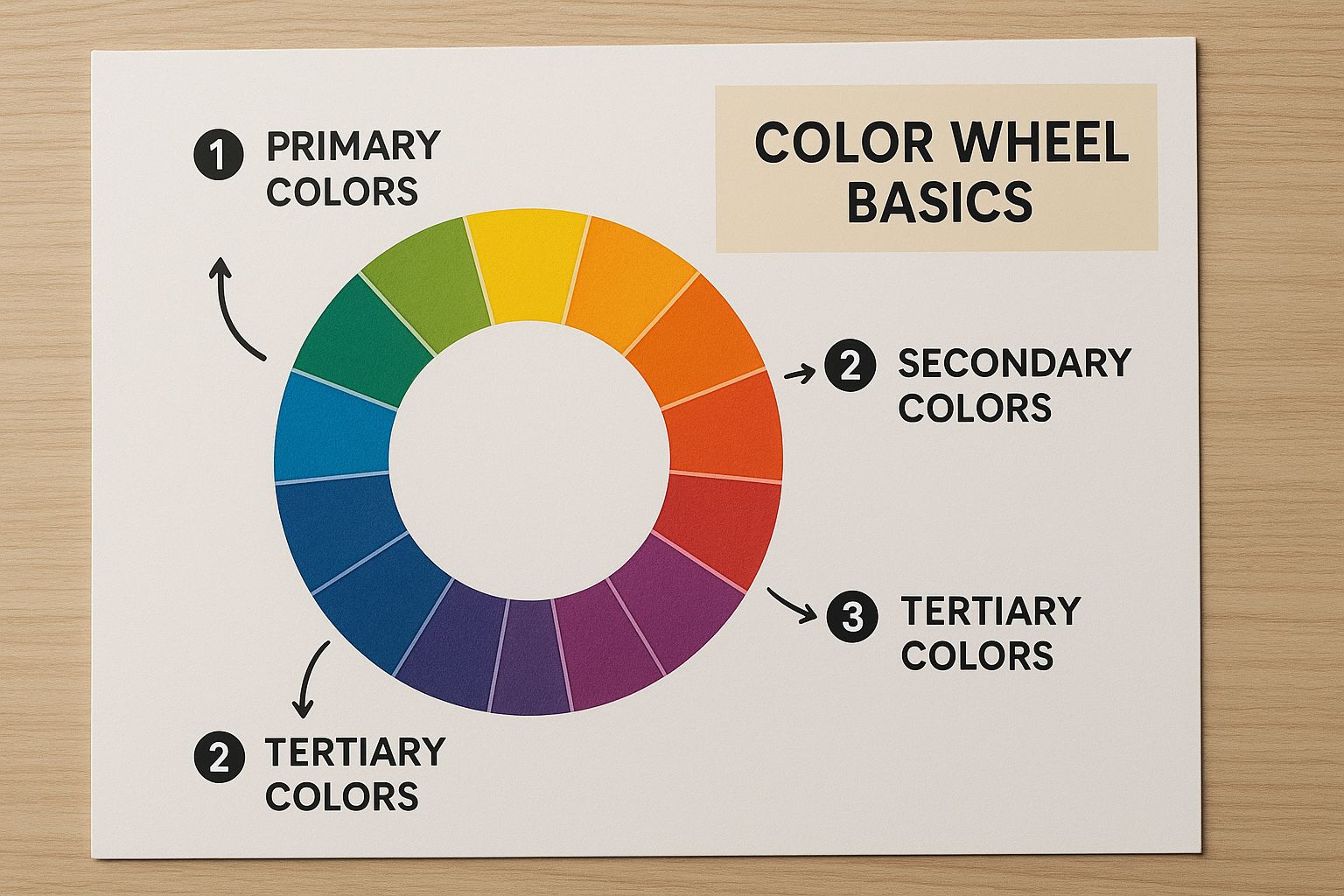
It’s a perfect visual for how your primary colors blend to form new ones, laying the groundwork for your entire palette.
First Up: Creating Secondary Colors
When you mix any two primary colors in roughly equal amounts, you get a secondary color. This is your first big step, and it’s refreshingly simple. Just follow these basic recipes.
Here’s a quick reference guide for creating secondary colors from your primary paints.
Primary and Secondary Color Mixing Recipes
| Primary Color 1 | Primary Color 2 | Resulting Secondary Color |
|---|---|---|
| Red | Yellow | Orange |
| Yellow | Blue | Green |
| Blue | Red | Purple |
These three new colors—orange, green, and purple—slot right in between the primaries on the wheel. So, if you're aiming for a brilliant turquoise, you'd start with your primary blue and then slowly add a bit of yellow to push it toward green. Nailing these simple mixes is a game-changer.
A Pro Tip: Working With Complementary Colors
Ready for a trick that will seriously elevate your painting? Look at the colors sitting directly opposite each other on the wheel—these are called complementary colors.
- Red and Green
- Blue and Orange
- Yellow and Purple
Mixing a tiny dab of a color's complement is the secret to creating rich, natural-looking neutrals and shadows. Instead of grabbing that tube of black paint to darken a red, try adding the smallest touch of green. This technique adds depth and complexity to your shade, avoiding that flat, lifeless look black paint can sometimes create.
A classic artist’s trick is to mix burnt sienna (a dark orange) with ultramarine blue. This creates a gorgeous, complex near-black that feels much more alive than a flat black pigment.
Suddenly, the color wheel isn't just a static chart; it's a dynamic tool. It empowers you to stop guessing and start making intentional, confident choices about your palette. Understanding these relationships is the key to truly mastering how to mix paint.
Lightening and Darkening Your Colors
You’ve mixed a brand-new hue, and that’s a great start. But the real magic happens when you start playing with its value—how light or dark it is. Most people reach for the white or black paint right away, but if you want colors with real depth and life, there’s a much better way to go about it.
It all starts with understanding three simple, but powerful, concepts: tints, shades, and tones. Once you get these down, you'll have so much more control over the final look of your work.
Getting a Handle on Tints, Shades, and Tones
Let's break these down. Each one is a different tool in your toolbox, perfect for creating a specific mood or effect.
-
Tints: This is what you get when you add white to a pure color. Think of taking a bold red and adding a bit of white to get a soft pink. Or adding white to a vibrant blue to create a dreamy pastel. This is your go-to for making colors feel lighter and more airy.
-
Shades: A shade is simply a pure color with black added to it. Take that same red, mix in a little black, and you get a rich, deep burgundy. This is how you create those dramatic, darker versions of your colors.
-
Tones: Tones are created by adding gray (which is just black and white mixed together) to a color. This dials down the intensity, giving you more subtle, muted colors. It’s how you get a sophisticated dusty rose or a calming, earthy olive green.
A classic beginner's mistake is to just dump black paint into a color to make it darker. Sure, it works, but it can also make your colors look flat and dead. Here's a little pro tip: try darkening a color with a tiny amount of its complementary color. You'll get a much richer, more natural-looking shadow every time.
The Trouble with Using Straight Black
Reaching for that tube of pure black paint can sometimes completely kill the vibrancy you worked so hard to create. For example, if you add black to a bright yellow, you don't get a deep, dark yellow. You usually end up with a murky, olive-greenish sludge. It's not a great look.
Knowing how to mix with precision is more important than ever, whether you’re a weekend DIYer or a professional artist. It’s no surprise that the market for high-tech paint mixers is projected to grow by 5.9% annually through 2034. You can see the full trend breakdown in this paint mixing technology market research.
This just goes to show how much people want that perfect, predictable shade. When you learn to use complementary colors to create your own shades, you're giving yourself that same level of expert control.
Getting Your Hands Dirty: Practical Mixing Techniques
Alright, you've got the color theory basics down. Now for the fun part—actually mixing the paint. Moving from theory to a physical palette is where the magic happens, and a few good habits will save you a world of frustration.
The single most important rule is also the simplest: always start with your lighter color, then add the darker one bit by tiny bit.
Let's say you're after a soft sage green. You'd start with a good dollop of white and then introduce your green a little at a time. It’s a piece of cake to add more dark paint, but you can’t take it away once it’s in there. This one trick will keep you from blowing past your target color and wasting a bunch of paint.

Why You Need a Palette Knife
Your first instinct might be to mix with your brush, but trust me, a palette knife is your secret weapon for getting a clean, perfect blend. When you use a brush, you risk grinding pigments into the bristles, which can muddy up later colors. Even worse, it often leads to a streaky, uneven mix.
A palette knife, on the other hand, makes sure every speck of pigment is completely blended.
Use the flat edge of the knife to scrape, fold, and press the colors together on your palette. Keep going until you have a totally uniform color with no swirls or streaks left. This consistency is what gives your work a polished, professional look. In the industrial world, they call this a homogeneous blend—a fancy term for a perfectly even color.
The professional paint industry is obsessed with consistency. Innovations in the Vertical Color Mixer Market are all about achieving perfect blends while reducing waste—principles you can apply to your own palette for better results. You can read more about these industrial mixing technologies and their market growth.
Learn to Create a "Color String"
One of the most powerful exercises I ever learned was creating a "color string." It's essentially a gradient of a single hue, showing its full range from light to dark. It’s an incredible way to truly understand a color's potential and is absolutely vital for creating depth and dimension in your paintings.
Here’s a simple way to create one:
- Put a dab of your pure color (like ultramarine blue) on one end of your palette.
- Place some white on the opposite end.
- Slowly pull tiny amounts of the blue into the white, making a line of progressively lighter tints.
- You can do the same thing with black (or a dark complementary color) to create a range of shades.
This quick exercise leaves you with a full spectrum of values for that one color, all ready to go on your palette. Having this "string" handy makes creating harmonious highlights, mid-tones, and shadows a breeze. It's one of those foundational painting techniques for beginners that really builds your confidence and control, turning your knowledge of how to mix paint colors from just theory into true artistry.
Common Color Mixing Mistakes to Avoid
We’ve all been there. No matter how long you’ve been painting, everyone has accidentally created ‘mud’—that dull, brownish-gray mess that pops up when you least expect it. Knowing why it happens is the key to making sure it doesn't happen again.
This frustrating result usually comes from one simple mistake: over-mixing. When you blend complementary colors, like red and green or blue and orange, you can get some really beautiful, complex neutrals. But when you keep throwing other colors into the same puddle, you're just muddying the waters. The pigments essentially cancel each other out, leaving you with a lifeless gray. For the cleanest results, a good rule of thumb is to stick to mixing just two or three colors at a time.
Solving Common Mixing Problems
Beyond making mud, a few other common frustrations can trip you up. One of the biggest is, without a doubt, not mixing enough of a custom color to finish your piece. I can't tell you how many times I've seen artists (myself included!) try to perfectly replicate a specific shade later on, only to end up with a patchy, inconsistent look.
Here are a few practical ways to sidestep these classic pitfalls:
-
Mix More Than You Think You Need: This is my number one tip. Always, always mix a larger batch of your custom color than you estimate. It's so much better to have a little paint leftover than to run out halfway through a critical section.
-
Save a Swatch and Your Recipe: When you create a color you absolutely love, paint a small swatch of it on a piece of paper or cardstock. Once it's completely dry, jot down the "recipe"—the exact colors and rough proportions you used—on the back. A physical reference like this is a lifesaver and far more reliable than just trying to remember it.
-
Rescue a Bad Mix Gracefully: If your color turns out too dark, resist the urge to just dump a bunch of white paint in. That can wash out the color and make it look chalky. Instead, try adding a tiny bit of your original lighter color from the recipe back into the mix. This helps preserve the hue's integrity while bringing the value back up.
Think of your color mixes like ingredients in a recipe. Work with a clean palette, add new colors slowly and deliberately, and always keep a record of what works. This simple shift in mindset can turn frustrating mistakes into your most valuable learning experiences.
Got Questions About Mixing Paint?
It's totally normal to have a few questions when you start diving into the world of color mixing. Honestly, getting these sorted out early on can save you a lot of headaches and let you focus on the fun part—creating! Let's walk through some of the things people ask me most often.

How Do I Make the Color Brown?
Ah, brown! It’s one of those essential, earthy tones, and thankfully, it's pretty simple to mix. The most straightforward way is to combine complementary colors.
Think about the color wheel:
- Red + Green
- Blue + Orange
- Yellow + Purple
Any of these pairs will give you a nice brown. You can also get there by mixing all three primary colors—red, yellow, and blue—together. The key is in the proportions; a little more red will give you a warmer, terracotta brown, while more blue will cool it down.
Can I Mix Different Brands or Types of Paint?
This is a great question, and the answer is a firm "it depends." When it comes to paint types, it's best to stick to one family. Mix acrylics with other acrylics, and oils with other oils. Trying to mix oil and acrylic paint is like trying to mix oil and water—their chemical makeups are just not compatible, and you'll end up with a mess.
As for mixing different brands of the same type of paint? You can usually get away with it. Just be mindful that pigment quality, consistency, and finish (like matte vs. gloss) can vary from one brand to another. This might subtly change the final look you're going for.
My Go-To Tip: Always, always test your new color on a scrap piece of paper or canvas first. Paint a small swatch and let it dry completely. Colors, especially acrylics, have a tendency to darken as they dry, so what you see wet isn't always what you get. This little step has saved me countless times!
Here at William Tucker Art, we know that every color tells a story. If you're inspired by the vibrant spirit of New Orleans and the beauty of the natural world, I invite you to explore my collection of original art and fine art prints. Find a piece that speaks to you at williamtuckerart.com.