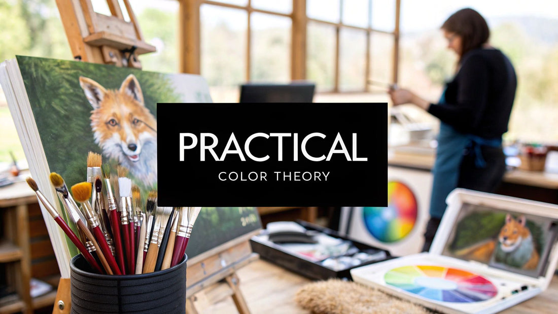
Color theory is one of those things that can sound really academic and, let's be honest, a little intimidating. But it's not about memorizing complex rules. Think of it as the practical science behind why certain color combinations just work—and how you can use that knowledge to make your art sing.
It’s really about understanding the relationships between colors. When you get how they mix, interact, and play off each other, you gain the power to create harmony, stir up drama with contrast, and guide your viewer’s eye exactly where you want it to go. Master these ideas, and you'll be the one in control of the mood, focus, and depth in every single piece you create.
Why Color Theory Is Your Most Powerful Tool
Let's reframe how we think about color theory. Forget the dry textbooks for a moment. Instead, imagine it's your creative partner, helping you pull the vision from your mind and bring it to life on the canvas. It's the secret language that helps you communicate emotion, build a sense of realism, and inject energy into your work.
This is the framework that supports every decision you make with your brush. Whether you're mixing the perfect earthy brown for a grizzly bear's fur or capturing the soft, hazy light of a sunset over the plains, a solid grasp of color fundamentals is what makes it all possible.
Building a Foundation for Success
The way we artists think about color today was really hammered out in the 18th and 19th centuries. It all came together with the work of Johannes Itten at the famous Bauhaus school. He’s the one who formalized the color wheel we all know and love, based on just three primary colors: red, yellow, and blue.
Itten showed how these three simple colors could be mixed to create predictable, harmonious combinations—he even called them "chords," like in music. This system is still the bedrock for artists everywhere. If you're curious, you can explore more about the history of color frameworks to see how these ideas grew over time.
Color is a power which directly influences the soul. The artist is the hand which plays, touching one key or another, to cause vibrations in the soul. - Wassily Kandinsky
Once you get a feel for this system, you can finally stop guessing and start making confident, intentional choices with your palette. No more fighting with muddy colors or wondering why a painting feels flat. You'll start to see what's going to happen before you even mix the paint.
Here’s a taste of what a solid understanding of color theory really gives you:
- Emotional Impact: You'll learn to pick colors that make people feel something—the energetic punch of a fiery orange, the deep calm of a forest green, or the quiet melancholy of a cool blue.
- Visual Hierarchy: You can use contrast to create a powerful focal point. It’s like telling your viewers, "Look here first!"
- Depth and Realism: By playing with color temperature and atmospheric perspective, you can create a convincing illusion of space and make your subjects feel truly three-dimensional.
- Cohesive Compositions: Forget random palettes. You’ll be able to build beautiful, unified color schemes using time-tested harmonies that just feel right.
We're going to start with the basics and build from there, turning these big ideas into practical skills you can use in your studio right away.
Meet the Color Wheel: Your Most Important Tool
Ever tried to cook a gourmet meal without knowing the difference between salt, sugar, and flour? You might stumble into something edible, but you’d have zero control over the result. Think of the color wheel as your artistic pantry—it’s stocked with all the basic ingredients you need to mix any "flavor" of painting you can dream up.
It’s far more than just a rainbow in a circle. It's a map that clearly shows how every single hue relates to the others.
I like to think of it as a family tree for color. When you understand these core relationships, you stop guessing and start making intentional, powerful choices with your palette. This simple tool, first whipped up by Sir Isaac Newton way back in 1666, is still the starting line for every color decision an artist makes.
The Foundation: Primary Colors
At the very core of this whole system are the three primary colors: red, yellow, and blue. These are the "great-ancestors" of every other color you can imagine. You simply can't mix other colors to create them; they are pure, elemental, and the ultimate building blocks.
When we're working with paint—what's known as subtractive color mixing—these three hues are the parents of all the other colors on the wheel. Every color on your palette, from a murky swamp green to a delicate lavender, can be traced right back to some combination of these three. They are your non-negotiables.
Grasping this is probably the single most critical piece of color theory. With just a high-quality red, yellow, and blue paint, you technically hold the power to mix an entire universe of color.
Understanding the primary colors is like learning the three main chords in music. Once you know them, you can start to play virtually any song you want.
The First Generation: Secondary Colors
So, what happens when you mix two of the primaries together in equal parts? You get the secondary colors: orange, green, and purple. Simple as that.
They are the direct children of the primaries, and on the color wheel, you'll find them sitting cozily between their "parent" colors.
The recipe is straightforward:
- Red + Yellow = Orange
- Yellow + Blue = Green
- Blue + Red = Purple (sometimes called Violet)
These secondary colors are a huge deal. They introduce a whole new layer of possibilities and form that second tier of our color family tree. Getting familiar with where they sit is the key to unlocking more advanced ideas we'll dive into later, like how to create stunning contrast.
The Grandchildren: Tertiary Colors
Ready to take it one step further? When you mix a primary color with one of its immediate neighbors—a secondary color—you create a tertiary color.
These six new colors fill in the remaining gaps on the wheel, giving us that smooth, continuous spectrum of color we're all familiar with.
Their names might sound a bit technical, but the logic is dead simple. They're just hyphenated names that tell you exactly what's in them. For example, mixing the primary blue with its secondary neighbor green gives you blue-green. These are the colors that bring real nuance and sophistication to your work, allowing for all those subtle, beautiful shifts in tone.
To make this super clear, here’s a little cheatsheet that shows how this color family comes together. Think of it as your quick-glance guide for mixing.
The Artist's Color Mixing Cheatsheet
This table breaks down how to get your secondary and tertiary colors from just the three primaries.
| Color Type | Color Name | Mixing Recipe |
|---|---|---|
| Primary | Red | Cannot be mixed. |
| Primary | Yellow | Cannot be mixed. |
| Primary | Blue | Cannot be mixed. |
| Secondary | Orange | Red + Yellow |
| Secondary | Green | Yellow + Blue |
| Secondary | Purple | Blue + Red |
| Tertiary | Red-Orange | Red + Orange |
| Tertiary | Yellow-Orange | Yellow + Orange |
| Tertiary | Yellow-Green | Yellow + Green |
| Tertiary | Blue-Green | Blue + Green |
| Tertiary | Blue-Purple | Blue + Purple |
| Tertiary | Red-Purple | Red + Purple |
There you have it! With this basic map of the color wheel in your head, you're ready to start understanding how colors actually behave. This simple diagram isn't just something to memorize; it's a powerful tool that will help you mix colors with confidence and finally get the exact visual effects you're after in your paintings.
Creating Harmony with Color Relationships
Alright, so you know your primary, secondary, and tertiary colors. That’s like knowing the individual notes on a piano. But art isn't about playing one note at a time—it's about creating chords that sing. That’s where color harmony comes in. It’s the art of picking colors that just work together, creating a specific mood and making your painting feel intentional.
Think of it like cooking. A good chef knows which ingredients enhance each other to create a delicious, balanced dish. Color harmonies are your tried-and-true recipes for visual success. Get these down, and you’ll have incredible control over the emotional punch of your art, turning a chaotic mess of colors into a cohesive masterpiece.
The Power of Complementary Colors
First up is the most dramatic, high-energy relationship in the color world: complementary harmony. This is simply pairing two colors that sit directly opposite each other on the color wheel. The classics you probably know are Red and Green, Blue and Orange, and Yellow and Purple.
So, what’s the big deal? When you put these colors side-by-side, they make each other look brighter and more intense. It’s a visual sizzle that grabs your viewer's eye and doesn't let go. It's exactly why a bright red cardinal pops so beautifully against green foliage, or why an orange sunset feels so electric against a deep blue sky.
In art, complementary colors create the strongest possible contrast. Use this to your advantage to make your subject the undeniable star of the show.
This punchy contrast is your secret weapon for creating a powerful focal point. If you want your wildlife subject to leap off the canvas, placing it against its complement is a surefire way to do it. Just a word of caution: a little goes a long way. Too much of this high-contrast action all over the piece can feel a bit chaotic and exhausting for the viewer.
This concept map shows you how complementary, analogous, and triadic harmonies are laid out on the color wheel.
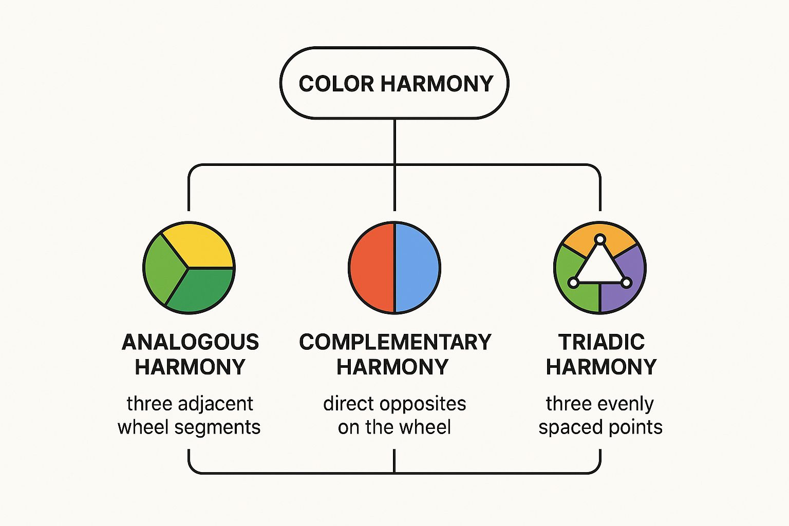
Each branch gives you a clear visual guide, showing how these distinct relationships work to create balanced and impactful color schemes in your paintings.
The Serenity of Analogous Colors
If complementary colors are all about drama, then analogous harmony is their calm, quiet cousin. This approach is all about peace and unity. You simply pick colors that are neighbors on the color wheel—usually one main color and the two sitting right next to it. Think yellow, yellow-green, and green.
Because these hues share common ingredients, they naturally blend together beautifully, creating a really serene and comfortable vibe. Picture the gentle, rolling hills of a green landscape, with all its subtle shifts from light, sunny greens to deep, moody blue-greens. Nature uses this color scheme all the time, and it’s perfect for creating a relaxed, cohesive mood.
This harmony is less about making a single element pop and more about making the entire painting feel like a unified, harmonious whole. It’s a fantastic choice for backgrounds or for any piece where you want to evoke a sense of tranquility.
The Balance of Triadic Colors
Last but not least, we have the triadic harmony. This one is a fantastic middle-ground, offering the balance of analogous colors with a nice splash of the contrast you get from complementaries. A triadic scheme uses three colors that are evenly spaced around the color wheel, forming a perfect triangle. The most famous triad is our old friend, the primary trio: red, yellow, and blue.
This combination is naturally vibrant and full of life, but because the colors are perfectly balanced, it doesn't feel as intense or in-your-face as a purely complementary pairing. You get high contrast and a ton of visual interest, all while keeping a strong sense of harmony.
To really nail a triadic scheme, it's best to follow a simple rule of thumb:
- Pick a star player: Let one of the three colors be your dominant, main color.
- Use the other two for backup: Use the remaining two colors in smaller doses as accents to support the star and add pops of interest.
This approach keeps your painting feeling lively and balanced without tipping over into visual chaos. It's an incredibly versatile harmony that works for almost anything, from a painting of a colorful parrot to a dynamic scene of wildlife in action. The emotional impact of color has been on artists' minds for centuries. Back in the 18th century, Goethe even classified colors into a 'plus side' (reds and yellows) for excitement, and a 'minus side' (blues and greens) for calm—a concept that still shapes how artists choose colors today. You can learn more about how these historical ideas developed by reading about the evolution of color principles.
Understanding the Language of Color Properties
Imagine you're a chef. You know "salt" is a key ingredient, but to really cook, you need to know more. You need to know how much salt to use (that's its intensity) and whether you need fine grains or big, flaky crystals. Color works the same way. Just calling a color ‘blue’ barely scratches the surface.
To truly master your palette, you have to get to know the three core properties that give every color its unique personality: hue, saturation, and value.
Think of these as three control dials for every color you mix. Once you learn how to tweak each one, you gain total control over the mood, depth, and realism of your wildlife paintings. This is the difference between just copying color and truly understanding it.
Dial 1: Hue — The Color's Family Name
Let's start with the easy one. Hue is simply the pure color itself—what we call it when we see it on the color wheel. Red, yellow, blue, green, violet; these are all hues. It’s the color’s basic identity, its family name.
When someone asks, "What color is that?" your first instinct is to name its hue. It's our starting point for every single decision we make on the canvas. Before we worry about how bright or dark a color should be, we first have to ask: is this a job for orange or a job for purple?
Dial 2: Saturation — The Color's Intensity
Now things get interesting. Saturation is all about the purity or intensity of a hue. Think of it like a volume knob for your color. A highly saturated color is loud, vibrant, and pure, like a fire-engine red squeezed straight from the tube. A color with low saturation is muted, subtle, and closer to gray—like the dusty red of an old brick.
This dial is absolutely critical for creating realism, especially in wildlife art. Let's be honest, nature is rarely full of neon colors. A wolf's fur isn't just a flat gray; it’s a beautiful, complex mix of desaturated browns, blues, and earthy ochres.
So, how do you control it?
- To knock a color back (decrease saturation): Mix in a tiny amount of its complement (the color directly opposite it on the color wheel). Adding a touch of green to your red will instantly make it feel more natural and less aggressive.
- Another way: Adding a neutral gray will also desaturate a color, but be aware this will affect its lightness or darkness, too.
Mastering saturation is what separates a good painting from a great one. It’s how you guide the viewer's eye. A single pop of high-saturation color in an otherwise muted painting becomes an instant focal point. For more hands-on tips, check out our guide on how to mix paint colors.
Dial 3: Value — The Light and Dark
Finally, we arrive at value, which is arguably the most important property for creating depth and a sense of three-dimensional form. Value is simply how light or dark a color is, completely separate from its hue.
A pale, buttery yellow and a deep, inky navy blue have totally different hues, but the most important thing for creating structure is the massive difference in their values.
Here's a great trick: imagine your painting as a black-and-white photograph. All the color vanishes, leaving only shades of gray. That's your value structure. It's what makes a subject look solid and real instead of flat and lifeless. Strong value contrast—placing very light areas next to very dark areas—is what creates drama, defines form, and pulls the viewer through your painting.
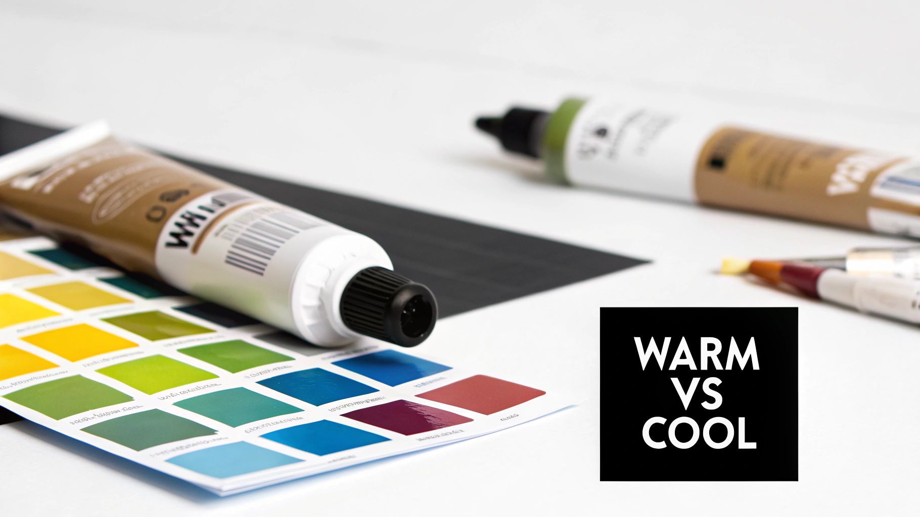
Using Color Temperature to Create Mood and Depth
Beyond just picking a color, say "red" or "blue," every single hue on your palette has a personality, a certain vibe. This is the subtle magic of color temperature. It's a simple idea that taps into our most basic feelings about the world: we see colors as either warm or cool.
Think about it for a second. We don't need a textbook to tell us that fiery reds, bright oranges, and sunny yellows feel like warmth and energy. On the flip side, deep blues, quiet greens, and dusky violets bring to mind shadows, water, or the stillness of twilight. This isn't just fluffy, poetic language; it's one of the most powerful tools you have for controlling the entire emotional atmosphere of your painting.
Shaping the Emotional Tone of Your Art
Color temperature is like a secret shortcut to your viewer's subconscious. By choosing to let warm or cool colors dominate your palette, you can set the stage for your entire piece before you even paint the first detail.
-
Warm Colors: These are your "in-your-face" colors. They feel energetic, inviting, and sometimes even aggressive. They have a funny way of seeming to pop off the canvas, advancing toward the viewer. If you want to paint a wildlife scene that feels intense, vibrant, and immediate, a warm-heavy palette is the way to go.
-
Cool Colors: These are the opposite. They feel calm, serene, and can even feel a bit distant or sad. Unlike warm colors, they tend to recede, sinking back into the painting. This makes them perfect for creating a sense of peace, quiet solitude, or vast, wide-open spaces.
Once you get a feel for this push-and-pull, you can start directing the emotional story of your art. You’re not just painting a wolf anymore; you're painting a wolf in the blistering heat of the hunt or one steeped in the quiet chill of a winter forest.
Creating a Believable Illusion of Depth
Okay, this is where color temperature goes from being an emotional tool to a technical powerhouse. The whole concept of atmospheric perspective—that trick artists use to make a flat canvas look miles deep—is built almost entirely on the clever use of temperature.
So, how does it actually work? Picture yourself looking out at a mountain range. The mountains right up close are sharp and full of rich, warm colors. But as your eyes travel further into the distance, the mountains get lighter, hazier, and noticeably cooler, leaning towards blue or grey.
This isn't an artistic invention; it's real life! As things get farther away, there's more atmosphere (dust, water vapor, etc.) between you and them. This atmospheric haze scatters light, filtering out the warmer light waves and letting the cooler, bluer ones pass through to your eyes.
To copy this effect in your wildlife paintings, you just need to follow a few simple rules. Honestly, learning this one technique can be a total game-changer for making your painted worlds feel real.
Applying Atmospheric Perspective Step by Step
To give your landscapes that feeling of vastness and make your animals feel like they truly belong in that space, just apply these ideas systematically, working from back to front.
-
The Far Distance: This is where you'll use your coolest, lightest, and least saturated colors. Think pale, misty blues and soft, washed-out purples. Keep details fuzzy and edges soft.
-
The Middle Ground: As things start moving closer, you can introduce a little more warmth and make your colors a bit darker and richer. Your greens will have less blue in them, and you can start to define shapes more clearly.
-
The Foreground: Let loose! This is where you use your warmest, darkest, and most saturated colors. Details should be tack-sharp, the contrast between light and dark should be strong, and edges should be crisp and clear.
By mastering this gradual shift from cool and muted in the back to warm and vibrant up front, you create a powerful visual path that pulls the viewer's eye deep into the world you've painted. It's this skillful dance with color temperature that lets you turn a flat piece of canvas into a place with breathtaking depth.
Putting It All on the Canvas: A Red Fox Case Study
Theory is one thing, but seeing it in action is where the lightbulb really goes on. Let's roll up our sleeves and walk through a practical painting to see how all these ideas—harmony, value, temperature—work together to bring a piece of wildlife art to life.
Our subject is a classic for a reason: a fiery red fox against a cool, deep forest background. It’s the perfect scene to really push and pull our colors.

Choosing a Powerful Color Harmony
First things first, we need a game plan for our palette. For a scene like this, a complementary color harmony is hands-down the most powerful choice. We're going to set the brilliant red-oranges of the fox's coat directly against the cool blue-greens of the forest.
Why? It's all about creating drama. This high-contrast pairing makes the fox practically leap off the canvas. The opposing colors intensify each other, immediately telling the viewer, "Hey, look here!" This single decision sets the entire mood for the painting.
By picking a complementary scheme, we're essentially building our focal point right into the color choices. The natural tension between red-orange and blue-green does all the heavy lifting for us, making sure our fox is the star of the show.
Sculpting Form with Value and Saturation
Okay, now let's get to the fox itself. Its fur isn't just one flat color, right? To give it that soft, three-dimensional feel, we have to play with value and saturation.
We'll start by mixing a nice, rich red-orange for the main body color—our mid-tone. From there, it's all about subtle adjustments to show how light is hitting the form.
- For the highlights: Think about where the sun would catch the fur on its back or the top of its head. Here, we’ll mix a lighter, slightly less saturated orange. A touch of white or even a pale yellow will do the trick, lifting the value without looking chalky.
- For the shadows: In the darker areas, like the folds of fur or under its belly, we need to mix a darker, more muted red-orange. The secret here is to add a tiny speck of its complement—that blue-green from the background. This will neutralize the orange and darken its value in a really natural way.
These simple shifts from light to dark are what trick the eye into seeing form and texture. If you're just starting out, exploring different painting techniques for beginners is a great way to learn how to apply these colors to build that fuzzy, fur-like texture.
Building Depth with Color Temperature
Finally, let's tackle that background. We don’t want a flat green curtain behind our fox; we want a forest that feels deep and immersive. This is where color temperature becomes our superpower.
We'll need a whole family of greens, and we'll place them strategically based on how far away they are.
- Distant Foliage: For the trees way in the back, we'll lean into cool, desaturated blue-greens. We’ll also keep them lighter in value and paint them with softer, blurrier edges. This makes them feel like they’re receding into the distance.
- Foreground Elements: For the leaves and branches right up close, we'll switch to warm, vibrant yellow-greens. These punchy, saturated colors feel energetic and seem to advance toward the viewer, creating that wonderful sense of space.
This gradual shift from cool, distant colors to warm, nearby ones is what turns a flat backdrop into a breathing, three-dimensional world. Artists have been chasing these effects for centuries. Back in the 16th century, masters like Rembrandt would use a glaze made from cochineal red—a pigment from Mexican insects—to make their reds even more intense. It was an incredibly valuable commodity at the time, all in the pursuit of more vibrant color.
Common Questions About Color Theory
Even after you've got a handle on the basics, putting color theory into practice can feel like a whole new challenge. Let's walk through a few of the most common questions that pop up for artists on their journey.
Do I Need to Memorize All the Color Harmonies?
Absolutely not! It's far more powerful to understand why they work than it is to memorize a bunch of diagrams. My advice? Start by really getting to know one or two, like complementary and analogous schemes.
Think of harmonies less like rules and more like trusted recipes. They’re a great starting point for creating a specific mood. With a little practice, you'll start to develop a gut feeling for what works, and you'll find yourself reaching for that color wheel less and less.
Why Do My Mixed Colors Look Muddy?
Ah, the dreaded muddy colors—every painter has been there. This classic problem usually boils down to one of two things. First, you might be over-mixing on the palette. Stirring too many colors together, especially all three primaries, will almost always lead you straight to a dull brown or gray.
The second culprit is often the quality of your paint. You’ll get much cleaner, more vibrant results by working with a limited palette of high-quality pigments. Try using just a warm and a cool version of each primary color; it makes a world of difference.
Here's a pro tip: mix your colors with a palette knife before touching them with a brush. This way, you see the true, clean hue you’ve created before it has a chance to get contaminated on its way to the canvas.
How Can I Paint More Realistic Colors?
Creating realism, especially in wildlife art, is all about seeing the subtle shifts in color, not just grabbing a tube of "brown" for an animal's fur. Nature is never just one flat color; it's a rich tapestry of related hues that change with the light.
To build that convincing sense of form and depth, really zero in on these areas:
- Play with Value and Saturation: Don't just use one color. Use lighter, darker, and less saturated versions of that base color to sculpt the form and show how the light is hitting it.
- Look for Reflected Light: The environment always bounces color back onto a subject. You might see hints of a cool blue from the sky in the highlights, or warm earth tones from the ground creeping into the shadows.
- Use Atmospheric Perspective: To create a believable sense of distance, make objects in the background cooler and less vibrant. Save your most saturated, eye-catching colors for your focal point to really make it pop.
At William Tucker Art, we believe that learning the language of color is what breathes life into a painting. You can see these principles in action by exploring our collections of vibrant wildlife and coastal paintings.