
You unwrap the portrait, lean it against the wall, and suddenly the question feels bigger than you expected. It's not just “Where should this go?” It's “How do I make this look finished, protect it properly, and still have it feel like my pet instead of a random piece of décor?”
That's the moment when framing starts to matter.
A loose print in a sleeve, a canvas straight from the artist, and a fully finished framed piece all land differently in a room. One feels temporary. One feels almost done. A pet portrait framed for the space feels settled, intentional, and gift-ready. It also feels more permanent in the emotional sense. For many people, that matters as much as the visual part.
Pet portraits also aren't a tiny niche interest. NielsenIQ reported that more than half of people globally have a pet at home, with dogs in about 33% of households worldwide, cats in 23%, and fish in 12%. It also found especially high dog ownership in Argentina, Mexico, and Brazil, which helps explain why pet-focused artwork connects with such a broad audience across markets (NielsenIQ global pet ownership data).
Introduction Why a Framed Pet Portrait Feels Different
One of the most common scenes I picture is this. Someone has just opened a portrait of their dog, cat, or horse at the dining table. They smile right away, then pause. The art is lovely, but now they have to decide whether it belongs over the fireplace, in the hallway, or on a bedside table. Then come the practical questions. Should it have glass? Does it need a mat? Is the frame supposed to be bold or quiet?

That hesitation is normal. A portrait can be emotionally important and still feel confusing to finish well. Framing is where sentiment meets construction. It changes how the portrait looks on the wall, but it also changes how safely it lives there over time.
It stops feeling like a file and starts feeling like art
A framed piece has presence. The mat gives the image breathing room. The frame gives it structure. The glazing, when appropriate, gives protection. The backing keeps the whole package stable. Those parts work together the way good shoes, a coat, and an umbrella work together for a person heading outside. One piece might be attractive on its own, but the full set prepares it for real life.
That's also why a framed portrait often feels more giftable. It arrives as a complete object rather than a project for later. If you like pet portraits that lean more toward gallery presentation than novelty décor, this look at pet portraits that feel like fine art helps show why presentation changes the whole impression.
A good frame doesn't steal attention from the pet. It makes the portrait easier to live with for years.
The choices are simpler when you sort them in the right order
People get tangled because they choose frame color first. I'd reverse that. Start with the artwork medium and the room conditions. A drawing on paper doesn't want the same treatment as an acrylic on canvas. A sunny breakfast nook doesn't treat art the same way a shaded hallway does.
If you understand that one shift, the rest gets easier. You can make calmer choices about size, style, glazing, and placement without second-guessing every step.
What a Pet Portrait Framed Actually Means
A framed pet portrait is not just a portrait with a border around it. It is a finished art object built for a specific kind of image and a specific place in your home.
That distinction matters because a charcoal drawing for a quiet hallway needs different protection than an oil portrait over a fireplace, or a canvas print in a bright sunroom. Framing is part presentation, but it is also part preservation.
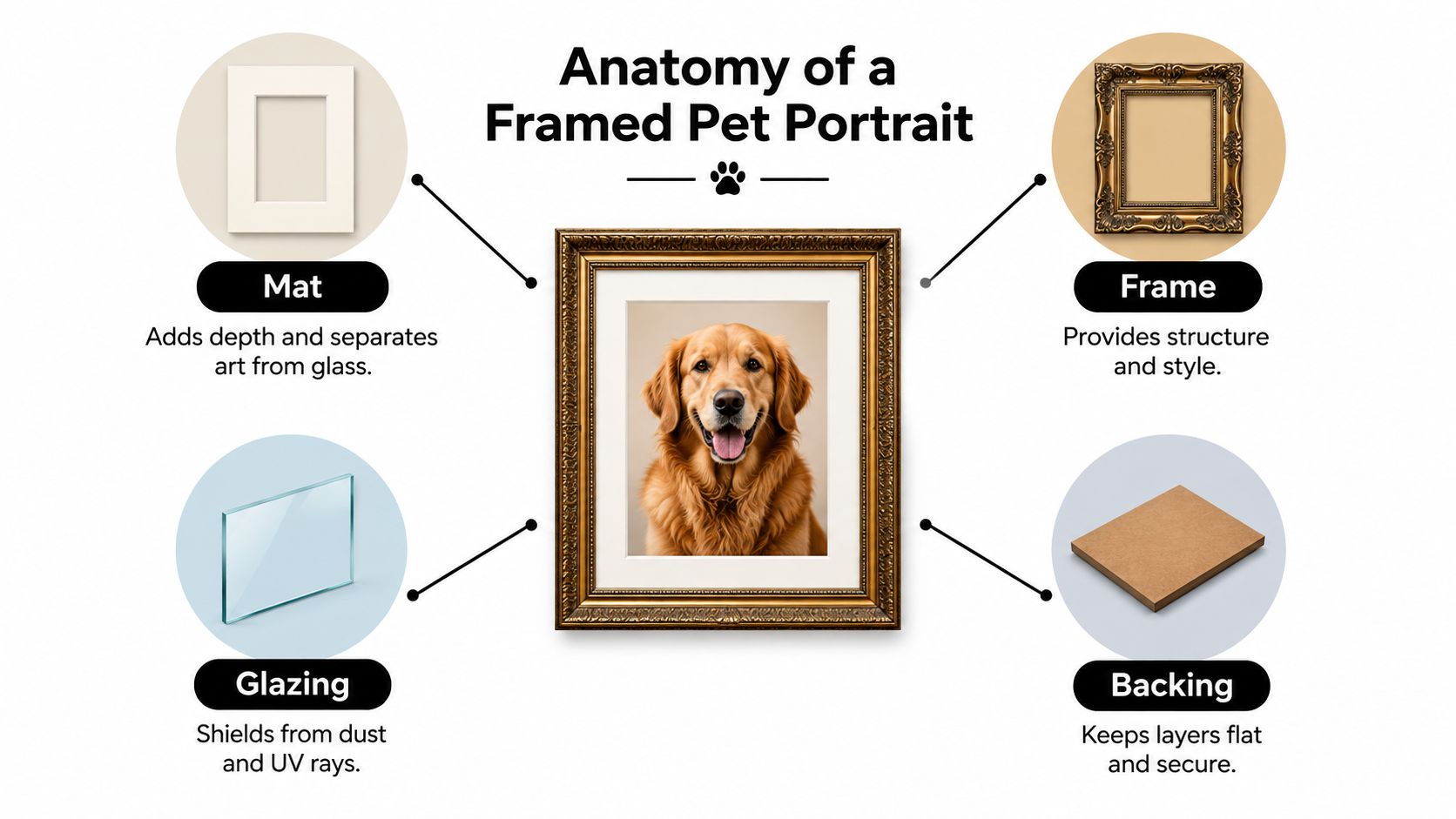
A simple way to read a framed portrait is to see it as a small system. Each layer has a job, the way a window has glass, trim, and a sill. If one part is chosen poorly, the whole piece can look off or wear badly over time.
The parts you are actually choosing
Buyers usually mean one of three things when they ask for a framed pet portrait. They may want a print that arrives already framed. They may already own the artwork and need it fitted properly. Or they may want that finished gallery look without knowing which parts create it.
Here are the main pieces:
-
Artwork
The portrait itself. This could be a photo print, watercolor, pastel, charcoal drawing, oil painting, or canvas print. -
Mat or spacer
This creates breathing room around the art or a gap between the art and the front covering. It is often helpful for work on paper. -
Frame
The outer structure that supports the package and shapes the overall style, from quiet and modern to warm and traditional. -
Glazing and backing
Glazing is the clear front layer, usually glass or acrylic. Backing supports the art from behind and helps keep dust, shifting, and warping under control.
“Framed” changes meaning with the medium
Many buyers get confused. The word framed sounds universal, but the right build depends on what the portrait is made of.
Paper portraits usually need separation from the front surface. Watercolor, pencil, pastel, and photo prints can all suffer if they sit directly against glass or acrylic. Moisture can collect, pigment can transfer, and the surface can mark more easily than people expect.
Canvas is different. A stretched canvas often looks best in a floater frame, with no glazing at all on the front. That setup suits painted surfaces that are meant to be seen directly, much like you would not cover a textured wall finish with plastic just to keep it safe. If you are starting with a digital photo and exploring a painted style before you frame it, this picture to oil painting convert guide can help you understand how the image might translate.
One short rule helps here. If the portrait is on paper, ask how it will be separated from the glazing. If it is on canvas, ask whether the surface needs glazing at all.
Ready to hang and properly framed are not the same thing
A ready-to-hang portrait may have hardware attached. That tells you how it goes on the wall, not how well it is protected.
A properly framed piece is assembled with the artwork medium and room conditions in mind. In a shaded bedroom, standard glazing may be fine for some pieces. In a bright family room, UV-filtering glass or acrylic often makes more sense. In a busy home with kids, pets, or frequent moving, acrylic can be the safer choice because it is lighter and less breakable than glass.
If you want a quick test, ask three questions:
- What is the portrait made of?
- Will the artwork touch the front layer?
- Is the back finished well enough to keep the piece stable and clean?
Clear answers usually point to framing that was chosen with care. Vague answers usually mean you are looking at décor framing, not a build chosen to help the portrait age well.
Mats Frames and Glazing Options Explained
Framing choices get much easier once you sort the portrait into one of three groups. Paper under glazing, canvas with breathing room, or a textured painted surface that should stay uncovered. That one decision shapes the mat, the frame depth, and whether glass, acrylic, or no front layer will help the portrait age well in your home.
Mats do more than make a portrait look finished
For paper portraits, a mat works like a small buffer zone. It keeps the artwork from resting against the front sheet, which matters because paper and condensation do not get along well. Even a simple print can develop sticking, smudging, or waviness if everything is pressed too tightly together.
Mat color also changes the feel of the portrait. Off-white and soft cream usually stay easy to live with because they support the image without competing for attention. Strong colors can work, but they date faster and can pull the eye away from the pet's face. In memorial pieces especially, quiet neutrals usually hold up better over time.
A mat is not always the answer. Many canvases and painted boards do better with a spacer, floater frame, or direct frame fit instead.
Frame materials set the tone and affect long-term practicality
Wood frames bring warmth. They often suit traditional rooms, older homes, and portraits with painterly detail. Metal frames feel cleaner and more architectural, so they fit better in modern spaces or rooms with simple lines.
Composite frames can be fine for lighter-duty jobs, but look closely at the corners and surface finish before you commit. A frame that looks good online can feel a bit flat or artificial in person.
Room context matters here. A rustic den with warm wood furniture often looks better with a natural oak, walnut, or painted wood frame than with a cool silver metal profile. A bright apartment with pale walls and simple furniture may benefit from a slimmer frame that does not add visual weight. Clear acrylic frames can also suit that lighter look. For room-by-room examples, these design insights from Lewis and Sheron are helpful.
Glazing should match both the medium and the room
This is usually where framing either protects the portrait properly or works against it.
Glass gives a sharp, crisp view and resists scratching better during routine cleaning. It also weighs more and breaks more easily if the piece is shipped, moved often, or hung in a busy hallway. Acrylic is lighter and safer for larger portraits, children's rooms, stairways, and homes where bumps happen. The tradeoff is surface scratching, so cleaning needs a gentler hand.
No glazing can be the right choice too. Many stretched canvases and textured painted surfaces look and age better without a front sheet, because the texture needs open air and visual depth rather than a hard barrier placed close to the paint. If you are comparing options for canvas, this guide on how to frame canvas paintings shows why canvas usually calls for a different build than a print on paper.
A simple home example helps. A graphite drawing in a sunny breakfast nook usually benefits from a mat and a protective front layer. A textured pet portrait on canvas in a low-traffic study may look better in a floater frame with no glazing at all. The artwork tells you the starting point. The room conditions help you refine it.
Choosing Mats Frames and Glazing by Artwork Type
| Component | Best For | Watch Out For |
|---|---|---|
| Mat | Paper prints, drawings, watercolor, memorial portraits that need a softer gallery look | Mats that are too dark or too narrow can crowd the image |
| Wood frame | Traditional rooms, warm interiors, classic watercolor or oil-style portraits | Heavy profiles can overpower a small portrait |
| Metal frame | Modern homes, minimal interiors, sharp photographic work | Can feel cold beside rustic or ornate décor |
| Composite frame | Casual spaces, simpler gift framing, some budget-conscious projects | Finish quality varies, so inspect corners and surface texture |
| Glass glazing | Smaller framed works in stable locations where weight isn't a problem | Breakage risk during shipping and moves |
| Acrylic glazing | Larger portraits, shipped gifts, homes with kids or high-traffic areas | Surface scratches more easily if cleaned roughly |
| No front glazing | Many stretched canvases and textured painted surfaces | Dust and touch become bigger concerns |
If the art has visible texture, treat that surface with care and do not assume it belongs pressed behind a flat front layer.
How Framing Protects and Preserves Your Portrait
A portrait can look perfectly fine on day one and still be set up badly for year five. That's why preservation framing matters. The danger usually isn't one dramatic event. It's slow exposure. Light hits the surface every day. Humidity changes with the seasons. Acidic materials sit in contact with paper longer than they should.
For paper and photographic work, the frame package can make a major difference in lifespan. One framing reference notes that archival-grade framing is designed for 100 years or more, while conservation-grade framing is typically aimed at about 20 years in normal display conditions. It also explains why archival mat board, reversible mounting, sealed backing, and an air gap help reduce chemical contact and moisture transfer (archival and conservation framing overview).
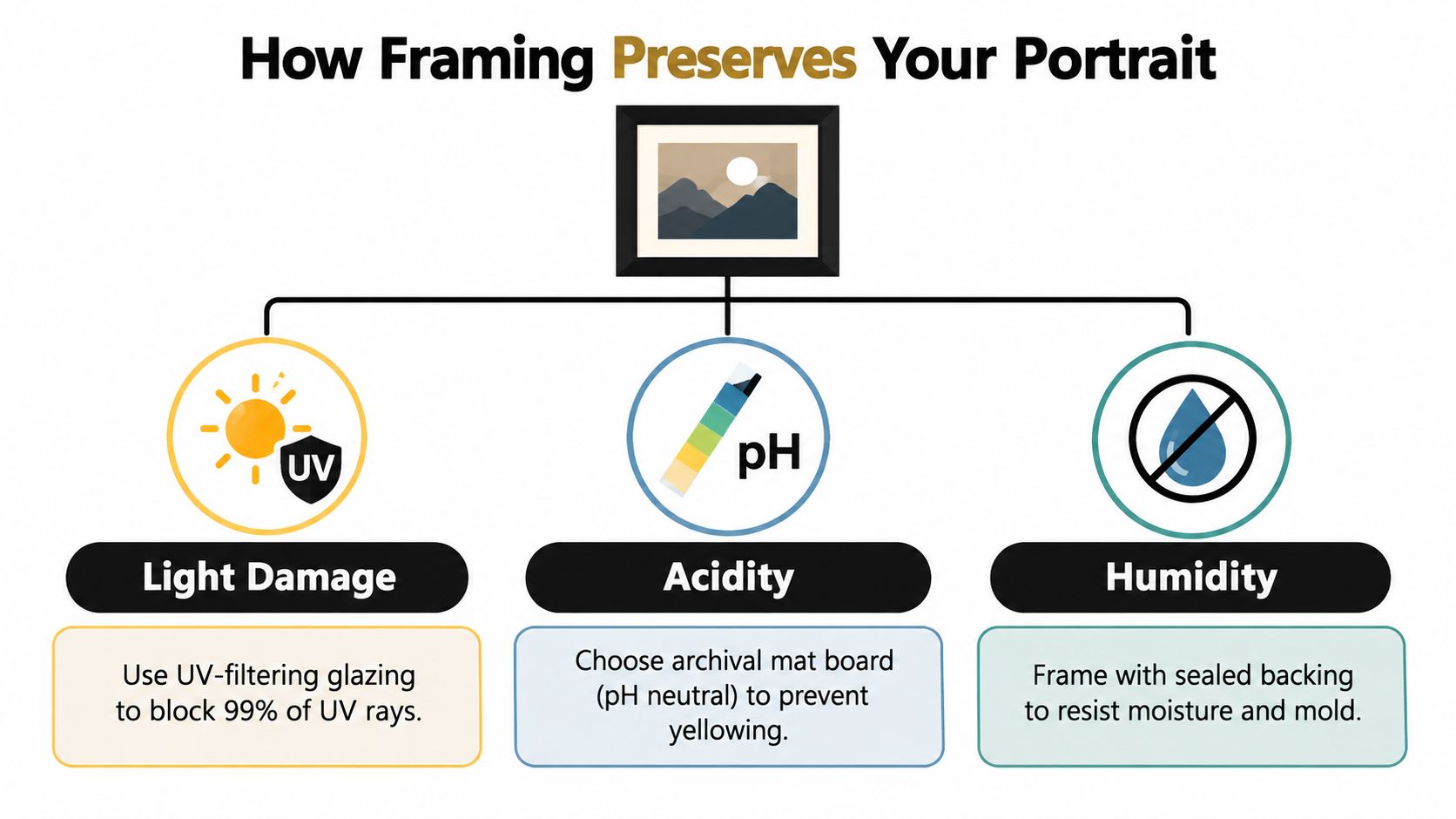
The three things that quietly age a portrait
Here's the plain-language version.
- Light fades inks and weakens paper over time.
- Acidity yellows paper and can make it brittle.
- Humidity invites warping, condensation, and trouble at the edges and back.
None of these are dramatic at first. That's why people underestimate them.
Why UV glazing matters but isn't magic
Professional conservation guidance recommends glazing that filters UV in the 300 to 400 nm range, and preservation sources commonly specify at least 97% UV blockage, with museum-grade products often cited at 99% or higher. That slows yellowing and fading caused by ultraviolet exposure, but visible light still affects art over time, so placement still matters (Canadian Conservation Institute glazing guidance).
That last part is where readers often get confused. They hear “UV protective” and assume the job is done. It isn't. UV glazing is more like sunscreen than a brick wall. It reduces one part of the problem very well. It doesn't make a sunny window harmless.
Practical rule: The better the keepsake value, the less casual you should be about materials touching the artwork.
Medium changes the preservation plan
Acrylics on canvas, oils, drawings, and prints don't all age the same way. For instance, William Tucker Original Alligator Painting - Coastal Art uses acrylics with mixed media on canvas, with vibrant green tones, bold brushstrokes, and a textured background. A piece like that raises different framing questions from a flat paper print. The texture and painted surface affect whether you want front glazing, spacing, or a more open presentation.
That's why “What frame looks nice?” is only half the question. The stronger question is, “What does this specific medium need in this specific room?”
Sizing Proportion and Hanging Guidelines That Work
You bring the framed portrait home, lean it on a chair, and it looks perfect. Then it goes on the wall and suddenly feels too small, too high, or oddly heavy. That happens because a wall reads differently from a tabletop. Empty space around the piece changes your sense of scale.
A simple fix helps before you order anything. Measure the full outer size of the frame, then tape that rectangle on the wall with painter's tape. Do it above the sofa, console, or bed where the portrait will live. Step back to the spot where you normally enter the room or sit down. You will see sizing problems far sooner than you would by judging the artwork flat on a table.
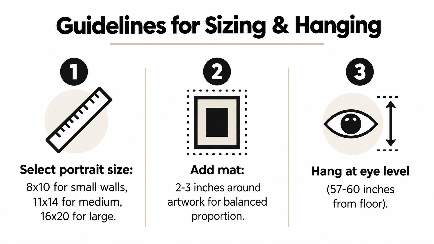
Start with the room and the medium
A pet portrait is not only filling wall space. It is also a physical object with a surface, a frame depth, and sometimes glazing that can reflect light. A pastel drawing under glass behaves differently from an acrylic painting on canvas with no glazing. In a bright hallway, glare may matter as much as size. In a humid bedroom corner, keeping the piece away from an exterior wall may matter more than adding another inch of mat.
Furniture gives you your first proportion clue. Over a wide sofa, a small frame can look like a postage stamp on a large envelope. On a narrow strip of wall between windows, a deep or oversized frame can crowd the trim and make the space feel tight.
Three home situations and what usually works
-
Entry hall portrait
Keep the outer size clear and readable from a few steps away. Moderate frame widths usually work better than fussy detailing because people see this piece in motion. -
Above the sofa
Build enough total size to relate to the furniture below. A mat often helps more gracefully than enlarging the pet image itself, especially for paper art that benefits from spacing and glazing. -
Bedroom or reading corner
Choose calmer proportions and softer finishes. This setting often suits memorial portraits, watercolor work, or smaller pieces hung a bit more intimately near where you sit.
Height matters too. Hanging at a natural standing viewing level usually looks more settled than placing the piece wherever the existing nail happens to be. If the portrait hangs above furniture, judge the height as part of that whole arrangement, not as an isolated object floating on the wall.
A quick measuring checklist
Before you order, do this:
- Measure the wall area you want the portrait to occupy.
- Measure nearby furniture so the framed piece relates to something, not just empty drywall.
- Tape the outer frame size on the wall with painter's tape, not just the art opening.
- Check it from normal viewing distance while standing and while seated, if the room is used that way.
- Look at the wall morning and evening to spot glare before you choose glass, acrylic, or an unglazed canvas presentation.
That last check prevents a common disappointment. A reflective glazing choice in the wrong spot can turn a sweet portrait into a mirror by late afternoon.
Cost Style and Decor Matching Without Regret
A framed pet portrait can disappoint for a simple reason. The budget goes into what is easy to notice first, like a bold frame finish or a larger size, while the long-term choices sit in the background. Those quieter choices often decide whether the piece still looks right five years from now and whether the artwork stays in good condition.
A good way to budget is to split the decision into two jobs. One job is protection. The other is room fit. If the portrait is a paper print, watercolor, pastel, or photo-based piece, glazing and proper backing usually deserve more of the budget than decorative extras. If it is a sealed canvas or a painted panel with texture, the money may be better spent on a stable frame and a presentation that does not press against the surface.
Where the money usually goes
Price usually rises for practical reasons before decorative ones:
- Artwork medium. Paper art often needs glazing, a spacer or mat, and better backing. Canvas may not.
- Glazing type. Standard glass, non-glare glass, and acrylic do different jobs in different rooms.
- Custom sizing. Odd-size art often costs more because standard ready-made parts do not fit cleanly.
- Frame material and finish. Solid wood, clean corner joins, and durable finishes usually age better than flashy coatings.
- Preservation details. UV filtering, acid-free mats, and a proper dust cover protect the portrait over time.
That last category is where regret often starts. A shiny ornate frame can look exciting on a product page. In a real living room, it may compete with the pet's face every single day. A simpler frame with better glazing usually feels calmer and lasts longer visually.
Spend by medium and room, not by trend
Framing works like choosing shoes for weather, not just for color. The right choice depends on what the artwork is made of and where it will live.
For a watercolor or paper portrait in a bright room, spend first on UV-protective glazing and a mat or spacer that keeps the art off the glass. For a canvas portrait in a hallway with lots of passing traffic, acrylic may be safer than glass if you want a glazed presentation, because it is lighter and less likely to shatter. For a textured acrylic painting, no glass can be the better choice if the surface was made to be seen directly and the room is fairly stable, dry, and out of strong sun.
This is also where style choices become easier. Quiet frames tend to age well because they support the medium instead of chasing a short-lived look. A thin black, warm walnut, muted gold, or painted off-white frame usually keeps working even if the room changes later. Highly themed finishes can feel tied to one moment, one sofa, or one trend cycle.
Match the frame to how the room behaves
Rooms have habits. Framing should answer those habits.
A kitchen banquette or sunny family room often has more glare, moisture, and movement than a study or bedroom. In those active spaces, acrylic glazing can make sense for safety and weight, even if glass might feel more traditional elsewhere. A formal sitting room with controlled light may suit glass well, especially for crisp paper art where clarity matters. A low-traffic bedroom can carry softer finishes and gentler colors without needing the toughest materials in the house.
Memorial portraits usually benefit from restraint. That does not mean plain. It means choosing a frame that gives the portrait a settled, lasting presence instead of a novelty-gift feeling.
A simple way to avoid regret
Before ordering, ask four plain questions:
- What is the portrait made of?
- What can damage it in this room: sun, glare, humidity, bumps, or none of these much?
- Do I want the frame to be noticed first, or the pet's expression?
- Will this style still feel comfortable if the room changes next year?
If the answers are clear, the budget usually becomes clear too.
If you're comparing custom fine-art approaches, William Tucker Art offers personalized pet artwork in a style that sits closer to art collecting than novelty gifting. That helps when the framed result needs to live in the room as art, not just as a pet-themed accent.
Caring for Your Framed Pet Portrait Over Time
A framed portrait usually needs the most attention in its first year on the wall. That is when seasonal light, indoor heat, and humidity changes start showing you how the piece and the room behave together.
Care starts with the medium. A paper print behind glazing has different needs from a textured acrylic painting or canvas. The frame may look similar from across the room, but the upkeep is not the same. Glazing can collect haze or condensation. An unglazed painted surface can catch dust in texture the way fabric catches lint.
Simple habits that keep the piece stable
Keep an eye on the room more than the portrait itself. If the wall gets strong afternoon sun, the risk is slow fading. If the wall sits near a heat vent, radiator, or steamy bath door, the risk is expansion and contraction that can lead to rippling, gaps, or a stressed backing.
Cleaning should stay gentle. Dust the frame with a soft dry cloth. If you need to clean glass or acrylic, spray the cloth first, then wipe. That small step helps keep cleaner from creeping under the frame edge, where moisture can reach the mat, backing, or the art itself.
Textured paint needs a different approach from a print under glazing. If your portrait includes acrylic paint, this guide on how to preserve acrylic paintings explains the extra care painted surfaces need over time.
What to watch for
A quick check every few months can prevent a larger repair later. Look for:
- Fading on the side that faces the window
- Yellowing near the mat opening or along exposed paper edges
- Rippling or waviness that suggests moisture movement
- Condensation, haze, or spotting inside the glazing
- Small gaps at the corners, backing paper, or hanging hardware after a move
If the portrait suddenly looks cloudy, check whether the haze is on the room side of the glazing or inside the frame package. Wiping harder only solves one of those problems.
Check the backing seal, hanging wire, and inside of the glazing every 6 months, especially after summer humidity or winter heating season. If you spot moisture, loosening corners, or anything touching the artwork inside the frame, have a framer inspect it before the mark becomes permanent.
If you want a portrait that feels finished on the wall, William Tucker Art offers wildlife and pet artwork that works well with the kind of framing choices covered here, especially when you're thinking about medium, preservation, and room style together. Browse William Tucker Art if you'd like to explore custom pet portraits and original animal art with a fine-art presentation in mind.