
Painting with acrylics is a fantastic way to bring pet and wildlife portraits to life. It's a forgiving medium that dries quickly, allowing you to build up rich layers of color and texture. Whether you prefer the thick, buttery feel of heavy body acrylics or the delicate flow of fluid acrylics, getting your toolkit right from the start is the key to a successful painting.
Gathering Your Tools for Acrylic Portrait Painting
Before a single drop of paint hits the canvas, you need to set yourself up for success. This isn't just about a shopping list; it's about understanding why certain tools make the process of painting portraits so much more intuitive and, frankly, more fun. Let’s build a kit that works with you, so you can focus on capturing that spark of personality in your subject.
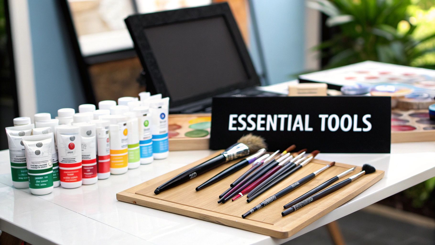
Here's a breakdown of the materials we recommend, what they're for, and why they help create stunning portraits.
Your Go-To Supplies for Acrylic Portraits
| Material | Our Recommendation | Why It Works for Portraits |
|---|---|---|
| Paints | A mix of Heavy Body and Fluid Acrylics | Heavy body paints are thick and hold brushstrokes, perfect for textured fur. Fluid acrylics are ink-like and ideal for fine details like whiskers and eye reflections. |
| Surface | Stretched Canvas or Gesso Board | Canvas has a "tooth" that grips paint, creating a painterly feel. Gesso boards are ultra-smooth, which is incredible for photorealistic detail and seamless blending. |
| Brushes | A few sizes of Flats, Rounds, and Filberts | You don't need a huge collection. These three shapes cover everything from broad backgrounds and sharp edges to soft blends and the tiniest details. |
| Palette | A Stay-Wet Palette or a simple ceramic plate | A stay-wet palette is a game-changer for acrylics, keeping your custom color mixes workable for hours or even days. A simple plate works fine for short sessions. |
| Essentials | Water container, paper towels, and an easel | The basics! A sturdy easel prevents neck strain, a good water pot keeps brushes clean, and paper towels are non-negotiable for controlling paint consistency and quick cleanups. |
With these core items, you’ll be well-equipped to tackle any portrait project that comes your way.
Paints: Heavy Body vs. Fluid Acrylics
Your first big choice is the consistency of your paint. Most artists start with heavy body acrylics. They have a thick, satisfying texture much like oil paint, which is brilliant for building up layers and showing off your brushwork in an animal's fur.
Then you have fluid acrylics. These are much thinner, almost like ink, and they are your best friend for getting those super-fine details just right. Think about the delicate whiskers on a cat, the soft, wispy edges of fur, or that little reflective glint that makes an eye look alive. Having both types gives you incredible versatility.
It's no surprise that acrylics are so popular. The global acrylic paint market was valued at about US$122.4 million in 2024 and is expected to climb to around US$165 million by 2031. If you're curious, you can dig into the acrylic paint market trends on persistencemarketresearch.com.
Surfaces: Stretched Canvas vs. Gesso Board
The surface you paint on dramatically changes how your brush feels and how the paint behaves.
- Stretched Canvas: This is the classic choice. The woven texture, known as "tooth," gives the paint something to grab onto, which is great for painterly effects. It also has a slight bounce to it that many artists love.
- Gesso Board: A gesso board is a rigid panel with a very smooth, absorbent surface. This is my go-to for hyper-realistic portraits because the lack of texture allows for incredibly fine detail and silky-smooth blends.
My Advice for Beginners: Start with a pre-primed stretched canvas. It's affordable, easy to find, and really forgiving. It gives you the freedom to just play with texture and layering without worrying about a perfect, flawless finish right out of the gate.
Brushes: The Essential Shapes
You really don't need a hundred brushes to start painting portraits with acrylics. A few reliable shapes will do the heavy lifting for almost any situation you'll face.
- Flats: These are your workhorses. The square tip is perfect for blocking in big color areas and creating clean, sharp edges.
- Rounds: With their pointed tips, round brushes are essential for drawing fine lines, adding small details, and making controlled, deliberate strokes.
- Filberts: Think of these as a hybrid of a flat and a round. The oval shape is incredibly versatile, making it a master of blending soft edges and creating beautiful, organic shapes.
I'd recommend starting with a small, medium, and large size in each of these three shapes. That simple nine-brush set will give you a powerful and versatile toolkit for any portrait you want to tackle.
Let's Talk References and Sketching
I can't stress this enough: a killer portrait starts way before you even unscrew a paint cap. It all comes down to a fantastic reference photo and a sketch you can trust. Get these two things right, and you've built a solid foundation for the fun part—bringing your animal's personality to life with paint.
Think of your reference photo as your guide for the entire journey. You absolutely need a high-resolution image. You want to be able to zoom right in and see the tiny details, like which way the fur grows around the nose or the little flecks of color in the iris. If you can't see it, you'll end up guessing, and that's a recipe for frustration.
How to Pick a Great Reference Photo
Lighting is your best friend here. Look for photos with a clear, single light source. This is what creates those beautiful highlights and shadows that give your subject form and make it feel like it could jump right off the canvas. I always steer clear of photos taken with a direct flash—it just flattens everything out and blows away all the subtle details you need.
Here’s my mental checklist when I'm scrolling through photos:
- Is it sharp? The eyes, especially, need to be crystal clear. A blurry photo will almost always lead to a muddy-looking painting.
- Does it have personality? Look for that quirky head tilt, a sleepy yawn, or an intense stare. That's the story you want to tell.
- Is there good contrast? Clear, defined light and dark areas make your job so much easier when you start mapping out your values.
My Two Cents: Don't feel like you have to be a slave to one photo! I often Frankenstein my references. I might take the pose from one, the perfect "smile" from another, and the dramatic lighting from a third. This is your painting, your world—you make the rules.
Getting Your Sketch onto the Canvas
Okay, you've got the perfect photo. Now you need to get that drawing onto your canvas or panel. This isn't about creating a perfect work of art in pencil; it's about making a reliable map for your paint. Lock in those proportions and you can paint with confidence.
There are a couple of tried-and-true ways to do this. The grid method is a classic for a reason. You just draw a grid over your photo (you can do this digitally) and a larger, proportional grid on your canvas. Then you tackle it one square at a time. It’s a fantastic way to nail the proportions.
My personal go-to, though, is graphite transfer paper. I just print my reference photo to the exact size of my canvas, slip the transfer paper underneath (the messy side down!), and trace over the key lines with a ballpoint pen. It’s fast, it’s accurate, and it gives you a clean, perfect foundation for painting with acrylics portraits.
Mixing Believable Colors for Fur and Eyes
A good sketch is the foundation, but color is what brings a portrait to life. This is the part of the process where your painting really starts to breathe. I see so many artists hunting for the perfect pre-mixed brown or gray in a tube, but here’s a little secret: it doesn't exist. The most believable, true-to-life colors are the ones you mix yourself, and it's a lot more intuitive than you might think.
When you're painting animal portraits, you're dealing with a whole world of subtle, complex tones. A "black" dog is never just flat black, and "white" fur is almost never pure, stark white. Look closer, and you'll find they're actually rich tapestries of blues, purples, deep browns, and warm ochres that shift depending on the light. Your job isn't just to paint what you think you see, but to train your eye to spot these subtle colors and recreate them on your palette.
Seeing Beyond the Obvious Color
Before you even think about squeezing out paint, spend some quality time with your reference photo. Seriously, just look at it. Pinpoint the warmest areas in the fur. Do you see glints of yellow ochre or maybe a burnt sienna where the sun is catching the tips?
Now, find the coolest shadows. Instead of just seeing "dark fur," look for the underlying tones. You’ll often find muted blues or even purples hiding in there. Training your eye to see like this is the single most important skill for a realist painter. Once you start noticing these hidden hues, you've unlocked the secret to mixing colors with genuine depth.
Simple Color Recipes for Complex Fur
You absolutely do not need 50 different tubes of paint. In fact, working with a limited palette is one of the best things you can do. It forces you to become a stronger color mixer and, funny enough, usually results in a more harmonious painting. The real magic happens when you learn to mix complementary colors to create those beautiful, rich neutrals that make up most of an animal's coat.
Here are a few of my go-to "recipes" that I use constantly:
- The Ultimate Gray-Brown: Mix Burnt Sienna and Ultramarine Blue. This is my workhorse combination. Add a little more Sienna to warm it up for sunny spots, or a bit more Blue to cool it down for shadows. A touch of Titanium White will give you an enormous range of grays, beiges, and tans.
- A Rich, Deep Black: Please, step away from the tube of black paint! It almost always looks flat and dead on the canvas. Instead, mix Ultramarine Blue with Burnt Umber. This creates a gorgeous, dimensional black that you can lean warm or cool just by tweaking the ratio.
- Convincing White Fur: Pure white should be saved for the absolute brightest, final-touch highlights. For the main body of white fur, I mix Titanium White with a tiny speck of Yellow Ochre to add warmth, or a touch of my Ultramarine Blue + Burnt Sienna gray for the cooler tones in the shadows.
Pro Tip: Keep your paint mixes clean! I can't stress this enough. Use a palette knife, not your brush, to do the heavy mixing. And always, always wipe it completely clean before dipping into a new color. This is the key to avoiding that dreaded "mud."
Capturing the Sparkle in the Eyes
If you want a portrait to feel truly alive, you have to nail the eyes. They aren’t just flat circles; they're glossy, reflective spheres. Capturing that look is all about thinking in layers of color and light.
I always start by blocking in the darkest value first, which is usually the pupil and the dark ring around the iris. For this, I'll use my mixed black. Next, I’ll layer the main color of the iris on top. For a classic brown eye, a mix of Burnt Sienna and a little Cadmium Yellow is a great starting point.
The final, magic touch is the catchlight. This tiny dot or sliver of light is the reflection of the main light source, and it’s what sells the illusion of a wet, glossy surface. Using pure Titanium White and a small, round brush, carefully place it exactly where you see it in your reference photo. It's a tiny detail, but it makes all the difference.
For a much deeper dive into the theory behind these mixes, exploring a guide on how to mix paint colors can be a game-changer.
Layering and Brushwork for Realistic Textures
If there’s one thing acrylics are absolutely brilliant for, it's layering. Because they dry so quickly, you can build up color, texture, and depth with a speed that other paints just can't match. Forget trying to get it perfect on the first go—the real magic happens when you build the form layer by thoughtful layer.
I always start by blocking in the major shapes. Grab a larger flat or filbert brush and mix a thin, watery wash of a dark neutral (my go-to is Ultramarine Blue and Burnt Umber). Use this to quickly map out the darkest shadows of your subject. This isn't about detail; it's about creating a value roadmap that will guide the entire painting.
Building Form from Dark to Light
Once that initial "map" is dry—and we're talking just a few minutes—it's time to build up the mid-tones. This is the stage where those flat shapes start to feel three-dimensional. Mix up a few of your subject's main colors, but keep them slightly darker than how they look in the brightest spots. Apply this paint more opaquely than the first wash, covering the shadow areas but leaving the lightest parts of the canvas completely bare for now.
Working from dark to light like this gives your shadows a natural depth and guarantees your highlights will really pop when you add them at the end.
This whole process hinges on how fast acrylics dry. They're typically ready for another layer in 15 to 30 minutes because the water just evaporates. It's this speed and flexibility that has made them so popular; the artist-grade acrylics market was valued at an estimated US$925.24 million back in 2021. You can find more details in this report on the global acrylic paints market.
Mastering Brushwork for Texture
The colors you mix are only half the battle. How you apply the paint is what truly sells the illusion of soft fur, a wet nose, or a sleek coat. Think of your brush as a texture tool.
- Coarse or Wiry Fur: For this, I reach for a stiff bristle brush. Use short, energetic dabs of slightly thicker paint. Make sure you're following the direction of the fur growth and overlap your strokes to build up that sense of density.
- Soft, Short Fur: A soft, flat brush is your best friend here. You'll want to use smooth, even strokes that gently blend into one another. The goal is to minimize obvious brush marks for a velvety finish.
- Sleek, Shiny Coats: Painting a Doberman or a seal? Use a soft filbert brush to lay down long, continuous strokes that follow the contours of the body. This is how you get that seamless, glossy look.
Here's a quick look at how just three basic colors can mix into a super versatile brown, which is perfect for blocking in an animal's coat.
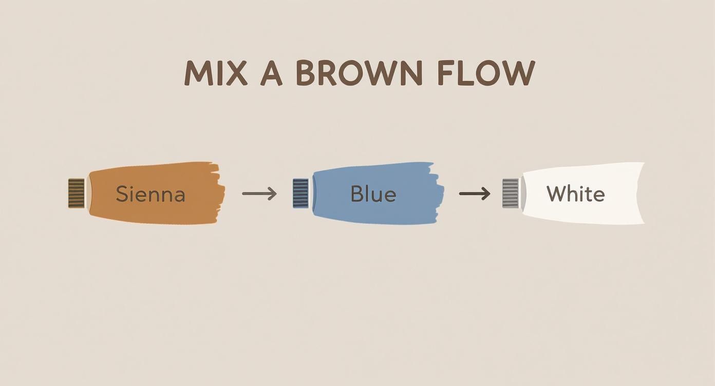
Starting with essential earth tones and a blue, then tweaking it with white, gives you a fantastic base for all kinds of natural shades.
The Role of Paint Consistency
Finally, don't forget you can control the thickness of your paint. This gives you yet another layer of creative power.
- Thick Paint (Impasto): Want some real, physical texture that catches the light? Use paint straight from the tube. This technique is amazing for rugged fur or for making foreground elements feel closer.
- Thin Glazes: By adding a bit of water or a glazing medium, you can create beautiful, transparent layers of color. I use glazes all the time to subtly shift a color's temperature or deepen a shadow without covering up the detail I've already painted underneath.
Designing Backgrounds That Make Your Subject Shine
Think of your background as the supporting actor—it’s there to make your star (the portrait) look even better. It’s so much more than just the leftover space on the canvas. A great background sets the mood and tells the viewer’s eye exactly where to look, turning a good painting into a fantastic one. Don't leave it as an afterthought; plan it right from the start.
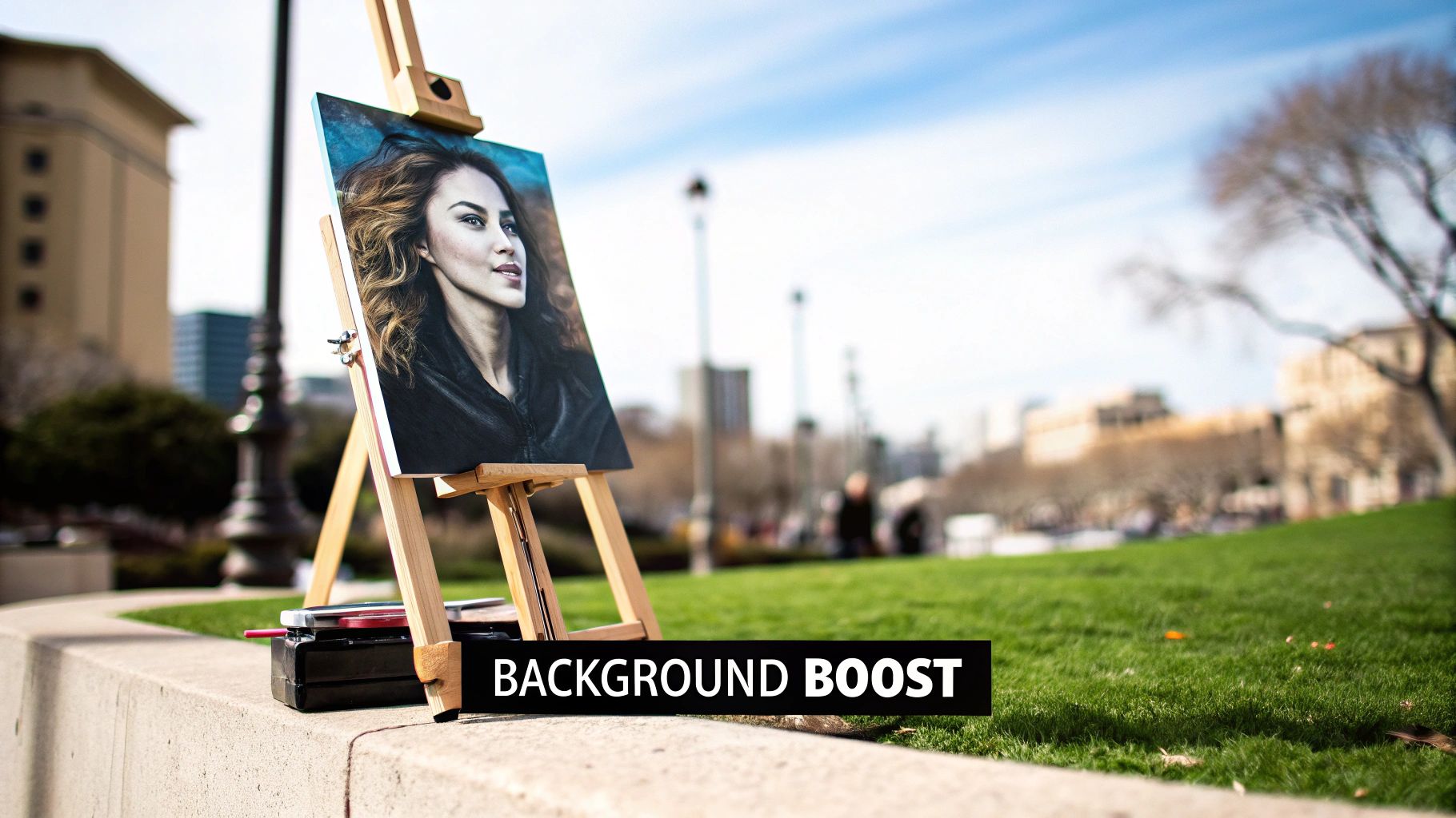
The real magic happens when you understand how value and color play together. For instance, a dark, moody background can make a light-colored animal almost pop off the canvas. On the flip side, a splash of vibrant color can inject a ton of energy and life into a portrait of an animal with more muted fur.
Soft and Simple Backgrounds
If you want the focus squarely on your subject, a soft, out-of-focus background is a timeless choice. This technique beautifully mimics the bokeh effect you see in professional photography, where the background melts away into soft, blurry shapes of light and color.
It's actually quite simple to pull this off with acrylics. Here's my go-to process:
- Pick a limited palette. I usually choose two or three colors that are already in my subject's fur or eyes, but I'll mix more muted versions of them. This creates a really natural, harmonious feel.
- Work wet-on-wet. You have to move fairly quickly with acrylics. I lay down my background colors right next to each other on the canvas.
- Blend gently. With a large, soft brush—a filbert is perfect for this—I gently soften the edges where the colors meet. You're not trying to mix them completely, just create a seamless gradient without any harsh lines.
This approach gives you a background that adds a sense of atmosphere without ever stealing the show.
A Quick Tip on Value: Here's a trick I swear by: your background should almost always have less value contrast than your subject. If your animal has really bright highlights and deep shadows, keep the background's values closer together, somewhere in the mid-range. This simple rule automatically pushes the background back and pulls your subject forward.
Abstract and Expressive Backgrounds
Sometimes, though, you want a background with a personality of its own. An abstract background can bring a modern, dynamic feel to a piece, especially when you've painted your subject with a lot of detail and realism. That contrast between a tight subject and a loose background creates a really exciting visual tension.
Don't be afraid to get creative with your tools to build up some interesting textures.
- Sponges: I love using a natural sea sponge dabbed in slightly thickened paint. It creates a beautiful, organic, mottled texture that's hard to get any other way.
- Palette Knives: For a bold, sculptural look, nothing beats a palette knife. Scrape on thick layers of paint and don't be afraid to let a little bit of the underpainting peek through for extra depth.
- Splattering: Need some energy? Load a stiff brush with watered-down paint and flick it at the canvas. It's messy but fun! Just make absolutely sure you've masked off your subject first—I learned that one the hard way.
Finishing and Sharing Your Artwork Professionally
https://www.youtube.com/embed/cnzGwFLdcI4
Laying down that final brushstroke feels incredible, doesn't it? But your journey isn't quite over, especially if you plan to sell or gift your work. These last few steps are all about protecting your painting and showing it off in the best possible light. This is how you make sure all that hard work truly lasts.
One of the most important things you can do is apply a final varnish. Varnish does two critical jobs: it shields your painting from dust and damaging UV light, and it unifies the sheen, making all the colors pop. Acrylics can sometimes dry with a slightly uneven finish, and a good varnish makes everything look consistent and polished.
Choosing the Right Varnish
You've got a few options for the finish, and each one sets a completely different mood. Your choice here can really change the final look of your painting with acrylics portraits.
- Gloss Varnish: This gives you a shiny, wet look that makes colors feel incredibly deep and saturated. It’s fantastic for bringing dark, rich colors to life.
- Matte Varnish: If you want a non-reflective, flat finish, this is your go-to. It's perfect for cutting down on glare, especially if the artwork will hang in a brightly lit room.
- Satin Varnish: This is my personal favorite. Satin offers a beautiful middle ground—it gives your colors a subtle boost without the intense shine of gloss, leaving you with a sophisticated, low-sheen finish.
No matter which varnish you pick, always apply it in a well-ventilated, dust-free space. I've found that two thin coats work best. Let the first dry completely before adding the second coat in a perpendicular direction to get the most even coverage.
Photographing Your Artwork for Sharing
You don't need a high-end studio to get great photos of your art. Believe it or not, your smartphone and a bit of natural light are often all you need to capture clear, color-accurate images for your portfolio or for a client.
The real secret is using indirect natural light. Try placing your painting near a window on an overcast day or in a spot that gets bright light without direct sun hitting the canvas. This soft, diffused light is your best friend—it minimizes glare and gets rid of harsh shadows. Just prop your painting up vertically against a neutral-colored wall and make sure your phone is perfectly parallel to it to avoid any weird distortions.
After putting so much time into your acrylic portrait, think about showing it off through specialized services like creating high-quality acrylic prints to share or sell. For a deeper dive into long-term care, you can learn more about how to preserve acrylic paintings and keep them looking amazing for years.
Dealing with Common Acrylic Portrait Frustrations
When you're new to painting portraits with acrylics, you’ll probably bump into a few common roadblocks. Don't worry, we've all been there! The trick is learning how to work with the paint, not against it. Once you get the hang of its quirks, you'll start to feel much more confident.
"My Acrylics Dry Out Before I'm Done!"
Ah, the classic acrylics dilemma. Their lightning-fast drying time can feel like a race against the clock. Your best friend here is a stay-wet palette; it's a total lifesaver that keeps your carefully mixed colors workable for hours, sometimes even days.
You can also mix a few drops of an acrylic retarder medium right into your paint on the palette to slow things down. Another simple trick I use constantly is to keep a small spray bottle filled with water on my table. A light, gentle mist over your canvas every so often keeps that top layer of paint just damp enough to work with.
"How Can I Get My Blends to Look Smooth?"
This is all about timing. For those soft, seamless transitions, you have to work while the paint is still wet. Lay down your two colors right next to each other, then grab a clean, slightly damp brush and use a super light touch to gently pull one color into the other right at the seam.
If you're still struggling, try an acrylic blending medium. It's designed to extend the paint's "open time," which gives you a much bigger window to fuss with those tricky gradients and get them looking just right. This can make all the difference in bringing a portrait to life.
"Can I Really Paint a Good Portrait with Just a Few Colors?"
You absolutely can. In fact, I highly recommend it! Starting with a limited palette is one of the best ways to master color mixing and keep your painting from looking chaotic. A simple but powerful setup for almost any portrait includes:
- Titanium White
- Mars Black (or you can mix your own rich black)
- Cadmium Red
- Ultramarine Blue
- Cadmium Yellow
It's genuinely incredible how many realistic skin tones and fur textures you can create with just these five core colors. It forces you to become a better, more thoughtful painter.
At William Tucker Art, we're all about capturing the unique spirit of an animal in paint. To see what's possible with a brush and some acrylics, take a look at our wildlife and pet portrait collections.