
A fantastic portrait background does so much more than just fill the empty space behind your subject. Think of it as the stage where your subject gets to shine. The real magic happens when you use color, value, and composition to set a mood, tell a story, and pull the viewer’s eye right where you want it—the face. This is how a good painting becomes a truly unforgettable piece of art.
The Secret Role of Your Portrait Background
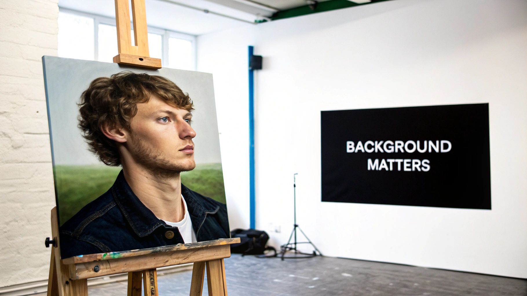
So many artists, especially when they're just starting out, pour all their energy into getting the subject’s features just right. That’s absolutely essential, of course, but the background often ends up being an afterthought—just a flat, boring coat of paint.
Instead, try thinking of your background as a supporting actor. It can't steal the show, but its performance is what makes the whole story work. It’s what provides the context, emotion, and visual balance that holds everything together.
A well-thought-out painting portrait background can do some heavy lifting for your artwork:
- Set the Atmosphere: Is the mood supposed to be somber, joyful, or maybe a little chaotic? The colors and textures in your background will signal that feeling instantly.
- Create a Sense of Depth: By playing with layers, value contrast, and how you handle your edges, the background can make your subject pop forward, giving the piece a real three-dimensional feel.
- Make Your Subject Glow: The right background colors can make skin tones look more vibrant and help define the features you worked so hard on.
Thinking Beyond Just Filling Space
Don't just see the background as negative space you have to cover. See it as an active player in your composition. Every shape, line, and color you place back there has a direct impact on how we see the person in the portrait. For instance, a soft, blurry background can create a feeling of intimacy and quiet, making the subject's emotional expression the undeniable focus.
On the other hand, a background with more detail or texture can tell us a story about who this person is and where they come from. The power is in making a deliberate choice.
These creative decisions are part of a much bigger picture. The global painting industry was valued at around USD 198.34 billion in 2023, and that number is expected to grow as demand for stunning visual art continues to rise in design and architecture. It shows just how much people value compelling imagery.
The purpose of a background is not to be noticed, but to be felt. It works silently to amplify the emotional core of the portrait.
Before we dive deeper, here's a quick summary of how these core elements work together to support your subject.
Key Background Elements at a Glance
| Element | Primary Role | Impact on Portrait |
|---|---|---|
| Color | Sets the emotional tone and mood | A warm palette can feel inviting; cool tones can feel distant or calm. |
| Value | Creates contrast and depth | High contrast makes the subject pop; low contrast creates a softer, unified look. |
| Texture | Adds visual interest and realism | Smooth textures feel modern and clean; rough textures can feel rustic or energetic. |
| Edges | Controls the viewer's focus | Soft, lost edges recede; hard, sharp edges pull the eye forward. |
Understanding these principles is the key to making your background an intentional and powerful part of your artwork.
While this guide focuses on painting, the idea that a background is fundamental to highlighting a subject is a universal truth in art. For a different perspective, you might find it interesting to explore the principles of background design in other visual arts. This shift in thinking—from seeing the background as filler to seeing it as the foundation—is the first real step toward creating portraits that truly connect with people.
Choosing a Powerful Background Color Palette
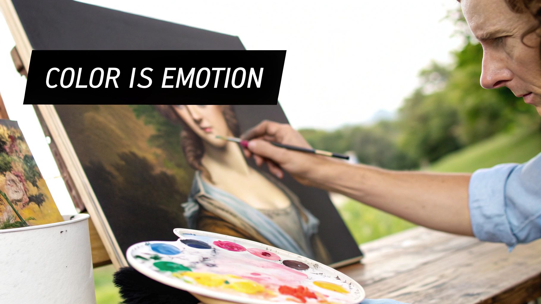
Color is pure emotion on a canvas. The palette you choose for your painting portrait background is often the first thing a viewer feels, long before they consciously take in the subject’s expression. This is your chance to set the story's tone right from the start.
Let’s move past the basic color wheel and dig into the practical strategies that make color really work for you. Picking a palette isn't about just grabbing your favorite tubes of paint; it’s about making intentional choices that serve the soul of the portrait.
Setting the Mood With Color Temperature
The easiest way to start thinking about your background is through color temperature. This isn't just some technical jargon—it's the emotional heartbeat of your painting.
Warm colors like reds, oranges, and yellows feel energetic, passionate, and intimate. They have a tendency to advance in space, making the background feel closer and more connected to your subject. Think about a portrait with a warm, earthy sienna backdrop; it instantly creates a sense of comfort and presence.
On the other hand, cool colors like blues, greens, and purples can evoke calm, serenity, or even a sense of distance and melancholy. These colors naturally recede, which can create a wonderful illusion of depth, making your subject feel like they’re stepping right out of the painting.
An artist's palette should be a tool for storytelling, not just a collection of pigments. Each color choice should be a deliberate word in the visual narrative you're crafting.
Think about the person you're painting. Are they vibrant and outgoing? A warm palette might be a perfect fit. Are they more reserved or contemplative? Cool tones could capture that essence beautifully. For a deeper dive, exploring a good guide on color theory for artists will give you a rock-solid foundation for all your work.
Creating Harmony and Contrast
Once you've got a mood in mind, you can get more specific. The relationship between your background and your subject is everything. Two of the most powerful approaches here are using analogous and complementary colors.
An analogous color scheme uses colors that sit side-by-side on the color wheel, like blue, blue-green, and green.
- When to Use It: This creates a very harmonious, cohesive, and gentle feeling. It’s perfect when you want the subject and background to feel completely unified and serene.
- A Real-World Example: Imagine your subject is wearing a deep blue sweater. Painting a background with shades of teal and muted green will feel incredibly peaceful. The lack of harsh color competition keeps the focus soft and inviting.
A complementary color scheme uses colors from opposite sides of the color wheel, like red and green or a classic blue and orange.
- When to Use It: This is your go-to for high drama and contrast. It makes your subject pop right off the canvas. The visual vibration between complementary colors is electric and demands attention.
- A Real-World Example: Placing a subject with auburn hair (an orange tone) against a deep teal or blue background will make their hair look electrifyingly vibrant. It’s a classic trick artists have used for centuries to pull the viewer's eye exactly where they want it.
Borrowing Colors for a Cohesive Look
Here’s a technique I swear by for creating a professional, unified portrait: subtly "borrow" colors from your subject and weave them into the background.
This isn’t about just matching colors perfectly. It’s about creating echoes. Take a tiny fleck of blue from your subject’s eyes, mix a muted, grayer version of it, and gently work it into a section of your background. Or, pull a warm undertone from their skin and glaze a transparent layer of it over parts of the backdrop.
This simple trick does two brilliant things at once:
- It Creates Unity: The whole painting feels tied together, preventing the background from looking like a separate, stuck-on element.
- It Adds Sophistication: It introduces a subtle complexity to your palette that just feels right to the viewer's eye.
For instance, if your subject has a hint of rosy pink in their cheeks, a few abstract marks of a similar, desaturated pink in the background creates an incredible sense of harmony. It’s a tiny detail, but it can transform the entire feel of the portrait, making the painting portrait background an active and essential part of the story.
Bringing the Background to Life: Essential Painting Techniques

Okay, you've got your colors picked out. Now for the really fun part—actually getting that paint on the canvas. The way you apply the paint to your painting portrait background is just as crucial as the colors you choose. Your technique is what breathes life, energy, and atmosphere into the piece.
Let’s walk through a few of my go-to methods. These will give you a massive range of effects, from dreamy and soft to textured and energetic. Don't ever be afraid to just play around. The "right" technique is simply the one that best tells your subject's story.
For That Dreamy Look: Soft Blends with Wet-on-Wet
The wet-on-wet technique is a classic for a very good reason. It’s all about applying fresh paint onto a still-wet layer, which lets the colors mingle and blend beautifully right on the canvas. This is my absolute favorite for creating soft, atmospheric gradients that feel almost out of focus.
The trick is to work fairly quickly, especially if you're using acrylics which dry fast. I'll often start by laying down a thin, even coat of a slow-drying medium or just a base color across the whole background. Then, I introduce my other colors into that wet paint, using a soft brush to gently feather them together.
What you get is a seamless transition that doesn't steal the show from your main subject. It's perfect when you want to create a feeling of calm or a dreamy, far-off mood.
Want More Character? Build Up Some Texture
Sometimes, a perfectly smooth background can feel a little... boring. When I want to give a portrait a bit more grit or a sense of history, I turn to techniques that create physical texture.
Two of the easiest and most effective methods are scumbling and dry brushing:
- Scumbling: Grab a stiff, dry brush, get a tiny bit of paint on it, and then lightly scrub it over a dry layer of paint. This creates a broken, chalky texture that’s wonderfully subtle.
- Dry Brushing: This is a close cousin to scumbling. You’ll use a dry brush with a small amount of thick paint, then lightly drag it across the canvas. The paint will only catch on the raised parts of the canvas weave or previous paint layers. It’s a fantastic shortcut for suggesting rough surfaces like an old wall without painting every single crack.
A background with just a hint of texture feels lived-in and real. It gives the portrait a sense of place, suggesting a world that exists beyond the edges of the canvas.
These textural approaches are a game-changer for moving beyond a flat, lifeless backdrop. To see how these methods fit into the bigger picture, check out our complete guide on how to paint a portrait, which covers the entire process.
Creating a Modern Vibe with a Bokeh Effect
If you’re after a more contemporary feel, try mimicking the bokeh effect you see in photography. It’s that beautiful, out-of-focus quality where lights in the background turn into soft, glowing orbs. It's a brilliant way to create depth and a touch of magic.
To paint a bokeh effect, start with a dark or softly blended background. Once it’s dry, mix up a light, semi-transparent color (a white with a touch of yellow works well). Now, using the round end of a brush handle or a small circular sponge, you can gently stamp or paint soft-edged circles of different sizes. Overlap them and vary their transparency to create a really convincing illusion of depth.
People are craving unique, modern artwork. In fact, the global wall art market, which includes portraits with these creative backgrounds, reached USD 68.9 billion in 2025 and is expected to climb to USD 130.2 billion by 2035. This trend shows a real hunger for art that feels fresh and personal—exactly what modern techniques can deliver. You can read more about the growing wall art market and consumer trends.
Go Bold with a Palette Knife and Impasto
When you really want to inject raw energy into your painting portrait background, nothing beats a palette knife. Using the impasto technique, you apply thick daubs of paint directly to the canvas, creating bold marks that literally stand off the surface.
This method is more about expression than precision. You can scrape, spread, and dab the paint to build up a dynamic, sculptural surface. The thick ridges catch the light in fascinating ways, adding a physical dimension to your work that you just can't get with a brush. A heavy impasto background creates a stunning contrast with a smoothly painted portrait, making your subject pop even more.
Using Composition to Support Your Subject
A great portrait background does more than just fill the space—it's an active player in your painting's design. The way you arrange the shapes, colors, and space behind your subject is one of your most powerful tools. It’s how you guide the viewer's eye, build a mood, and make sure your subject remains the star of the show.
Think of it like a supporting actor. A good one makes the lead look even better, but a bad one can steal the scene for all the wrong reasons. Your background's job is to create interest without becoming a distraction.
Guiding the Eye with Shapes and Patterns
One of the sneakiest tricks in a painter's toolbox is using abstract shapes to tell the viewer's eyes where to go. You can create a visual road map that leads straight to your focal point, and it doesn't have to be complicated. In fact, simple is almost always better.
Imagine you're painting a portrait and you add a soft, diagonal slash of a lighter color just behind the subject’s head. That simple shape acts like a subtle arrow, subconsciously pointing right to the face. You could also try a series of soft, repeating brushstrokes that get smaller and fainter as they move away from the subject. This creates an incredible sense of depth and pulls the focus right where you want it.
- Linear Elements: Even a simple broken line or the edge of a shadow can do the heavy lifting. A gentle curve in the background that mimics the curve of a shoulder creates a beautiful, natural rhythm that ties the whole piece together.
- Mass and Shape: Don't be afraid to use large, simple blocks of color. A big, dark mass on one side of the canvas can be wonderfully balanced by a smaller, more detailed area on the other, creating a composition that feels both dynamic and stable.
The goal here is to be suggestive, not literal. You're not painting a detailed landscape; you're orchestrating a visual journey for your viewer.
The Rule of Thirds Isn't Just for Your Subject
You probably already use the rule of thirds to place your subject off-center for a more compelling composition. But have you ever thought about applying it to your background, too? It's a game-changer. Avoid placing a strong background element, like a bright spot of light or a dark, moody shadow, directly behind your subject's head. It just feels static.
Instead, try positioning those points of interest along the rule-of-thirds grid. For example, if your subject is positioned on the right vertical third, placing a strong compositional shape in the background on the left vertical third can create a gorgeous sense of balance. It's a simple move that makes the entire painting feel more intentional and harmonious.
Harnessing the Power of Negative Space
Negative space is just a fancy term for the "empty" parts of your painting around the subject. But here’s the secret: that space is anything but empty. It's an active and absolutely critical part of your composition. A classic beginner mistake is to feel the need to fill every single inch of the background with "stuff," which almost always makes a portrait feel cluttered and claustrophobic.
By purposefully leaving some areas of your background simple and unadorned, you give your subject room to breathe. This quiet space acts as a visual break for the viewer, which in turn makes the detailed areas of the face seem even more captivating and important.
Negative space is the silent partner in your composition. It doesn't shout for attention, but its presence is what allows your main subject to be heard clearly.
Think about a musician holding a single, beautiful note. The silence that comes before and after is what gives that note its impact. Your background's negative space works the exact same way. It isolates your subject, cranks up their presence, and helps you create a more powerful and elegant painting.
Simple Suggestion vs. Detailed Environment
Ultimately, you face a big decision: do you want the background to be simple and abstract, or a detailed environment that tells a story? There's no right or wrong answer here; it all comes down to what you want the portrait to say.
A simple, abstract background is perfect for evoking a mood or an internal feeling. It keeps the focus squarely on the person's expression and character. This is often the best route for intimate, emotional portraits where the subject’s inner world is the real story.
An environmental background, on the other hand, adds a whole new layer of narrative. A portrait of a chef in their bustling kitchen or a writer in a cozy, book-filled study uses the background to tell us more about who this person is. The trick is to keep the background details softer, with less contrast and less-defined edges than your subject. That way, it supports the story without ever upstaging the main character.
Layering for Unbelievable Depth and Realism
If you want to know the real secret behind a professional, luminous painting portrait background, it almost always comes down to the layers. A single, flat coat of paint just can’t capture the richness our eyes see in the real world. Building your background in stages is how you turn a simple backdrop into a dynamic, believable space.
Think of it like building a history on the canvas. Every new layer you add talks to the one beneath it, creating a visual story that’s far more engaging than a one-and-done approach. This isn't some high-level technique reserved for the pros; it's a foundational skill that will elevate every single portrait you create.
Start with a Solid Foundation: The Block-In
Before you get lost in the details, you’ve got to lay the groundwork. This first stage is what we call the 'block-in' or underpainting. Its whole job is to map out the big shapes of color and—more importantly—your values (the lights and darks) in a loose, simple way.
Seriously, don't sweat perfect blending or clean edges here. Grab a big, flat brush, thin down your paint, and just get it on the canvas. Establish your darkest darks and lightest lights. This initial map is what will guide every layer that follows, making sure your final painting has a solid sense of form and light right from the start.
This infographic breaks down some core compositional ideas that go hand-in-hand with a good layering strategy.
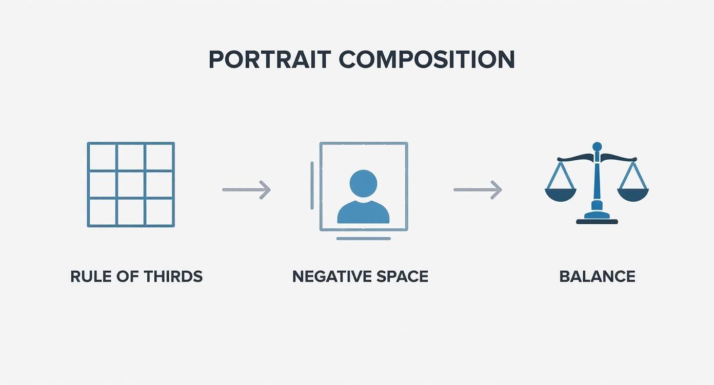
As you can see, things like the rule of thirds and how you handle negative space are all part of creating a balanced piece that pulls the viewer's eye exactly where you want it.
Adding Complexity with Glazes
Once your block-in is totally dry, the real fun begins. It's time for glazing. A glaze is just a super thin, transparent layer of paint you brush over a dry area. It's like laying a piece of colored glass over your painting; it doesn't hide what’s underneath, it just tints it and gives it more depth.
This is where you can achieve some incredible subtlety. For instance, a thin glaze of a warm yellow ochre over a cool blue underpainting can create a complex, earthy neutral that you could never hope to mix on the palette. It's a game-changer.
You can use glazes to:
- Deepen Shadows: A transparent wash of ultramarine blue or burnt umber can push those shadows back, creating a real sense of three-dimensional space.
- Shift Colors Subtly: Is a color screaming a little too loud? A gentle glaze of its complementary color can tone it down beautifully.
- Unify the Background: A single, thin glaze brushed over the entire background can tie all the different elements together in a harmonious way.
Glazing is a conversation between layers. Each new application responds to the one before it, building a color and light story that is impossible to achieve in a single pass.
Managing Drying Times and Using Mediums
Let's get practical. One of the biggest hurdles with layering is dealing with drying times, which are worlds apart for oils and acrylics.
For acrylics, you're in the fast lane. They dry so quickly you can often be ready for the next layer in minutes. If you need more time to blend and work the paint, a retarder medium is your best friend—it slows things down.
With oils, patience is key. A layer can take days to be dry enough to work over. To speed things up, you can use a medium containing an alkyd resin.
The right medium makes all the difference. For glazing, you need something that boosts transparency and flow without making the paint film weak. A gloss medium works great for acrylics, while a classic mix of linseed oil and solvent is perfect for oils.
Final Touches: Highlights and Shadows
Your last layers are all about making the background pop. This is where you define your light source by adding the brightest highlights and reinforcing the deepest shadows.
Use thicker, more opaque paint for those final highlights to really make them stand out. A single, well-placed dab of light can suggest a sunbeam or a reflection from a window, instantly dialing up the realism.
At the same time, go back into your darkest areas one last time with a transparent dark glaze. This final push into the shadows makes the light areas feel even brighter. It’s this final push-and-pull that seals the deal, giving your painting portrait background that believable, atmospheric quality we're all after.
For even more inspiration, you can see how AI texture generators are being used to come up with all sorts of unique surface effects that can add an extra layer of tactile realism to your work.
Answering Your Top Portrait Background Questions
Let's dive into some of the questions that always seem to come up when you're wrestling with a portrait background. I get asked these all the time, so I've put together some straightforward, practical advice to help you get unstuck and keep painting.
Think of this as your go-to FAQ for creating backgrounds that truly make your portraits sing.
How Do I Keep My Background from Stealing the Show?
This is the big one, right? You've spent hours on the face, and the last thing you want is a background that shouts over it. The secret isn't in a magic color or brush, but in controlling your values and edges.
Your subject needs to have the most dramatic contrast in the painting. That means your lightest lights and your darkest darks should be right there, usually around the focal point of the face. The background, in comparison, should live in a much quieter, more limited value range. If you do have a bright spot in the background, just make sure it’s a notch less brilliant than the highlights on your subject.
The same idea applies to your edges. Sharp, defined edges grab our attention instantly. So, let the background have softer, more diffused edges. When the forms in the background blur and blend a little, you’re sending a subconscious signal to the viewer: "The main story isn't here. Move along to the good stuff."
A great background is like a supporting actor—its job is to make the star look even better, not to compete for the spotlight.
Help! My Background Looks Flat and Lifeless.
A flat-looking background is almost always a symptom of using one single, monotonous color. The real world is full of subtle shifts, and your painting should be too. Luckily, this is a pretty easy fix.
Here are a few tricks I use all the time:
- Play with Color Temperature: Is your background a cool gray? Try mixing a slightly warmer gray and gently blending it into a few spots. This simple temperature variation immediately creates a sense of atmosphere and depth.
- Scumble for Texture: Grab a dry, stiff brush, put a tiny bit of a neutral color on it (like a light beige), and lightly scrub it over parts of your background. This technique, called scumbling, breaks up that flat, sterile surface and adds a beautiful, subtle texture.
- Add a Transparent Glaze: After your background is dry, you can add a whole new layer of complexity with a glaze. A thin, transparent wash of a related color can unify everything. For instance, a quick glaze of burnt sienna can add a lovely warmth and glow to an otherwise cool background.
Should I Paint the Background First or Last?
Ah, the age-old debate. While some artists swear by finishing the subject first, I'm a huge advocate for working on the background and the subject at the same time. Why? Because painting is all about relationships.
Imagine you paint the portrait to perfection and then try to squeeze a background in around it. The colors you chose for the skin can look completely wrong once they're sitting next to that new background. You're essentially painting in isolation.
Instead, try blocking in the basic colors and values for both the subject and the background right from the start. This way, you see how everything interacts from the get-go. You can make adjustments as you go, ensuring the entire piece feels connected and harmonious. It’s a much more holistic approach that saves you a lot of headaches later on and leads to a more unified painting.
At William Tucker Art, we believe every brushstroke contributes to the final story. Explore the collections to see how thoughtfully crafted backgrounds bring our wildlife and pet portraits to life. Find your next favorite piece at https://williamtuckerart.com.