
Painting water reflections isn't about creating a perfect mirror image. It's about capturing a distorted, darker, and softer version of the object you're painting. The real secret lies in using vertical brushstrokes for the reflection itself and then adding subtle horizontal strokes to break it all up. This is what creates that believable illusion of a water surface.
Understanding Why Reflections Deceive the Eye
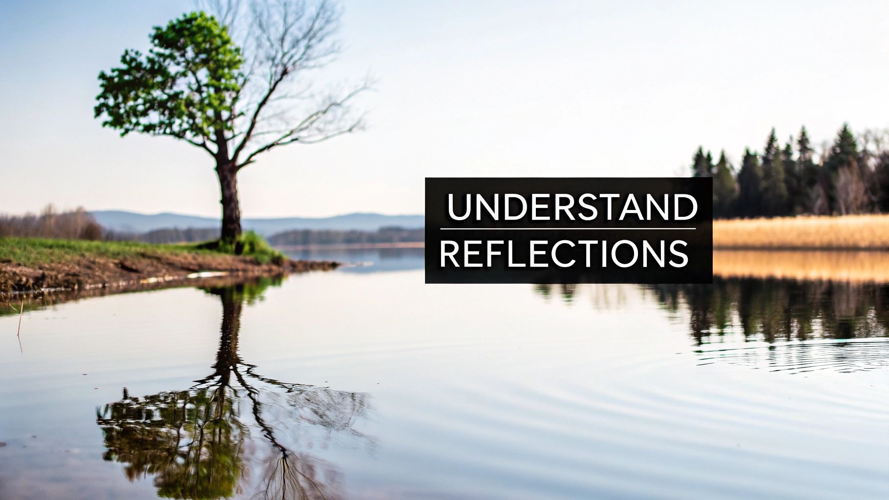
Have you ever painted a gorgeous, detailed tree, only to have its reflection in the water look like a cheap sticker you slapped on the canvas? We've all been there. It’s a classic challenge that has tripped up artists for centuries.
Interestingly, one analysis of 19th-century landscape paintings revealed that only about 35% of reflections in major European art museums were truly accurate. Most artists took liberties, either simplifying or exaggerating what they saw. It's a fascinating look at how even the masters grappled with this, and you can dive deeper into the findings on painting reflections in art.
The truth is, our brains play tricks on us. We think a reflection should be a perfect, upside-down copy. In reality, it's a completely different animal—one shaped by light, your viewing angle, and the water itself. Let's break down the "why" so you can start painting what you actually see, not what your brain wants you to see.
The Science of Seeing Reflections
At its most basic, a reflection is just light bouncing off the water's surface and hitting your eye. But that journey is rarely straightforward. The water’s surface always absorbs some light and scatters the rest, which is why reflections are almost always darker and less vibrant than the objects they're mirroring.
On top of that, water isn't a flawless mirror; it has its own character and color.
- Water's Intrinsic Color: A muddy river will cast a brownish tint on everything it reflects. A clear alpine lake might add a cool blue or green hue to the scene. You have to account for the water's own color.
- Surface Texture: The slightest breeze creates tiny ripples that distort and fracture the reflected image. This is what softens those edges and breaks up solid shapes into shimmering fragments.
- Viewing Angle: Your perspective changes everything. If you're looking straight down into the water, you'll see more of what's under the surface. But from a lower angle on the shore, you'll see more of the reflected sky and surrounding landscape.
The biggest mindset shift you can make is this: You're not painting the same object twice. You are painting two completely different things—one solid object, and one fragmented, darker, softer interpretation of it on a fluid surface.
Common Hurdles Artists Face
Once you get these principles, you can sidestep the common traps. So many beginners struggle because they paint reflections with the same color intensity and sharp detail as the main subject. This creates a visual disconnect that makes the water look flat and the reflection feel completely unnatural.
To paint believable water, you have to train your eye to see these subtleties. Notice how the reflection of a bright red boat becomes a dull, muted crimson in the water. See how the crisp edges of a building become a soft, wobbly suggestion of its shape.
This is the key. Making that mental switch from painting objects to painting light and form is your first real step toward mastering this beautiful and dynamic subject.
Choosing the Right Tools for the Job

Having the right gear in your studio can feel like the difference between fighting your painting and flowing with it. To really nail the magic of water reflections, you need tools that work with you, not against you. Let's build your ideal toolkit, going beyond a simple shopping list to understand why certain materials are just perfect for this task.
Which Paint Is Best for Reflections?
Your choice of paint is probably the biggest decision you'll make. It completely shapes your process, from drying time to the final look of the reflection. The big three—oils, acrylics, and watercolors—each bring something different to the party when it comes to painting water.
The medium you choose has a huge impact on your ability to blend and layer, which are both crucial for creating believable water. Oils give you that luxurious, long blending time for soft, dreamy reflections, while acrylics offer the speed for crisp, layered ripples. Watercolors, of course, have a natural transparency that can feel like it was made for this very subject.
Here's a quick breakdown to help you decide.
Choosing Your Medium for Painting Water
| Medium | Best For | Blending Ability | Drying Time | Pro Tip |
|---|---|---|---|---|
| Oil | Soft, glassy reflections on calm water. | Excellent | Very slow (days) | Use a medium like Liquin to speed up drying if you're layering. |
| Acrylic | Sharp, defined reflections and quick layering. | Good (when wet) | Very fast (minutes) | Keep a spray bottle of water handy to mist your palette and canvas, extending your blending time. |
| Watercolor | Transparent, luminous, and flowing water scenes. | Good (wet-on-wet) | Fast | Let the paper's white do the work for your brightest highlights. You can't easily add it back! |
Ultimately, there's no single "best" choice—it's about matching the paint's personality to your own artistic style and the specific look you're aiming for in your painting.
If you're leaning towards watercolor but feeling a bit intimidated, we've put together a great guide on watercolor painting for beginners to get you started on the right foot.
By the way, did you know that by the mid-19th century, about 75% of English watercolor landscapes featured water? That’s a huge testament to how perfectly suited the medium is for capturing light and reflection.
Your Go-To Brushes for Painting Water
Your brushes are your partners in creating texture and detail. You don't need a massive collection, just a few key shapes that will make painting different types of water surfaces feel much more intuitive.
Here are a few workhorses I always have on hand for reflections:
- Soft Filbert Brush: The rounded shape is a dream for creating the soft, vertical strokes of a reflection. It avoids the hard edges a flat brush can leave, making it perfect for blending a reflection seamlessly into the surrounding water.
- Rigger or Liner Brush: With its long, skinny bristles, a rigger is your best friend for those sharp, dancing highlights that skip across the water's surface. It's also brilliant for the thin, distorted lines of reflected tree branches.
- Flat Brush: A good wide, flat brush is great for quickly laying in those initial, broad areas of water and sky. Turn it on its side, and you can create crisp horizontal lines for gentle ripples or the edge of a shoreline.
- Fan Brush: This one is my secret weapon. Load a fan brush with thinned-down white paint, then lightly drag it horizontally across a darker reflection. Instant shimmering ripples!
The goal isn't to own every brush under the sun. It's about building a small, versatile set of tools that you know inside and out. When you know exactly how your filbert softens an edge or how a rigger can lay down a crisp line of light, you gain the confidence to tackle any water scene that inspires you.
How to Mix Colors for Believable Reflections
This is where the real magic happens. Once you’ve got a feel for the physics of light and your tools are ready, mixing the right colors is what will make or break your water reflections. It's less about perfectly matching the object's color and more about capturing its essence as it's filtered through the water.
Here’s the single most important thing to burn into your brain: reflections are generally darker and less saturated than the object they mirror. The sky is often the big exception here, but for everything else—trees, buildings, boats—this is your North Star. That subtle shift in value and chroma is what sells the whole illusion.
The Three Golden Rules of Reflection Color
Forget about just winging it. There’s a reliable process for mixing colors that will give you authentic-looking results time and time again. I like to think of it as a quick, three-step mental checklist I run through before my brush even touches the paint.
- Mute the Color: First, mix the object’s base color. Got a vibrant green tree? Mix that green. Now, you need to knock that intensity way back. The easiest way is to add a tiny touch of its complementary color—a speck of red for a green, a hint of orange for a blue. This instantly desaturates the color, making it feel more natural for a reflection.
- Darken the Value: Reflections absorb light; they don't create it. This means the value (how light or dark it is) has to be darker than the original object. You can pull this off by mixing in a touch of a dark neutral like Burnt Umber or Payne’s Gray. I sometimes even use a bit of the dark, murky color I’ve already mixed for the deep water to harmonize everything.
- Add a Tint of Water: The water itself has a color, right? Is it a muddy brown river, a tropical turquoise sea, or a deep blue mountain lake? Mix a tiny amount of this "water color" into your reflection mix. This is the final step that really ties the reflection into the scene, making it feel like it belongs in the water, not just pasted on top.
This little process—Mute, Darken, Tint—is your core strategy. It trains your eye to stop seeing the reflection as a lazy copy and instead interpret it as an object being transformed by its environment.
Practical Color Mixing Recipes
Alright, let's move from theory to the palette. Getting your hands messy is always the best way to build confidence. Here are a couple of real-world scenarios and starting recipes to get you going.
For a Reflected Green Tree
Picture a lush, sunlit tree. Its color might be a bright, punchy mix of something like Cadmium Yellow and Ultramarine Blue.
- Step 1 (Mute): To that vibrant green mix, add the tiniest speck of Cadmium Red. You’ll see the green instantly shift to a more natural, olive tone.
- Step 2 (Darken): Now, mix in a touch of Burnt Umber. This deepens the value without killing the color, which is a risk you run when using straight black.
- Step 3 (Tint): If that tree is reflected in a blue lake, stir a small amount of the lake’s blue (maybe Cerulean or Cobalt Blue) into your muted, darkened green.
The final color sitting on your palette will look kind of dull and drab compared to the tree's actual green, but trust me—once you lay it on the canvas, it will look absolutely perfect.
For a Reflected Blue Sky
The sky is the big exception to the "darker" rule. On a calm day, the sky's reflection is often the lightest part of the water, but it's still different from the sky itself. It's usually a touch darker near you and gets lighter as it approaches the horizon.
- Sky Reflection Base: Start with a mix like Cerulean Blue and Titanium White.
- Add Depth: For the parts of the reflection closer to the viewer, mix in a bit more blue, or maybe even a touch of Ultramarine, to deepen the value. This little trick creates a wonderful sense of perspective on the flat plane of the water.
Understanding Value and Its Role
I've thrown the word "value" around a lot, but it deserves its own moment in the spotlight. Value is simply the scale of light to dark in your painting, and honestly, it does more of the heavy lifting than color does when it comes to creating realism and depth. If you took a black-and-white photo of your painting, it should still "read" correctly if your values are on point.
Here's a great little trick: try squinting your eyes when you look at your reference photo or scene. Squinting blurs out all the distracting details and colors, letting you see the basic shapes and their values much more clearly. You’ll immediately notice that the entire shape of the reflection is a darker block of value than the object itself.
For any artist looking to really master this, diving deeper into the principles of color and value is a game-changer. Exploring a detailed guide on how to mix paint colors will build a solid foundation for all your future work. If you're working with acrylics, an essential acrylic paint mixing guide can offer tips specific to that medium. Nailing your values is a huge leap forward in painting water reflections that feel authentic and truly alive.
Bringing Your Reflections to Life with Brushwork
Alright, you've got your colors mixed and you're staring at a blank (or maybe just blocked-in) canvas. Now for the fun part. This is where we stop thinking so much and start painting, translating all that careful observation into brushstrokes that actually look like water. The real secret isn't about fussing over tiny details; it's about building up layers of light and texture in the right order.
We'll start by establishing the basic shapes and then dive into the specific strokes that make a glassy lake look different from a choppy sea.
This handy visual breaks down the core color mixing process into three simple steps I always come back to.
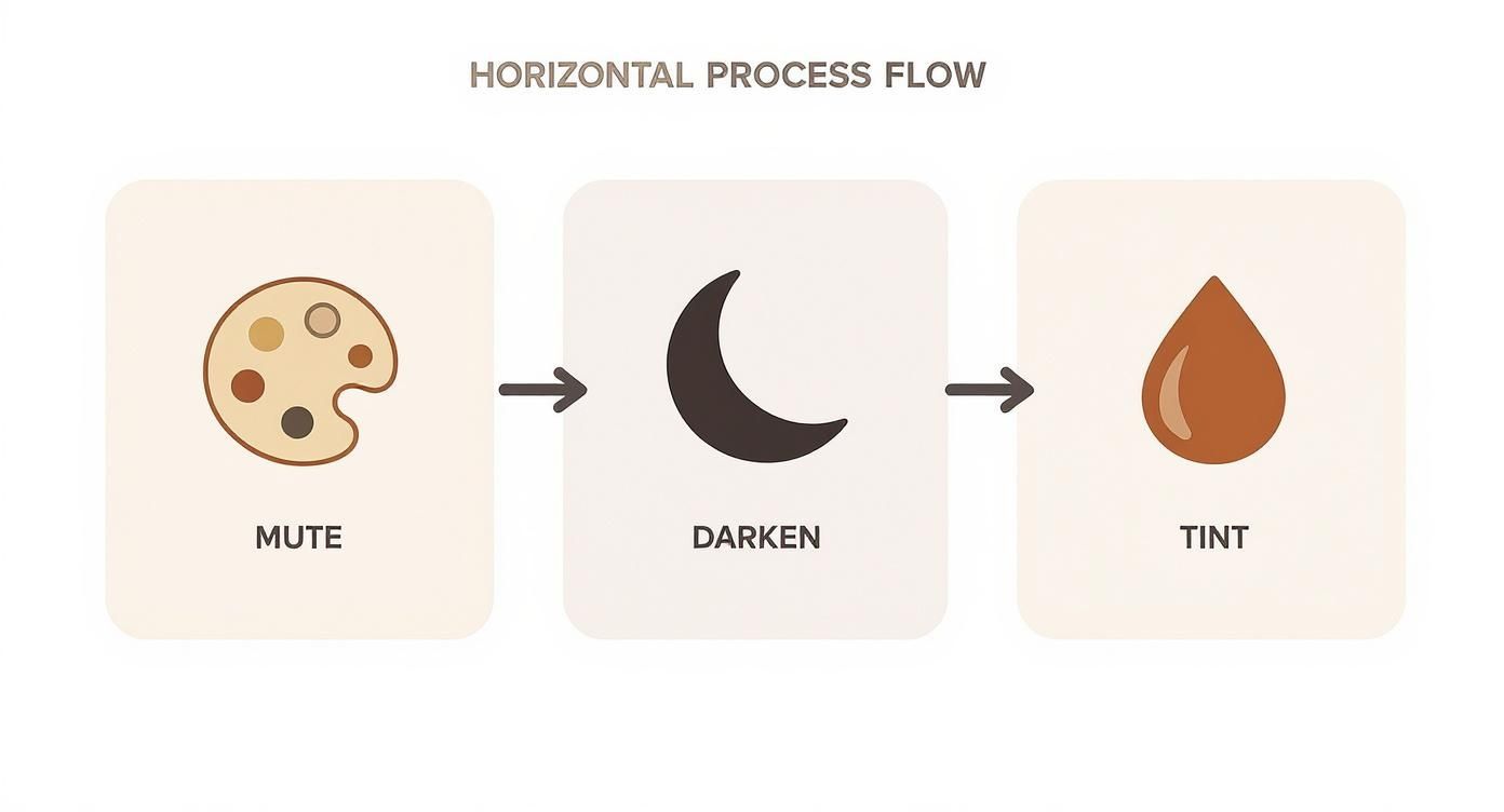
Remembering this workflow—Mute, Darken, Tint—is your ticket to creating reflection colors that look like they belong in the water, not just pasted on top of it.
Laying the Foundation: Blocking In Shapes
Before you even dream of painting a single ripple, you need a solid foundation. Start by loosely blocking in the big shapes of your scene—the sky, that line of trees, the dock—and then sketch their upside-down reflections in the water. Keep these shapes super simple for now. The only thing that matters is getting the general placement and values correct.
For the reflected shapes, grab those muted, darker colors you just mixed. The goal here is absolutely not detail. You're creating a dark, unified base that the rest of your water texture will be built upon. It's this dark underlayer that will ultimately make your final, bright highlights sing.
The All-Important Vertical Brushstroke
Now for the most critical technique in your toolkit: the vertical brushstroke. Light reflects off water and travels to your eye in a predominantly vertical path. If you can mimic this simple motion with your brush, you’ve already won half the battle.
Using a soft brush (a filbert is perfect for this), gently drag your reflection colors downward from the shoreline or the edge of an object. Don’t try to make these strokes perfect or solid. You want them to be a little uneven, a little broken. This sense of fragmentation is what immediately sells the effect.
This single technique is the visual cue that tells the viewer’s brain, "Hey, that's light bouncing off a liquid surface." Mastering this is more than half the battle in painting believable water reflections.
A classic beginner mistake is to paint reflections using the same horizontal strokes you used for the landscape itself. Always remember this simple rule: objects are built with varied strokes, but their reflections always start with vertical ones.
Painting Glassy, Still Water
When you're painting water that's as smooth as a mirror, your brushwork needs to be incredibly subtle and your blending has to be seamless. This is where those soft vertical strokes you just practiced really get to shine.
After blocking in your vertical reflections, the main job is to soften the transitions between colors. How you do this depends on what you’re painting with:
- Oils: This is what oils were made for. Use a clean, dry, soft brush to gently "feather" the edges where two colors meet. The famously slow drying time is your best friend here, giving you all the time in the world to create smooth, buttery gradients.
- Acrylics: You have to work faster here. Either blend quickly while the paint is still wet or use a blending medium to give yourself more open time. I often keep a small spray bottle of water handy to lightly mist the surface, keeping it workable for a few extra minutes.
- Watercolors: The wet-on-wet technique is your go-to. Lay down your initial reflection colors, then drop in other hues and let them bleed and mingle naturally on the damp paper. It's a beautiful, and often unpredictable, effect.
The key to still water is the near-total absence of hard edges within the reflection. Everything should feel soft and just a little out of focus.
Creating Choppy, Moving Water
Once the wind picks up, the game changes completely. Moving water shatters a reflection into a million moving fragments. To capture this energy, you have to bring in horizontal strokes to fight against your vertical base.
Start by laying in your vertical reflection just like you did for the calm water. Crucially, let this layer dry completely. Now, grab a flat or fan brush and load it with the water's main local color—the deep blue of the ocean or the murky green of a river.
With a few confident, horizontal strokes, slice right across your vertical reflections. This action physically breaks up that mirrored image, creating an instant illusion of ripples and waves. Make sure to let some of the vertical underpainting peek through. It’s this push-and-pull between the vertical reflection and the horizontal water surface that creates that dynamic, shimmering effect we’re all after.
To help you keep these approaches straight, here’s a quick-glance table summarizing the techniques for different water conditions.
Reflection Painting Techniques for Different Water Surfaces
| Water Type | Dominant Brushstroke | Color Approach | Key Feature to Capture |
|---|---|---|---|
| Glassy Lake | Soft, blended vertical strokes | Muted, dark colors with very soft transitions. Gradients are key. | Seamlessness and lack of hard edges |
| Slow River | Broken vertical strokes with subtle horizontal drifts | Colors can be murkier (browns, greens). Some sharp edges where current pulls. | The gentle distortion of shapes |
| Choppy Waves | Strong horizontal strokes over a vertical base | Sharp contrast between dark troughs and light wave-tops. | The interplay of vertical and horizontal |
| Ocean Swells | Broad, sweeping strokes that follow the wave form | Deep blues and greens in the body of the wave, bright white for foam/sea spray. | The form and power of the wave itself |
This table is a great starting point, but always let your reference photo or real-life observation be your ultimate guide.
Adding the Final Sparkle
Highlights are the jewelry of your painting. They’re the last little bits of magic that make the water feel truly wet and alive. These should be the very last marks you add.
- Technique: Use a small, stiff brush—like a rigger or a tiny round—to apply thick dabs of your lightest color. This is an impasto technique, where the paint is thick enough to stand up from the surface, giving it a physical texture that catches the light.
- Placement: Resist the urge to sprinkle highlights everywhere like glitter. Look closely at your reference. Where does the light actually catch the tops of the ripples? Often, you’ll see sparkles appear in a "path" leading from the sun or moon toward your viewpoint.
- Variety: Nature is random, and your highlights should be too. Vary their size and shape. Some should be tiny pinpricks of light, others slightly longer dashes or commas. This variety is what makes them feel authentic.
By layering these brushwork techniques—from the dark, simple block-in to the final, brilliant highlights—you'll build a convincing illusion of light dancing across the water. It’s a patient process, but the results are absolutely worth it.
Moving Beyond Realism to Find Your Style
So, you’ve nailed the basics. You know the rules of reality—how to mute colors, darken values, and keep your brushstrokes vertical. Fantastic. Now, let’s talk about how to break those rules with intention.
Painting is so much more than just copying what’s in front of you. It’s about telling a story, creating a mood. And let me tell you, water reflections are one of the best tools in your arsenal for injecting your own personal style and emotion into a piece.
Once you truly get why a reflection behaves the way it does, you’re free to start bending reality for artistic effect. This is the moment you graduate from being a skilled technician to a true artist who communicates what they feel.
Drawing Inspiration From The Masters
The Impressionists were absolute masters of this. Think about Monet. He wasn't trying to paint a perfect photograph of a lily pond. He was capturing the feeling of a moment—the dazzling shimmer of late afternoon sun or the quiet chill of a misty morning. His reflections were often an explosion of exaggerated color and bold, confident brushwork.
This wasn't just a happy accident. Art history shows a deliberate shift in how artists treated reflections. In fact, research shows that during the Impressionist period, about 60% of water reflections were painted with intentionally intensified colors and distorted shapes. That's a huge jump from the mere 20% seen in the more rigid, academic paintings that came before.
Take a page from Monet's book. Don't just paint the reflection of a green tree. Ask yourself: is this a joyful, vibrant spring green? Or is it a somber, deep forest green that feels more mysterious? Push the color to match the emotion you're trying to convey.
Creative Prompts To Find Your Voice
I know that stepping away from realism can feel a bit daunting. To help you loosen up and start experimenting, here are a few exercises I love to use for painting water reflections.
- The Memory Painting: Find a spot with interesting reflections and just look at it for about 15 minutes. No photos, no sketching. Then, head back to your studio and paint it from memory. You'll naturally forget the tiny, insignificant details and be forced to focus on the overall impression and the feeling of the place.
- The Color Push: Grab a reference photo you like. Now, intentionally crank up the saturation on all the colors in the reflection. That muted blue? Make it a brilliant cobalt. That dull, muddy brown? Turn it into a rich, fiery ochre. See how far you can push the colors before the painting feels like it's falling apart. You might be surprised.
- The Shape Distortion: Ditch the brush for a palette knife when you lay in your reflection colors. The hard edge and the way a knife drags the paint will naturally abstract the reflected shapes, creating a much more dynamic and energetic surface.
To keep your work fresh, it's always a good idea to seek out new drawing and painting ideas.
The goal here isn't just to be unrealistic for the sake of it. It’s about making deliberate, creative choices. It’s about using every single element on your canvas—especially something as naturally expressive as a reflection—to serve your unique artistic vision. That’s how you develop a style that is powerfully and recognizably your own.
Answering Your Top Questions About Painting Reflections
Every artist hits a snag now and then, especially with something as tricky as water. Let's walk through some of the most common questions I hear and get you past those hurdles so you can paint with more confidence.
"Why Does My Reflection Look So Fake?"
I get this question all the time. If your reflection looks like a sticker slapped onto the water, it's almost always one of two things: your edges are too hard, or your values are off.
Think about where the reflection meets the shoreline or the base of an object. In the real world, that line is rarely a razor-sharp edge; it's soft and often broken. Grab a soft brush and gently smudge that transition.
The other big giveaway is when the reflection is just as bright and detailed as the object itself. Remember this rule of thumb: reflections are always darker and less detailed. A quick fix is to mix a duller, more muted version of your object's colors before you even start painting the reflection.
Here’s a little trick I use all the time: squint at your reference photo. Seriously, try it. It instantly blurs out all the fussy details and shows you the true value shapes. You'll immediately see how the entire reflection reads as a single, darker mass compared to the object above it.
"How Do I Handle Reflections in Moving Water?"
When you've got ripples or waves, the key is to suggest, not to state. You're trying to capture the feeling of movement, not paint every single ripple—that's a recipe for madness.
First, block in the reflection with simple, vertical strokes as if the water were perfectly still. Let that layer dry. Then, come back with horizontal strokes using the main color of the water (the blue of the ocean, the murky brown of a river). Slice right across those vertical reflections. This back-and-forth between the vertical colors of the reflection and the horizontal color of the water is what sells the illusion of a fragmented image on a moving surface.
"What's the Best Way to Paint Those Sparkling Highlights?"
Ah, the sparkles! These are the final little jewels you add to your painting. They should be the absolute last thing you do.
Here’s how to make them really sing:
- Go Thick with the Paint: Use your brightest white, maybe with a tiny touch of yellow, and apply it with an impasto technique. You want the paint thick enough to physically stand up off the canvas.
- Mix Up Your Marks: Don't just make a bunch of identical dots. Nature is beautifully random. Use a small, stiff brush to dab on a variety of tiny dots, short dashes, and little comma shapes.
- Place Them Smartly: Avoid sprinkling them randomly like glitter. Look at where the light actually hits the tops of the waves. You'll often see a shimmering path leading from the light source (like the sun) straight to you.
"Should a Reflection Be the Same Size as the Object?"
This is a fantastic question, and the answer completely depends on your perspective.
If you're painting perfectly still water and your viewpoint is low and close to the water's surface, then yes, the reflection's length will pretty much match the object's height.
But change your viewpoint, and everything changes. If you’re standing on a cliff looking down, that same reflection will appear much shorter and compressed. Ripples and waves also break up the reflection, making it seem shorter. For most typical landscape scenes, starting with a reflection of a similar length is a safe bet, but always trust your eyes and adjust for the specific scene you're painting.
At William Tucker Art, we find that capturing the ever-changing beauty of nature is one of an artist's greatest challenges and deepest joys. Feel free to explore our collections of wildlife and coastal art to find a spark of inspiration for your own work.