
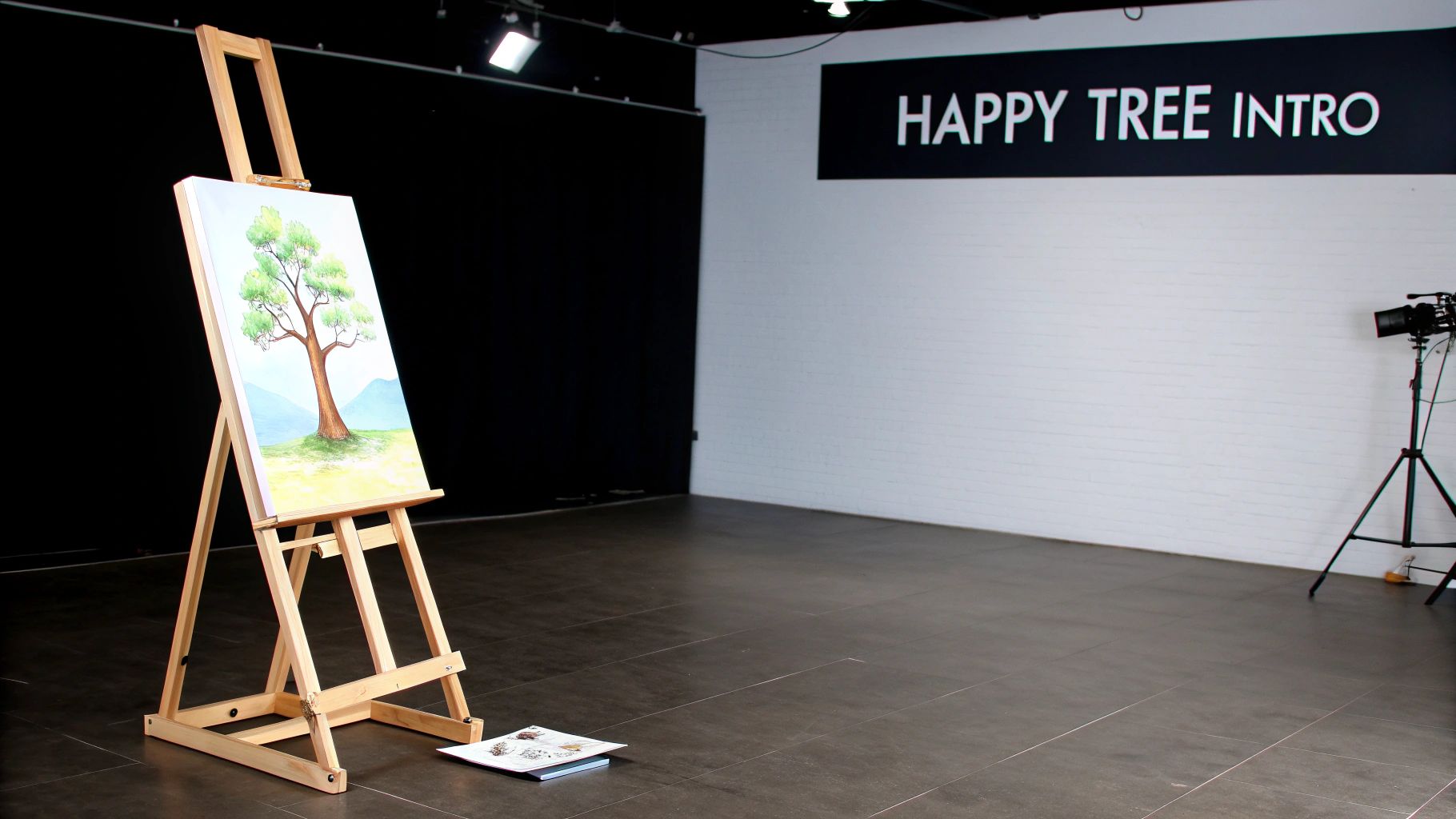
You know, when someone mentions a happy tree painting, they're talking about more than just putting paint on a canvas. It's a whole philosophy, a joyful and wonderfully pressure-free way to be creative, made famous by the one and only Bob Ross. The whole point is that anyone can paint beautiful landscapes with just a few simple techniques. And the best part? Mistakes aren't mistakes—they're just 'happy little accidents.'
The Enduring Charm of Painting Happy Trees
Dipping your toes into the world of happy tree painting feels like getting a warm hug. It's especially welcoming if you've ever felt that little jolt of fear staring at a blank canvas. This art form is all about finding the joy in the process itself, not chasing some impossible idea of perfection. It’s an open invitation to just breathe, slow down, and create something that makes you feel good, without worrying about messing it up.
Honestly, the therapeutic side of this is huge. When you start to see "happy accidents" as part of the fun, you learn to let go a little. Unexpected splotches or a color blend you didn't plan for become opportunities. That mental shift is what turns a painting session into something truly meditative and rewarding.
A Legacy That Inspires Millions
The fact that we're still talking about this method today really says something about its founder, Bob Ross. Decades after his show, The Joy of Painting, first aired from 1983 to 1994, his gentle voice and unwavering positivity are still pulling in a whole new generation of artists online. It's pretty amazing, really. Ross has a massive posthumous digital footprint, with around 2 million followers on Twitch and over 5 million subscribers on YouTube. It just goes to show that his message is as relevant as ever. You can dive deeper into his incredible online influence and see how his legacy is booming in the digital age.
"We don't make mistakes, just happy little accidents."
This simple phrase is the heart and soul of it all. It’s about being kind to yourself and having fun with the creative journey.
The Magic of Wet-on-Wet Painting
The secret sauce behind all those misty mountains and fluffy clouds is a technique called wet-on-wet, or alla prima if you want to get fancy. You start by covering your canvas with a thin, wet base layer of paint. Then, you apply your other wet oil paints right on top of it.
This is what allows for that beautiful, soft blending and gives you those immediate, satisfying results. You don't have to wait around for layers to dry. In just one sitting, you can paint a sweeping sky, distant mountains, and all the textured leaves on a happy little tree.
In this guide, I'll walk you through everything you need to get started on your own happy tree painting adventure. We're going to cover:
- The essential supplies you'll need to get your creative space ready.
- Fundamental techniques for blending colors and creating all that wonderful texture.
- Step-by-step guidance for painting trees, mountains, and water that look fantastic.
- Tips for fully embracing the joyful, stress-free spirit that makes this art form so special.
Setting Up Your Creative Space

Before a single happy little tree can find a home on your canvas, you need to get your world ready for it. Setting up your creative space is more than just a pre-flight check; it’s about getting to know your tools so you can paint with freedom and joy. I like to think of it as building my own little artist's sanctuary, a place where the imagination can just run wild.
Don't worry, you don't need to buy out the entire art store. The real beauty of this painting style is its brilliant simplicity. You’ll be amazed at how far a handful of carefully chosen supplies can take you, letting you craft sprawling, gorgeous landscapes with a surprisingly minimal toolkit.
Core Paint Colors for Your Palette
Your paint is the soul of your landscape. While it's tempting to grab every color under the sun, a specific, limited palette is all you need to mix sprawling skies, majestic mountains, and lush forests. These particular colors have been chosen for their strong pigments and how beautifully they play together.
- Titanium White: This is the hero of your palette. You’ll use it for everything from fluffy clouds to the final, bright highlights that make your painting pop.
- Phthalo Blue: A deep, powerful blue that’s perfect for skies and water. Be careful—a tiny dab goes an incredibly long way with this one.
- Van Dyke Brown: This is a rich, dark brown that becomes the foundation for tree trunks, earthy ground, and the deep shadows hiding in your foliage.
- Alizarin Crimson: A cool, deep red. It’s fantastic for adding a hint of warmth to a sunset or for mixing with blue to create beautiful purple tones.
- Cadmium Yellow: A bright, sunny yellow that's absolutely essential for mixing vibrant greens and adding those sun-kissed highlights to your trees.
The real magic happens when you start blending. Try mixing just a touch of Alizarin Crimson into your Phthalo Blue; you'll get this gorgeous, subtle purple haze that looks incredible on the horizon. It's all about playing around and seeing what you can create.
Brushes and Other Essential Tools
The right brushes feel like an extension of your own hand. In this style of painting, specific brushes are used to achieve those signature effects, from sweeping backgrounds to the delicate, leafy texture of the trees. You'll quickly find that a few key brushes do most of the heavy lifting.
Your two-inch brush, for example, is your workhorse for applying that first layer of liquid white and blending big areas like skies and water. On the other end of the spectrum, the fan brush is your go-to for tapping in the leafy clusters that bring your happy trees to life. And don't forget the palette knife! It's not just for mixing paint; it’s a painting tool in its own right, perfect for carving out the sharp, broken edges of a mountain or the straight lines of a distant cabin.
So, let's take a look at the key items you'll want to have ready before you dive into your first painting adventure.
Your Essential Happy Tree Painting Toolkit
Here’s a simple breakdown of the core materials you'll need, what they're for, and a few tips I've picked up along the way to help you get started on the right foot.
| Supply Item | Purpose in Happy Tree Painting | Beginner's Tip |
|---|---|---|
| Two-Inch Brush | Applying the initial wet base coat and blending large color areas like skies and water. | Always clean it thoroughly between colors to avoid a muddy sky. Use long, crisscross strokes. |
| Fan Brush | Creating the classic leafy texture on trees and bushes through gentle tapping motions. | Don't overload the brush. Use just the corner bristles for the best, most delicate effect. |
| Palette Knife | Mixing paints and creating sharp textures, like mountains, tree trunks, and distant rocks. | Let the knife do the work. A light touch creates a wonderful "breaking" effect on the canvas. |
| Stretched Canvas | The surface for your masterpiece. A standard 18x24 inch size is great for starters. | Make sure it’s primed with gesso, which most store-bought canvases already are. |
| Liquid White | A thin, fluid oil paint used to create the slick base for the wet-on-wet technique. | Apply a very thin, even coat. If you can see your fingerprints in it, you've used too much. |
| Odorless Thinner | Used for cleaning your brushes thoroughly between colors to keep your painting crisp. | Work in a well-ventilated area and keep the container covered when not actively in use. |
Having these items laid out and ready to go makes all the difference. When you aren't scrambling to find a tool, you can stay in that creative flow and just enjoy the process of bringing your world to life.
Learning the Wet-on-Wet Painting Technique
This is where the real magic happens. The secret sauce behind every happy little tree is a wonderfully immediate method called the wet-on-wet technique, known in the art world as alla prima. The whole idea is to apply wet oil paint directly onto another layer of wet paint, which lets you create gorgeous, soft blends right on the canvas.
Instead of waiting days for each layer to dry, you get to bring a complete, stunning landscape to life in a single, joyful session. That speed is what makes the process so satisfying and honestly, pretty perfect for anyone just starting out.
Preparing the Canvas for Blending
Your very first move is to create a slick, workable surface. You'll do this by applying a very thin, even coat of liquid white over the entire canvas. I always think of it like putting a little butter in a pan before you start cooking—it just ensures everything glides smoothly.
Grab your two-inch brush and apply the liquid white with long, crisscross strokes. You want just enough to make the canvas feel slippery to the touch. A great way to test this is to press your finger lightly on the surface; if you can see a clear fingerprint, you’ve hit the sweet spot.
This wet base is the foundation for everything to come. It's what allows you to effortlessly blend those dreamy skies, create soft, distant mountains, and lay down the base colors for your entire world.
The wet-on-wet technique is all about working quickly and intuitively. You're not just painting a picture; you're building a world in real-time, letting the colors mix and mingle directly on the canvas to create beautiful, often unexpected, results.
This process flow gives you a bird's-eye view of how to bring your happy tree painting to life.
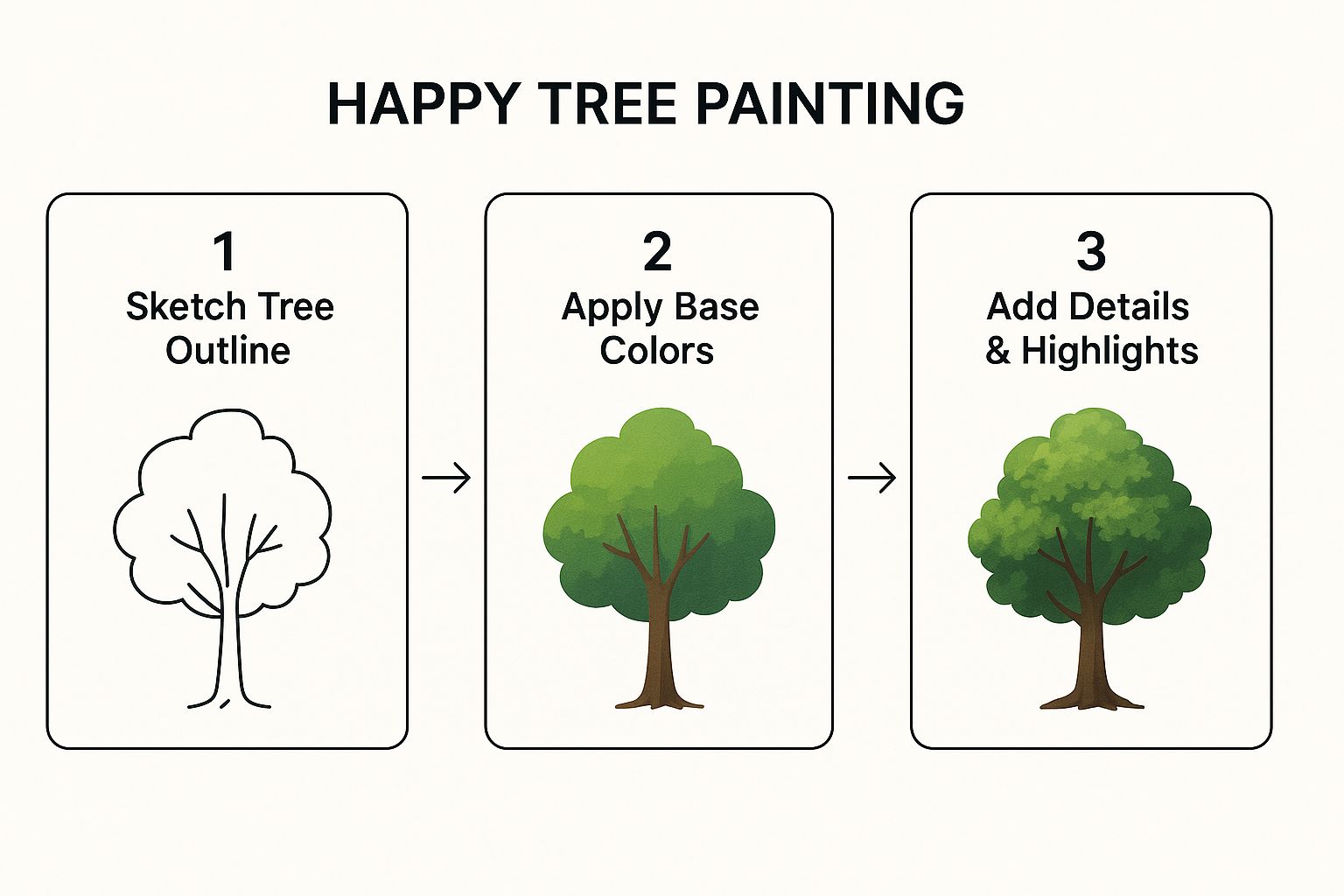
As you can see, the process moves logically from the big picture down to the fine details.
Mastering Signature Strokes and Textures
With your canvas prepped, it's time to dive in with some color. This technique actually traces its roots back to artists who needed to capture scenes quickly, long before it became famous on TV. Bob Ross learned this rapid-painting method from his mentor, Bill Alexander, who was a true pioneer in completing entire landscapes in under 30 minutes on his own PBS show. Alexander even used the phrase "happy little trees" before Ross made it a global phenomenon.
This method relies on some very specific brush and knife work to create those signature effects.
- Tapping with the Fan Brush: For that delicate, leafy look, load just the corner of your fan brush with a highlight color. Then, gently tap it against the canvas. This motion lets the paint "break" off the bristles, creating the perfect illusion of clusters of leaves.
- Carving with the Palette Knife: Your palette knife is for more than just mixing! Use its edge to scrape a roll of thick paint—like Titanium White mixed with a bit of brown—onto the canvas. This is how you get the sharp, textured look of a snowy mountain peak or the rugged bark of a tree trunk.
Getting a feel for blending colors effectively is what will really make this technique sing for you. For some deeper guidance on that, check out our guide on how to mix paint colors to get the most out of your palette. Once you start to control your brush pressure and color choices, you'll be well on your way to creating your own happy tree masterpieces.
Painting Your First Happy Trees
Alright, let's bring the star of your landscape to life. I find that painting trees is one of the most rewarding parts of the process because each one seems to develop its own personality right there on the canvas. We’ll start with the foundation—the trunk—and then build our way up to those sun-kissed leaves.
To get started on the trunk, grab your palette knife. Pull out a small roll of Van Dyke Brown, maybe mix in a little Dark Sienna and just a touch of black. You want multiple colors on the knife; this is key to making sure the trunk doesn't look flat.
Now, using the edge of the knife, lightly touch the canvas and pull straight down. Don't stress about making it perfectly straight—a little wobble here and there just adds character.
Crafting a Strong Trunk and Branches
With the main trunk in place, you can use a script liner brush or even the thin edge of your knife to gently pull out some branches. Think about how a real tree grows. The branches are always reaching for sunlight, twisting and turning as they go.
Try varying the pressure as you work. This will give you a mix of thick, sturdy limbs and delicate little twigs. That variety is what will make your tree feel alive.
And remember, every tree needs a friend. It’s a simple but foundational idea in this style of painting, and it creates a wonderful sense of community and balance in your landscape. You'll rarely see a single, lonely tree in these compositions.
Fun fact: data actually backs this up. If the famous painter Bob Ross put one tree on his canvas, there was a 93 percent probability he would paint at least one more right beside it. His preference for grouping things is a big part of what makes his scenes feel so natural and inviting. You can check out more cool insights into his work in this statistical analysis.
This is a great time to practice some core principles that apply to all kinds of art. If you'd like to explore more foundational skills, our guide on painting techniques for beginners offers some really valuable insights.
Now, let’s give those branches some beautiful foliage.
Adding Foliage with Depth and Light
The foliage is where your happy tree truly gets its shape and personality. Using a one-inch or a fan brush, load it up with a dark color. I like to use Sap Green mixed with a bit of Phthalo Blue. This dark base layer is crucial—it represents the shadows and the inner parts of the tree where the sun just doesn't reach.
Gently tap the canvas with the corner of your brush, creating little clusters of leaves. Make sure you don't cover all your branches! Let some of that beautiful trunk and limb structure peek through. This contrast is what adds a real sense of depth.
Once your shadows are in, it’s time for the highlights. This is the magic step that really makes your tree pop.
- First, get that brush clean. I can't stress this enough. It needs to be clean and dry, or you’ll end up with muddy colors.
- Next, mix your highlight color. Thin down a brighter color, like Cadmium Yellow, with a tiny bit of liquid white. The paint needs to be thinner than your base color so it will stick right on top.
- Finally, apply with a light touch. Load your brush and gently tap over the dark areas. Let the brush just kiss the canvas. Think about where the sun would hit the leaves—focus your highlights on the tops and sides of your leafy clusters.
This simple layering technique—dark to light—is what creates that incredible illusion of form and dimension. Just like that, your tree feels three-dimensional and full of life, ready to bask in the world you've created for it.
Building a Complete and Vibrant Landscape
A happy tree needs a happy little world to live in, right? Once you've gotten the hang of painting the trees themselves, the real fun begins: building the entire environment around them. This is the part where your canvas transforms from a simple study into a complete, harmonious scene.
It's time to invite in the supporting cast—the majestic mountains, the fluffy clouds, and the serene lakes that make your landscape feel alive.
For those dramatic, textured mountains, your palette knife is going to be your best friend. Get a small roll of paint on the edge of the knife. I like to use Titanium White with just a touch of Phthalo Blue and Van Dyke Brown.
Then, with a firm but gentle touch, let the knife just scrape across the canvas. Let the paint "break" over the texture—that’s what creates the illusion of rugged, snowy peaks. Whatever you do, don't try to smooth it out. Those little imperfections are what sell the effect and make the mountain feel real.
Creating Atmospheric Skies and Water
The sky you paint sets the entire mood for your piece. I always grab a two-inch brush and blend my colors directly on the canvas to get those soft, sweeping gradients.
When it's time for clouds, just wipe your brush clean, load it up with some Titanium White, and use light, circular motions to fluff them in. Let them blend softly into the blue behind them. It's that simple.
Water works on a similar principle, but it's all about reflections. Start with a base color that’s a little darker than your sky. Then, using flat, horizontal strokes, gently pull the colors of the mountains and trees down into the water.
The secret to believable water is creating a clean shoreline. Take your palette knife or a liner brush with a dark color and draw in a crisp, thin line right where the water meets the land. This one little detail instantly grounds your entire scene.
Adding Depth with Light and Shadow
To give your landscape that vast, deep feeling, you need to master light and shadow. It's a simple trick of atmospheric perspective: things farther away should look lighter and a bit hazier.
Just mix a little Titanium White into the colors for your distant hills to push them back. In contrast, the elements in your foreground—like your main happy tree—should have the darkest darks and the brightest highlights. This contrast is what pulls them forward and creates that tangible sense of distance.
These are the final touches that tie everything together. Your happy tree painting is now more than just a tree; it's a peaceful little world you’ve built from scratch, full of life, light, and harmony.
Got Questions? You're Not Alone.
As you start splashing paint around and bringing those happy little trees to life, you're bound to run into a few head-scratchers. It happens to everyone! Think of these moments not as mistakes, but as the first steps toward really understanding how the paint works. Pushing through these little challenges is how you find your confidence.
So, let's walk through some of the most common questions I hear from painters just starting out. My goal is to give you simple, clear answers that get you right back to your easel, feeling inspired.
"Help! All My Colors Are Turning to Mud."
Ah, the classic wet-on-wet conundrum. This is probably the number one issue new painters face, and trust me, the fix is easier than you think. Muddy colors almost always come from one of two things: over-blending or, more likely, a dirty brush. The absolute golden rule is to thoroughly clean your brush with odorless thinner every single time you switch colors.
Another tip is to use an incredibly light touch. You want the brush to just graze the canvas. When you're adding a light color over a dark one—like putting a bright highlight on a tree—make sure that dark base layer is thin. A thick, wet glob of dark paint will just swallow up your highlight. A thin base lets that new, thicker highlight paint sit right on top without turning into a brown mess.
Pro Tip: A clean brush is your secret weapon against mud. Make cleaning it between colors a non-negotiable habit, and your paintings will instantly look cleaner and more vibrant.
"Why Do My Trees Look Like Green Blobs?"
If your trees are looking a bit more like shapeless blobs than leafy wonders, it usually comes down to technique and the consistency of your paint. You’re probably either pressing too hard or your highlight paint is too thick and goopy.
First, lay down your dark base color for the tree's foliage. Next, grab your highlight color (something like Cadmium Yellow) and thin it with just a tiny drop of liquid white. You want it to be just a little bit thinner than the paint that's already on the canvas.
Now for the magic part:
- Load up only the corner of your fan brush with that highlight color.
- Gently tap the canvas. Don't press, don't scrub—just tap, tap, tap.
- The goal is to let the paint "break" off the bristles, creating the illusion of individual leaves and clusters.
Try practicing this on a piece of cardboard first. You'll get the feel for it in no time.
"How Long Do I Have to Wait for My Painting to Dry?"
With oil paints, patience is part of the process. For a wet-on-wet happy tree painting, you can expect it to be "touch dry" in about one to three weeks.
But "touch dry" isn't the whole story. For the paint to cure—meaning it hardens all the way through to its core—it can take several months, sometimes even a year or more. A few things can affect the drying time:
- How thickly you applied the paint.
- The specific pigments you used (some colors just naturally dry slower than others).
- The humidity and temperature of the room where it's stored.
Just find a safe, well-ventilated spot for your finished masterpiece, keep it out of direct sunlight, and let time work its magic.
At William Tucker Art, we believe every brushstroke is a step on a joyful journey. Discover art that celebrates the beauty of the natural world and find your next inspiration at https://williamtuckerart.com.