
What if choosing a print by matching its colors to your sofa is the wrong first question? Most buyers start with color, then discover the true problem later. One guest sees a fox, another sees only splashes, and a third finds the piece too intense for a room meant for rest.
Abstract animal art prints work better when you judge them by two things first. How recognizable is the animal, and how is the room really used? Once you've answered those, color, finish, and framing become much easier decisions.
What Abstract Animal Art Prints Really Are
You're standing close to a blurred fox stretched across teal and rust. Up close it's all movement and broken color. Step back a few paces, and the ears, the long body, and the bushy tail suddenly click into place. That moment of recognition is exactly what you're buying.
An abstract animal print is a reproduction of an artwork where the animal is present but simplified. The artist doesn't record every hair or feather. Instead, color, gesture, and shape carry as much meaning as anatomy, so the creature feels alive without looking like a photograph.
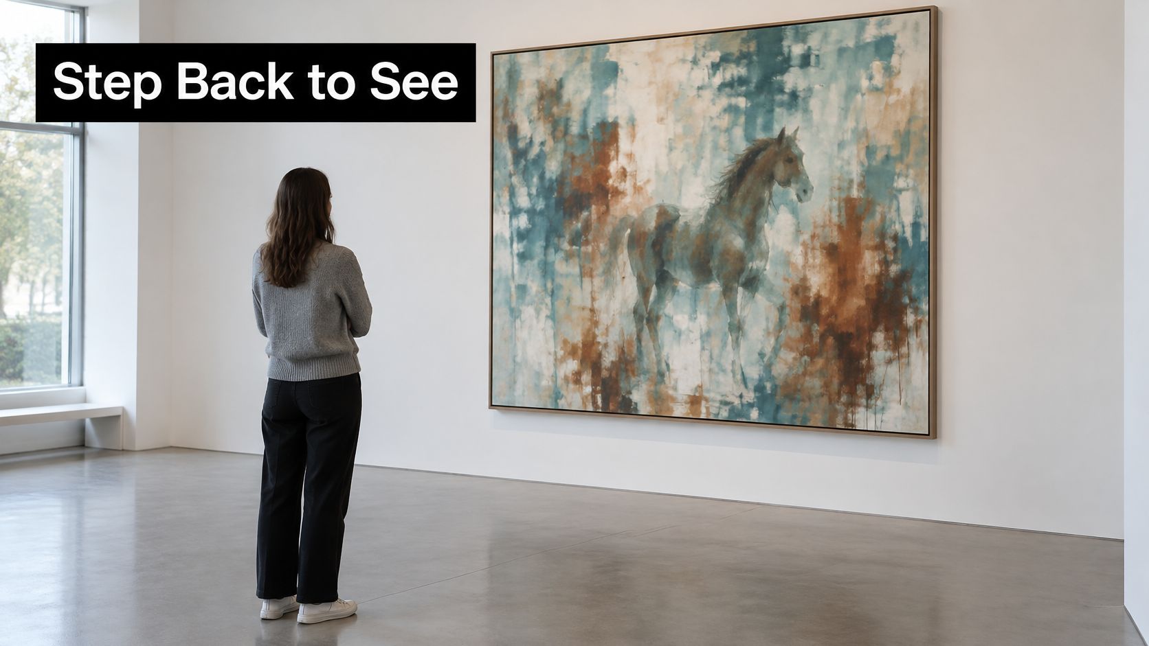
Think of a good caricature. A caricaturist keeps the nose, grin, or eyebrows that make a face unmistakable and drops the rest, and you still know the person instantly. These prints do the same with a creature, keeping a curved neck, a striped flank, or a watchful eye. If you'd like the wider contrast explained, this comparison of abstract and realistic painting approaches shows how both can describe the same subject differently.
This isn't a recent trick. Animal imagery has been central to visual art for at least 45,500 years, and the oldest currently known figurative animal depiction is a Sulawesi warty pig in Indonesia dated to approximately 45,500 years ago, as described in the French cultural authority account of Aurignacian cave art. That same account reports 435 animal images at Chauvet, created across periods around 36,500 years ago and 30,000 to 31,000 years ago, using charcoal, red pigment, engraving, contouring, and shading.
Those early artists already simplified outlines and emphasized movement. Abstraction, then, isn't a break from animal art. It's part of the tradition, carried from cave walls into modern reproducible prints.
Abstraction selects the animal's most telling features and leaves the rest to the viewer.
That idea guides everything ahead. You'll choose a recognition level for your room, compare finishes, check color, test sustainability claims, and, if you want one made for you, commission with confidence.
Matching Style, Size and Hanging to Your Room
Start with the question most listings don't answer. How much of the animal will show? Recent coverage of animal motifs describes a shift toward blurred, hybrid, and unusually colored interpretations, and notes that abstract animal art may communicate through shape, color, silhouette, or brushwork rather than a clearly identifiable full animal, as summarized in this overview of 2026 animal print trends. That's exciting, but it leaves you guessing how a piece will land with guests, children, or clients.
Use the table to pick a recognition level before you think about size. It's the same logic as choosing a rug. The rug anchors a room not because it matches one cushion, but because its scale and energy suit how people gather there.
| Style | Recognition level | Best setting | Size, finish and hanging |
|---|---|---|---|
| Clearly figurative with abstract background | High | Nursery, pet owner's hallway, gifts | Fill the largest blank wall span; framed paper under glass at child eye level |
| Suggestive silhouette | Medium | Living room over sofa, shared family spaces | About two thirds to three quarters of sofa width; matte or satin print, centered at eye level |
| Gestural abstraction | Low to medium | Office or gallery wall | Groups of three with 2 to 3 inch (5 to 8 cm) gaps; framed under museum grade glass |
| Geometric or pattern based | Varies by viewer | Hospitality lobby or restaurant | Large single statement or repeated panels; acrylic face mount or framed glass |
The Two Second Self Test
Here's a simple test you can do with a phone photo or a printed sample. Step back about six feet, look up, and ask whether you can name the animal within two seconds. If you can, you're in clearly figurative territory. If you need a hint from an ear or a wing, it's suggestive. If you mainly sense motion and mood, it's gestural.
That timing matters more than it sounds. A pet owner buying a gift usually wants instant recognition, because the likeness is the point. A nursery works the same way. A child should spot the owl or the puppy right away, and the abstract background can stay playful around it.
Shared rooms are different. In a living room where tastes differ, a suggestive silhouette gives animal lovers something to find while other people enjoy a contemporary composition without effort. A gestural piece goes further. It reads as art first and animal second, which suits an office where you want energy without a literal mascot on the wall.
There's a useful trade off here. A recognizable species can tie a work to one decor trend, so it may date faster. A suggestive silhouette may age better, because it can move from a family room to a hallway to a study as your furniture changes. Ambiguity, used well, isn't vagueness. It's flexibility.
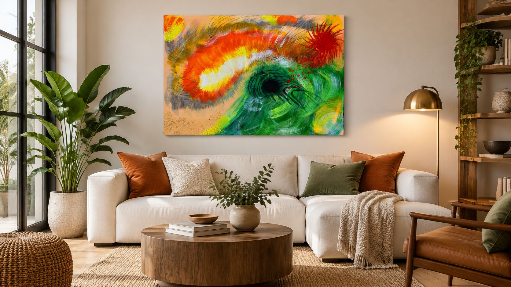
For a sense of how far gesture can carry a subject, look at William Tucker Abstract Collection - Original Environmental Art for Sale - Eye of the Storm. The catalog describes it as part of the Climate Change Series, with bright orange and yellow bursts blending with deep greens and black strokes, made with acrylic, oil, and mixed media on canvas or wood panels. In a neutral room, that kind of movement does the anchoring work a bold rug would do, pulling scattered colors into one focal point.
Size and Cropping Change Recognition
Cropping and scale can move the same image between levels. At a small size on a shelf, a heron's neck might read as an elegant curve and nothing more. Printed large, the beak and eye appear, and guests name the bird at once. Always check the exact crop at the size you'll order, not just the thumbnail.
For over a sofa, a reliable starting point is a print about two thirds to three quarters of the sofa width. Center it about 57 to 60 inches (145 to 152 cm) from the floor, which puts the middle of the work near standing eye level. If you're planning the whole wall, this guide on how to choose wall art for a room walks through proportion in more detail.
For a gallery group of three gestural pieces, keep gaps of 2 to 3 inches (5 to 8 cm) and line the animals up at the same height. Consistent spacing tells viewers the three belong together even when each creature is only hinted at. Print paper templates first and tape them up. You'll spot a cramped arrangement in minutes, before any holes go in the wall.
Edge Cases Worth Planning For
A few rooms need extra care:
- Bathrooms and steamy kitchens: Choose framed glass or metal rather than unprotected paper or canvas, because moisture is unkind to absorbent surfaces.
- West facing windows: Strong afternoon sun calls for UV filtering glazing and a wall that isn't in direct light all day.
- Nurseries: Hang framed paper under glass at child eye level for the clearly figurative row, and secure the frame well.
- Hospitality spaces: Geometric or pattern based work in acrylic face mount or framed glass handles passing traffic and varied tastes, since recognition can vary by viewer without causing a problem.
Practical rule: Give shared rooms suggestive or gestural work, and save the clearly figurative piece for a personal room you alone enjoy.
That one rule prevents most mismatches. You're not asking whether a print is good in the abstract. You're asking whether its level of clarity fits the people who'll live with it every day.
Finishes and Materials Compared Side by Side
Finish is where a lovely image either holds up for years or disappoints. Use this table to shortlist two options, then ask the seller the archival question attached to each row.
| Finish | What it looks like | Best setting | Care and archival note |
|---|---|---|---|
| Cotton rag fine art paper, matte | Soft texture, deep blacks, visible paper grain | Detailed pet and wildlife portraits, framed | Ask for pigment inks and the permanence test basis |
| Semi gloss or satin paper | Stronger colour punch, some light reflection | Vivid abstract backgrounds | Check whether optical brightening agents are present |
| Stretched canvas giclée | Painterly texture, gallery feel, ready to hang | Large living room statements | Confirm ink type and canvas coating details |
| Metal panel, dye sublimation | Sharp, glossy, luminous colour | Bold modern rooms, entryways | Ask the printer for the coating and light stability data |
| Acrylic face mount | Depth and glassy shine under the image | Hospitality lobbies, reception areas | Dust with a microfiber cloth; fingerprints show |
| Framed behind UV filtering glass | Protected, formal, gallery like | Offices, collector walls, zoo spaces | Avoid humid bathrooms; keep out of direct sun |
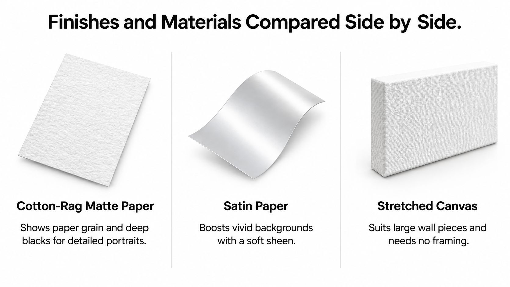
What Each Finish Does for the Animal
Matte cotton rag paper shows grain and deep blacks, so whiskers, fur, and feather edges stay readable without glare. Satin paper has a soft sheen that boosts vivid backgrounds, which helps when the abstract field carries most of the color. Ask the seller this. Which exact ink and media combination will you use for my print?
Stretched canvas suits a large living room statement and needs no framing, giving a painterly surface that flatters broad gestural strokes. Metal panels and dye sublimation produce luminous color with a sharp, modern edge. Ask the seller this. What coating protects the surface, and what light stability data supports it?
Acrylic face mount adds depth under a glassy surface, which is why lobbies and reception areas use it, though fingerprints show and you'll dust it with a microfiber cloth. Framed UV filtering glass gives offices and collector walls a formal, protected finish. Ask the seller this. Is the glazing UV filtering, and is the backing sealed against dust?
The Archival Basics in Plain Terms
Longevity depends on the complete ink and paper system, not the image file alone. Conservation guidance for artists recommends neutral or alkaline paper with low lignin, and points to permanent paper standards such as ISO 9706 or ANSI/NISO Z39.48, which address pH, tear resistance, alkaline reserve, and lignin thresholds, according to preventive conservation guidance for artists. A practical specification from that guidance is 100% cotton rag paper at about 310 to 400 gsm paired with pigment based inks rather than dye inks.
Why should you care? Pigment particles generally provide better light stability and water resistance, while paper acidity accelerates yellowing and embrittlement. Saturated abstract backgrounds show fading or hue shifts more visibly than muted areas, so the contrast between your animal and the marks around it can weaken first. Ask the seller this. Which paper standard does this meet, and are optical brightening agents present?
Care at home is simple. Display the print away from direct sunlight, store any unframed spares flat with acid free interleaving, and aim for a stable environment around 30 to 50% relative humidity. Ask the seller this. Can you put the ink, paper standard, and care notes in writing with my order?
Checking Color Accuracy Before You Order
You've probably brought a shirt home that matched perfectly in the shop, then looked slightly off in your hallway light. Prints do the same thing. With abstract animal art prints, that small shift matters because the background can be as loud as it likes, but the animal must stay sharp and believable.
A slight hue change around fur, feathers, or whiskers can flatten depth. Near neutral shadows are especially unforgiving. If a grey shadow tips green or purple, the animal can look pasted onto the background instead of sitting within it.
Delta E00 Without the Jargon
Printers measure this with Delta E00, more formally CIEDE2000 color error. In plain terms, it's a score for how different two colors look to a human eye. Lower means closer. Picture paint swatches lined up side by side. One step is barely noticeable, while several steps and anyone can see the mismatch.
One gallery production guide cites an average Delta E00 below 2 as a useful benchmark, with below 1 identified as a museum level target, in its explanation of gallery quality artwork services and color control. You don't need to run the measurement yourself. You need to know the benchmark exists so you can ask whether your printer works to one.
Good reproduction follows a predictable path. The printer uses a calibrated monitor, applies an ICC profile made for the chosen paper, and produces a physical proof before the final print. That proof is your reference point, not the image on your phone.
The shirt problem has a name, metamerism, meaning colors appear to change under different light sources. Comparing proof and print under the same consistent, neutral lighting avoids false alarms. Check them side by side in daylight balanced light, not under a warm lamp one day and a kitchen strip light the next.
Use this short checklist before you pay:
- Request a proof: Ask for a signed or retained proof you can compare against the final print.
- Ask for the paper profile: Request the profile name and the viewing light conditions used for approval.
- Confirm the ink: Ask whether the final print uses pigment inks, and get that in writing.
- Inspect the edges: Look closely at shadow transitions and complementary color edges near fur, feathers, and whiskers.
A small sample swatch on the actual paper can save a costly reprint at full size.
That swatch tells you more than any screen preview. If the background overwhelms the animal at proof stage, it's far cheaper to adjust then than after framing.
Judging Sustainability Claims Without the Hype
Eco friendly is the most overworked phrase on art product pages. It sounds reassuring, but it rarely tells you what to compare. One seller means recycled packaging, another means a particular paper, and a third means very little at all.
Demand is clearly part of the story. One industry report claims that 70% of art collectors are willing to pay a premium for eco friendly artworks, a figure presented in this report on the global art industry going green. Treat that as a claim from that report, not as proof about any specific print you're considering. Your job is to verify the product in front of you.
Work through this verification checklist and note which answers a seller can document.
- Paper or canvas certification: Look for FSC or another clearly stated source, named specifically rather than described as green.
- Fiber type: Ask whether the fiber is recycled or responsibly sourced virgin fiber, since those are different claims.
- Ink technology: Ask what ink system is used and how it relates to the print's expected lifespan.
- Packaging materials: Ask what protects the print in transit and whether that packaging can be reused or recycled locally.
- Made to order or bulk: Ask whether the print is produced when you order or pulled from stock printed in quantity.
- Size and shipping distance: Note the format and how far the finished, possibly framed, piece will travel to reach you.
Here's the contrarian point worth sitting with. The greenest choice isn't automatically the material with the loudest marketing claim. A durable, archival print that stays on your wall for decades avoids the waste of replacement. Meanwhile, an oversized format shipped across an ocean in a heavy frame can outweigh a small advantage in paper choice.
Framing belongs in the calculation too. A frame you'll keep and reuse tells a different story from one bought cheaply and discarded. Disposal counts as well, even if it's decades away. Materials that local services can handle in practice beat theoretical recyclability.
Which combination of material, size, framing, longevity, and delivery creates the lowest realistic impact for my location?
That's the key question. If a seller answers each checklist item plainly, you've found transparency. If you get only adjectives, you haven't.
How to Commission a Custom Animal Print
A commission sounds grand, but it's really a series of small, clear agreements. William Tucker Art describes an approach that pairs custom pet and wildlife portraits with abstract backgrounds, which is the same balance you've been learning to judge. A detailed subject holds the eye while expressive marks supply the mood.
If you want background reading before you start, this walkthrough on how to commission an artist covers the relationship side of the process. The steps below turn that into a practical order of operations.
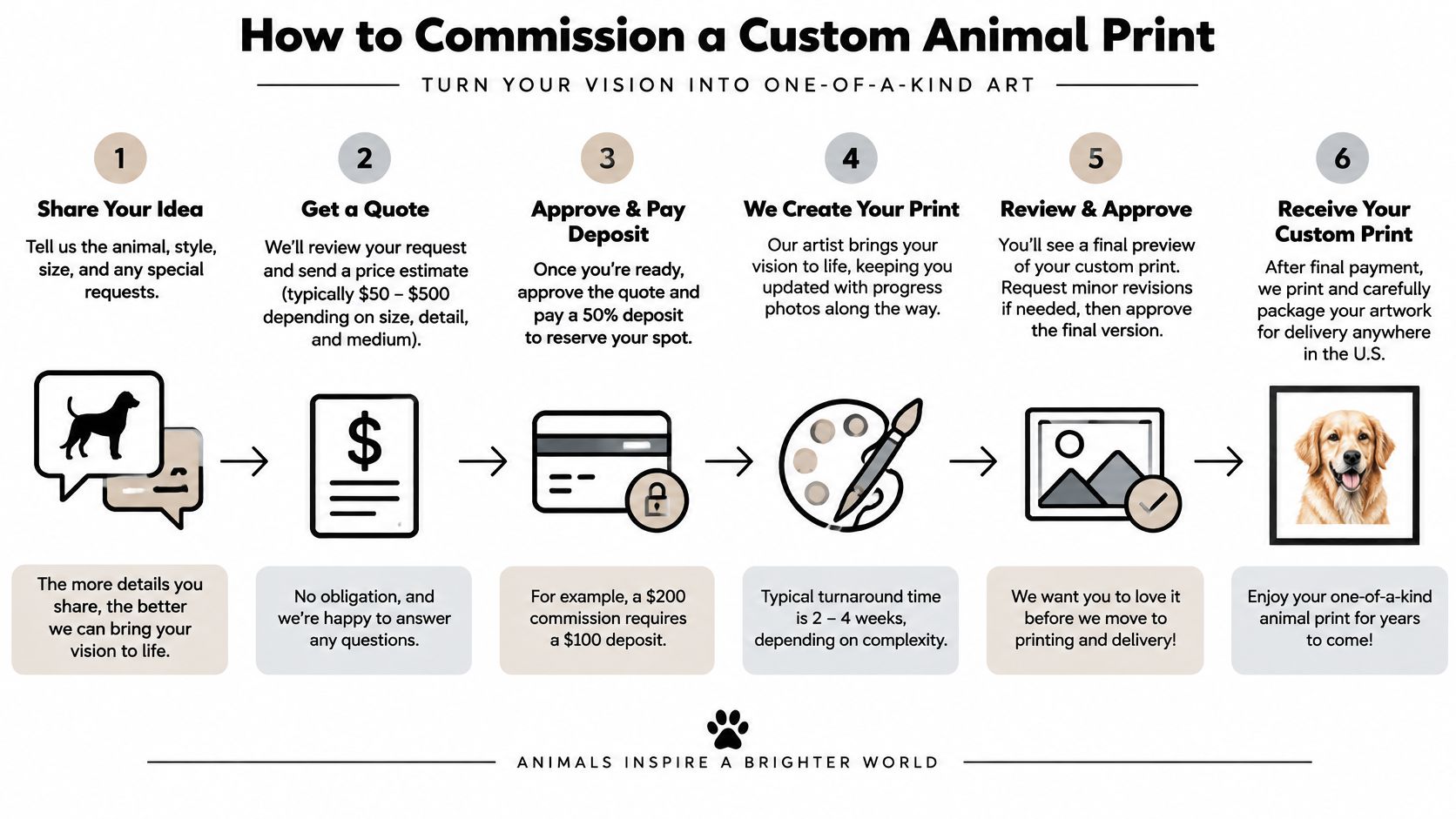
The Eight Steps
- Share reference photos and a room photo: Send clear photos of the animal plus a photo of the wall where the print will hang, because placement shapes composition, scale, and how much background the piece needs.
- Choose your recognition level: Pick a row from the style table, clearly figurative, suggestive, or gestural, so the artist knows how literal to be. This single decision prevents the commonest disappointment, a portrait that's more abstract, or less, than you imagined.
- Pick a background palette: Choose two to four colors that either echo the room or deliberately contrast with it. For example, William Tucker Original Landscape Wall Art Abstract Collection - Mountain Abstract is described in the catalog as Mountain Sunset, with layered blue mountains and gold sky strokes, showing how loose color can frame a subject without copying it.
- Review a sketch or digital preview: Check the animal's scale and crop at this stage. Moving a head turn or widening a crop is easy now and painful later.
- Approve a physical or retained proof: Compare it under neutral light and confirm the paper profile and lighting notes, using the same checks from the color section above.
- Confirm finish, size, and framing in writing: Agree the timeline and total cost before production starts, so there are no surprises about what arrives or when.
- Agree the edition rules: Settle whether prints are limited or open before the first one is made, not after.
- Inspect the delivered print: Hold it beside the approved proof under neutral light and check the shadow transitions around the animal before framing.
Edition Terms to Understand First
Two terms decide how exclusive your print is. A limited edition states a fixed number of numbered prints, after which the image is closed and no more are produced. An open edition has no set limit and may be reprinted.
Neither is automatically better. A limited edition suits a collector who values a defined run, while an open edition suits a gift you'll want to reorder for family. What matters is clarity.
Ask three questions. Which type applies to my print? Is each print signed? How is the edition count recorded? Get the answers in writing alongside size, finish, and timeline, and your commission rests on facts rather than assumptions.
Confirm These Specs and Choose Your Print
You're ready to decide, and the order matters. Start by choosing a row in the style and room table, then run the two second self test to confirm the recognition level feels right for the people who'll see it daily.
Next, run the three checks you've built up. Confirm the finish's archival specification, including ink and paper standard. Approve a proof before printing, checked under neutral light. Verify the sustainability facts a seller can document, rather than accepting a label.
Browse the Abstract Collection at williamtuckerart.com to see how original works balance expressive backgrounds with recognizable subjects. The examples discussed earlier both have prints listed, so ask the artist for current sizes, finishes, and pricing rather than assuming them.
Do one final test before committing. Hang a printed sample or proof on the wall for a week and look at it in morning and evening light. If you still spot the animal at the pace you wanted, and the colors hold up in both lights, you've found your print. Ask your questions about custom work now, and request that proof before you order.
William Tucker Art offers wildlife and pet portrait work that pairs detailed animal subjects with expressive abstract backgrounds, alongside originals and prints in its Abstract Collection. If you're choosing abstract animal art prints for a home, a gift, or a custom portrait, visit William Tucker Art to browse the collection and ask about a proof for your wall.