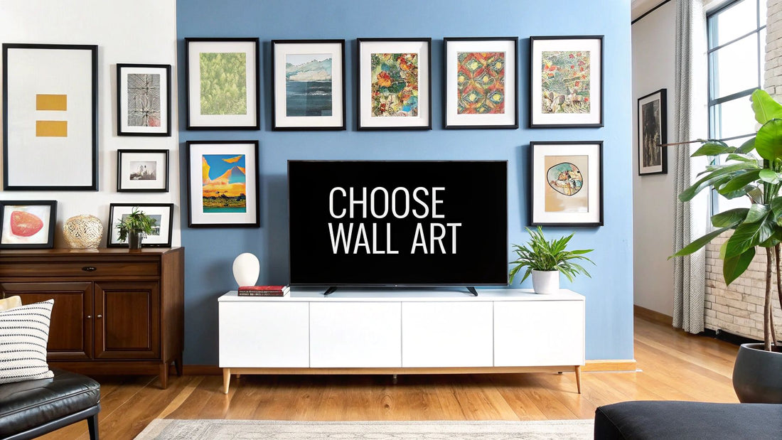
Picking the right art for your walls can feel like a huge challenge, but I've found it really just comes down to four things: your personal style, the size of the piece, its colors, and where you plan to hang it. Once you get a handle on these, the whole process shifts from being overwhelming to actually being a lot of fun. You'll end up with art that doesn't just hang there, but truly feels like it belongs.
A Simple Roadmap for Selecting Wall Art
Before you dive headfirst into browsing online galleries or local shops, take a moment to step back and build a vision. Trust me, without a plan, it’s all too easy to fall in love with a piece that looks stunning on its own but feels completely wrong once you get it home.
Thinking about how to choose wall art isn't about finding one single "perfect" painting. It’s more about understanding how a piece will live and breathe in your space. A little bit of planning upfront will save you so much time, money, and the inevitable headache of a purchase you regret.
The whole point is to stop guessing and start choosing with intention. You're not just plugging a hole on a blank wall; you're creating a mood and telling a story about who you are. The right piece can be the final touch that pulls a whole room together, create a stunning focal point, or inject that little burst of energy it was missing.
To get you started, here's a quick cheat sheet covering the four main things I always consider. Think of it as a simple filter to help you narrow down the endless options out there.
The Four Pillars of Choosing Wall Art
| Pillar | Key Question to Ask Yourself | Why It Matters |
|---|---|---|
| Personal Style | What's the overall vibe of my room? Is it modern and minimalist, cozy and rustic, or eclectic and bohemian? | Your art should feel like a natural extension of your existing decor, not an awkward guest at a party. It needs to complement the room's personality. |
| Size & Scale | How big is the wall, and what furniture is around it? | Proportions are everything! The right scale creates visual harmony, while the wrong one can make a room feel unbalanced or cramped. |
| Color Palette | Do I want the art to blend in with my current colors or stand out as a bold statement piece? | Color sets the mood. It can either create a serene, cohesive look or introduce an exciting, eye-catching contrast. |
| Placement & Purpose | Is this piece meant to be the star of the show above the sofa, or a subtle accent in a quiet nook? | Where you hang your art determines its impact. The placement defines its role in the room—is it a focal point or a supporting character? |
Thinking through these four pillars gives you a solid foundation for your search. It’s the difference between wandering aimlessly and shopping with a clear, confident purpose.
By grounding your search in these four areas, you create a filter that makes navigating the vast world of art significantly easier. It’s the difference between wandering aimlessly and shopping with purpose.
This kind of intentional approach is more important than ever. The global wall art market is already valued at around $5 billion and is only getting bigger, mostly because we all want our homes to feel more personal. With so many options online, having a clear strategy is a must. You can learn more about the growing wall art market to see just how massive the industry is.
This guide will give you that strategy, turning you into a confident art buyer who knows exactly what they’re looking for.
Getting to Know Your Personal Decor Style
Before you even start scrolling through galleries, take a look around. The best art choices don't happen in a vacuum; they start with understanding the story your room is already telling. To pick something that truly feels right, you need to get specific about your own aesthetic—moving past generic labels like "modern" or "bohemian" to figure out what you genuinely love.
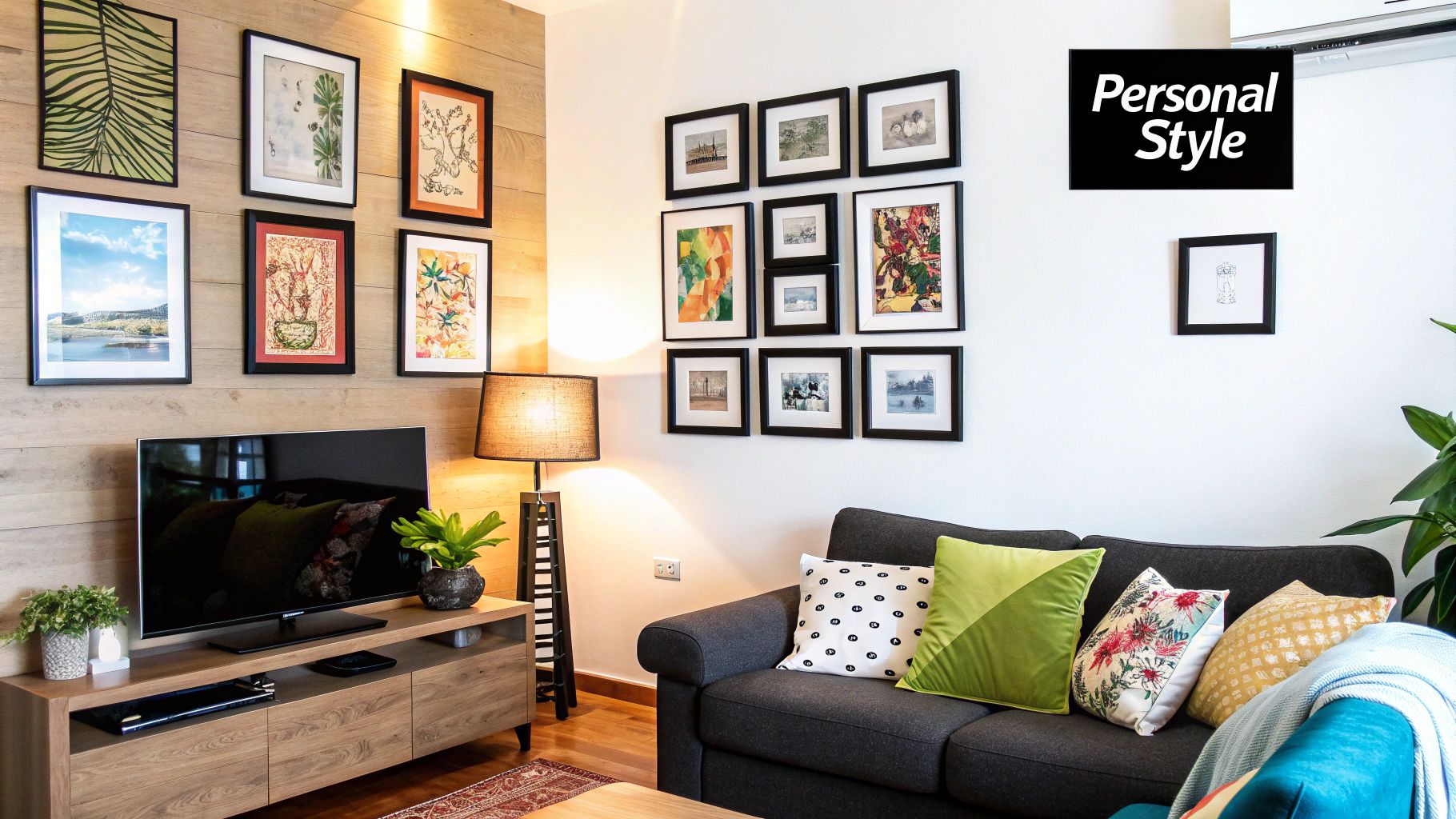
Your home is already dropping hints. Look at your furniture. Are the lines sharp and clean, or are they soft and curvy? What about the colors and textures you're drawn to in your throw pillows, rugs, and even the clothes in your closet? These are the clues that define your unique style.
A fantastic way to get clarity is by starting a Pinterest board, but with a twist. Don't just pin images of rooms you like. In the notes for each pin, jot down exactly what you love about it. Is it the dramatic, moody color scheme? The calm, uncluttered vibe? The cozy jumble of textures? This little trick helps you move from a vague "I like that" to a concrete list of elements you can look for.
Pinpointing Your Preferred Art Style
Once you’ve got a handle on your room's overall vibe, you can zero in on art styles that will feel right at home there. Different genres of art can completely change the mood of a space, so it helps to think about the feeling you're trying to create.
Here are a few popular styles and the atmosphere they tend to evoke:
- Abstract Art: This is all about feeling. It uses color, shape, and form to spark an emotion rather than show a literal picture. A bold abstract piece can be the perfect energetic focal point for a modern or eclectic room.
- Landscape and Nature Art: From serene seascapes to powerful wildlife photography, pieces that bring the outdoors in can instill a real sense of calm. These are incredibly versatile and can work just as well in a rustic farmhouse as in a sleek, contemporary apartment. If you're curious, you can dive deeper into the world of nature-inspired wall art and see how it transforms a room.
- Minimalist Art: Think simplicity, clean lines, and a muted color palette. Minimalist art is your go-to for creating a sophisticated, uncluttered, and peaceful environment. It’s about making a quiet but confident statement.
- Portraiture and Figurative Art: Art featuring people or animals brings a deeply personal, soulful touch to a space. It creates a sense of connection and storytelling, making a room feel more intimate and truly lived-in.
The goal isn't to find a piece that rigidly fits into one box. It's about finding art that speaks the same language as the rest of your room. The right piece should feel like a natural extension of your personal style, finishing the conversation your decor already started.
When you take a moment to understand your own taste first, you gain the confidence to spot the art that feels genuinely you. Suddenly, the whole process transforms from a daunting chore into an exciting act of self-expression. You'll stop worrying about what you're supposed to like and start choosing what you truly love.
Getting Scale and Proportion Just Right
You could find the most stunning piece of art in the world, but if it's the wrong size for your wall, the whole room will feel slightly… off. Honestly, getting the scale right is probably the most critical technical part of choosing wall art. It’s what separates a room that looks professionally designed from one that just feels a bit random.
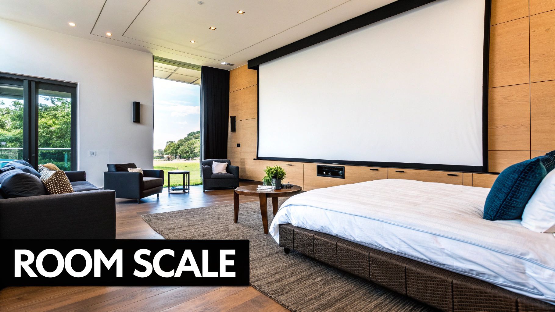
The biggest mistake I see people make? Choosing art that is way too small. A tiny frame floating on a big, empty wall looks like an afterthought and can make the entire space feel unfinished. On the other hand, a piece that’s way too massive can swallow the room whole, making it feel cramped and unbalanced. You're looking for that "just right" Goldilocks size—something that commands attention without completely dominating the conversation.
The Two-Thirds Guideline
Here’s a fantastic rule of thumb that I use all the time, especially for hanging art above furniture like a sofa, headboard, or console table. It's called the two-thirds rule.
Basically, your artwork (or a grouping of pieces) should be about two-thirds the width of the furniture it’s hanging over.
Let's say your sofa is 90 inches wide. You should be looking for a piece of art, or a gallery wall arrangement, that measures around 60 inches across. This simple trick creates a beautiful visual anchor, connecting the art to the furniture and making them feel like a single, cohesive statement.
Finding the Perfect Hanging Height
Just as important as width is height. So many people hang their art too high, leaving it floating awkwardly near the ceiling, totally disconnected from the rest of the room. A couple of simple guidelines will fix this instantly:
- The 57-Inch Rule: This is the magic number. Aim to hang your art so its center point is 57 inches from the floor. Why? Because that’s the average human eye level, and it’s the standard galleries and museums use to create a comfortable viewing experience.
- The 6-8 Inch Gap: When you’re placing art above furniture, leave a gap of just 6 to 8 inches between the top of the furniture and the bottom of the frame. This keeps the whole composition tight and prevents that disconnected, floating look.
Pro Tip: Before you even think about grabbing a hammer, use painter's tape to mark out the dimensions of your potential art on the wall. Live with that blue rectangle for a day or two. This is the easiest way to see how the size and placement actually feel in your space, and it can save you from a lot of spackle and regret.
Getting these little details right has become a big focus for homeowners lately. During the pandemic, a whopping 57% of homeowners dived into home improvement projects, and a lot of that energy went into decor and art to make their living spaces more personal and beautiful. This trend also brought a love for different textures, with people exploring everything from canvas to metal and wicker. It just goes to show that both scale and material matter. You can read more about these home improvement trends and how they've shaken up the art market.
At the end of the day, remember that these are just guidelines, not strict laws. The most important thing is that you love how your space feels. But by keeping these principles of scale and proportion in your back pocket, you’ll be able to make choices with confidence and get that professionally styled look you’re after.
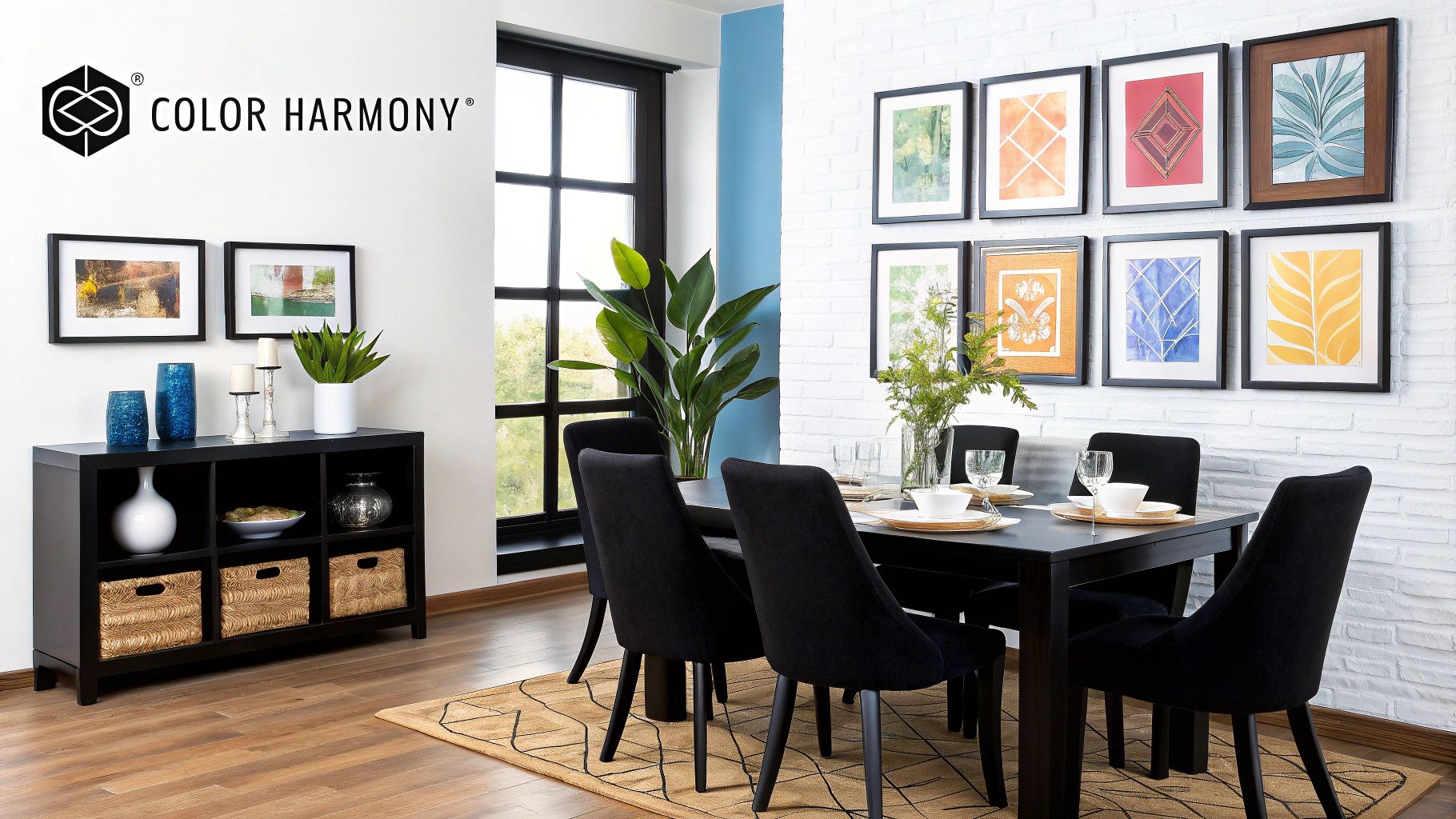
Using Color to Unify Your Space
Color is the secret sauce of interior design. It sets the mood, creates a vibe, and gives a room its unique energy. Your wall art is a huge part of that conversation. It can either be a subtle supporting actor or the star of the show—and you get to decide which role it plays.
Don't worry, this isn't about memorizing a complex color wheel. It's much simpler than that. It all comes down to what you want to feel when you walk into the room.
Take a look at your room's current palette. Are you aiming for a calm, cohesive retreat where everything flows together seamlessly? Or do you want a jolt of energy—a dramatic focal point that makes people stop and stare? Once you know that, you'll know exactly how to pick the perfect piece.
The Complementary Approach: Creating Harmony
If you want a polished, designer look without the guesswork, this is your go-to strategy. The idea is to choose art that picks up on colors already in your room. It’s a classic trick for making your art feel like it was always meant to be there.
Look around the room for your color cues. They're everywhere!
- The pattern in your rug
- The accent colors in your throw pillows
- The shade of your curtains
- Even that favorite ceramic vase on the mantel
Zero in on one or two of those colors and hunt for art that features them. It doesn’t have to be a perfect match, just in the same family.
Let’s say you have a grey sofa with a couple of deep navy blue pillows. A landscape painting with a moody blue sky or an abstract with just a hint of navy will instantly tie the whole room together. The art doesn't need to scream "blue!"—even a whisper is enough to create that beautiful, intentional connection.
The Contrasting Statement: Making a Bold Move
Sometimes, a room just needs a little bit of drama. It needs a "wow" moment. This is where a contrasting piece of art comes in to steal the show. Instead of blending in, you choose art that pops, creating an exciting focal point that’s full of personality.
This works especially well in rooms with a lot of neutrals. A space filled with soft beiges, greys, and whites is the perfect canvas for a piece of art bursting with vibrant, saturated color. Just imagine a large abstract canvas with fiery reds and oranges hanging in an otherwise calm, neutral living room. It's instant energy.
The trick is to make it feel deliberate.
A contrasting piece of art acts as the exclamation point in your room's design story. It's a confident choice that says, "Look at me," drawing the eye and adding a layer of drama and sophistication.
To pull this off without it feeling random, make sure the style of the art still fits your home's vibe. A bold, graphic print might feel a bit jarring in a rustic farmhouse setting, but a vibrant, colorful landscape could fit right in. The key is to find a contrast that feels exciting, not out of place.
Choosing the Right Materials and Mediums
The image on your art is only half the story. The material it’s printed on—the medium—tells the other half, adding texture, depth, and a whole lot of character that can completely transform how a piece feels in your room. When you look beyond a standard canvas print, a whole world of unique, tactile possibilities opens up.
Think about the distinct vibe each material gives off. A high-gloss metal print feels sleek and almost industrial, perfect for a clean, contemporary space. On the other hand, art printed on wood or framed with reclaimed timber brings an immediate sense of rustic warmth and natural texture. It just makes a room feel cozier and more grounded. Then you have acrylic pieces, which offer this incredible, light-catching vibrancy with a glossy finish that’s both polished and full of energy.
Matching Material to Your Vibe
The key is to choose a material that speaks the same language as your room's overall style. It’s all about creating a cohesive sensory experience.
For example, if you’re pulling together a beach house look or just want a relaxed, airy feel, materials like distressed wood, woven textile art, or even delicate paper pieces can really enhance that breezy atmosphere. It's something we get into a lot in our guide to coastal wall art ideas, where texture and medium are crucial for nailing that specific aesthetic.
Here are a few popular options and where they shine:
- Canvas Prints: The timeless, go-to choice. Its subtle texture adds a classic, artistic feel that honestly works with almost any style you can think of.
- Metal Prints: These are incredibly durable and known for making colors pop with sharp, vivid detail. They're a fantastic choice for high-impact photography and modern abstract art.
- Wood Art: You can’t beat wood for a warm, organic feel. It’s perfect for rustic, bohemian, or any nature-inspired decor.
- Acrylic Prints: For a sleek, gallery-quality look, this is it. Acrylic delivers stunning color depth and a glossy, reflective surface that feels incredibly high-end.
Making Choices That Align With Your Values
More and more, people are thinking about where their decor comes from, not just how it looks. It's about conscious consumerism, and this shift is having a huge impact on how we decorate our homes.
Choosing sustainable art isn't just a trend; it's a statement. It reflects a desire to create a home that is not only beautiful but also thoughtful and aligned with personal ethics.
This isn’t just a feeling; the numbers back it up. The US wall décor market is projected to grow by an impressive $10.53 billion between 2024 and 2028. A massive driver behind this is sustainability, with studies showing around 83% of consumers prefer buying from brands with strong eco-friendly practices. This has really fueled the demand for art framed with natural materials like wood and metal, which offer both a premium feel and a welcome connection to nature. You can read more about these wall art trends and consumer choices and see how much this is shaping the industry.
When you choose your wall art, you’re really investing in the story of your home. Opting for pieces from local artists, fair-trade artisans, or those using eco-friendly framing allows you to make a choice that not only looks fantastic but feels genuinely good, too.
Your 6-Step Gut-Check Before Buying Wall Art
Alright, you've done the hard work of exploring styles, colors, and sizes. Now comes the exciting part: making that final choice. Think of this as your last-minute gut-check, a quick rundown to make sure the piece you’re about to buy is one you'll love for years to come.
Before you pull the trigger, let’s run through the essentials one last time.
The Big Three: Style, Scale, and Color
First, take a step back and look at the big picture. Does the artwork’s style actually feel right with your existing decor? You’re not just filling a space; you’re adding to the room’s personality.
Then, double-check your measurements. Have you confirmed the scale is right for the wall? Remember the two-thirds rule for hanging art above a sofa or headboard—it's a game-changer. Finally, consider the colors. Will the piece harmonize beautifully with your current palette, or will it create that bold, intentional contrast you’re aiming for?
Ultimately, the most important rule is to pick something you absolutely love. Guidelines are fantastic starting points, but that genuine connection to a piece of art is what really makes a house feel like home.
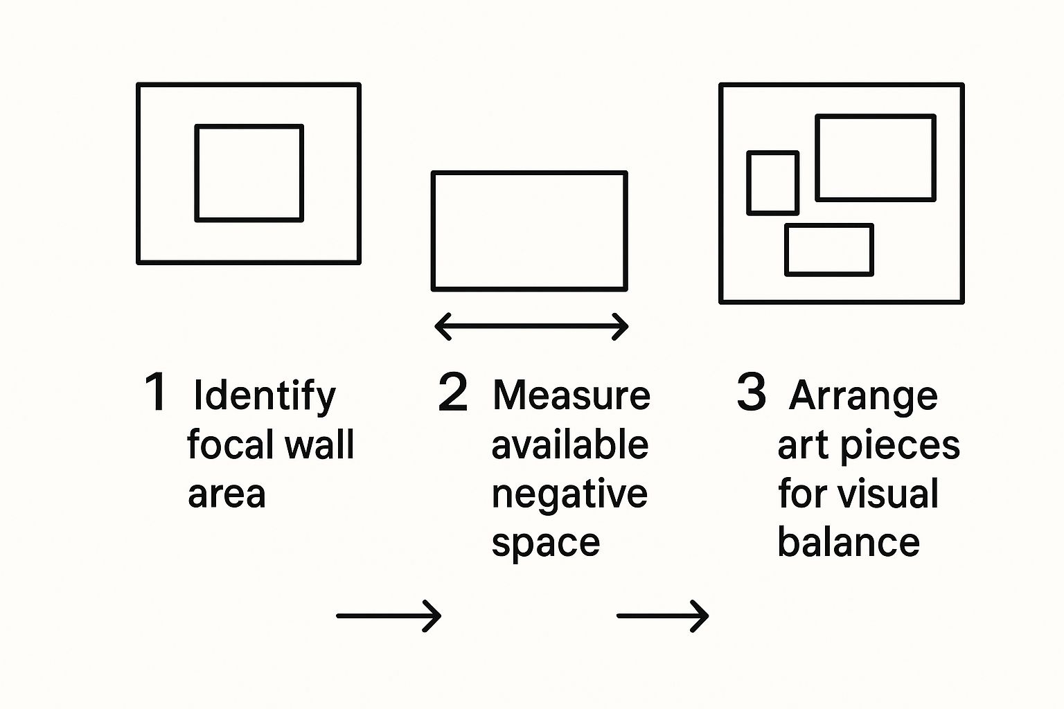
This simple guide can help you visualize the process from start to finish, ensuring you consider both the space and the arrangement for a balanced, professional look.
A Couple of Pro-Tips from the Trenches
Still feeling a little unsure? I've been there. Here are two tricks I always rely on to avoid buyer's remorse:
-
The Painter's Tape Trick: Grab a roll of painter’s tape and outline the exact dimensions of the artwork on your wall. It’s a surprisingly effective way to visualize the scale and impact before you even bring it home.
-
Try It On Virtually: Many galleries and online art stores now have augmented reality (AR) features in their apps. You can use your phone to "hang" the art on your wall and see how it looks in your actual space, with your lighting. It’s the modern-day equivalent of taking a fabric swatch home.
Got Questions? We’ve Got Answers
Even after you've considered all the big picture stuff—style, color, and scale—a few practical questions always seem to pop up right when you're about to pull the trigger. It's completely normal.
Let's walk through some of the most common head-scratchers I hear all the time. Getting these details right is what separates a good room from a great one.
How High Should I Hang This Thing?
This is, without a doubt, the number one question people ask. The good news is there's a pretty standard rule that galleries and designers swear by.
You'll want to hang the artwork so the center of the piece is at eye level, which for most people lands somewhere between 57 and 60 inches from the floor. This creates the most natural and comfortable viewing experience.
What if you're hanging it over a sofa or a console table? A good guideline is to leave about 6 to 8 inches of space between the top of your furniture and the bottom of the art. This helps the two pieces feel connected, rather than having your art look like it's just floating aimlessly on the wall.
Does My Art Need to Match My Sofa?
Not at all! In fact, it probably shouldn't. The goal is coordination, not matching. You want your art to feel like it belongs in the room, not like it came as a set with the couch.
A great way to do this is to pick a piece of art that pulls in an accent color from somewhere else in the room. Maybe it echoes the color of your throw pillows, a detail in your rug, or even a ceramic lamp. This creates a really nice, subtle thread that ties everything together.
On the other hand, if your room is mostly neutral, a bold, contrasting piece of art can be an incredible focal point. It’s all about creating a conversation between the different elements in your space.
Is It Okay to Mix and Match Art Styles?
Absolutely! I’m a huge fan of this. Mixing different art styles is what gives a room personality and makes it feel uniquely yours—like it’s been curated over time. Think about a great gallery wall; they almost always feature a mix of styles, mediums, and eras.
The key to making a mixed-style collection look intentional is to find a unifying element. This could be a consistent color palette that runs through each piece, similar frame styles (like all simple black frames or all natural wood), or even a common theme, like landscapes or portraits.
Help! My Wallpaper Is Really Busy. What Art Do I Choose?
When your walls are already making a statement, you want your art to complement the pattern, not fight with it. The last thing you want is a visual battle happening on your walls.
Look for art that has plenty of negative space—those quiet, empty areas that give your eyes a place to rest. Simple line drawings or classic black-and-white photographs are fantastic choices.
Another pro tip is to use a frame with a wide mat. That clean, white border creates a visual buffer, separating the art from the busy wallpaper and helping it stand out in a calm, confident way.
At William Tucker Art, we know that finding the right piece is about more than just filling a wall; it’s about telling your story.
Ready to find art that truly speaks to you? Explore our collections of stunning wildlife and coastal art and discover your next masterpiece.