
Animal prints in home decor aren't just about making a wild statement. When used thoughtfully, patterns like leopard, zebra, or snakeskin bring a layer of texture, drama, and personality that can truly elevate a room. I've seen designers treat these prints as sophisticated neutrals for years, and for good reason—they can anchor a space or act as that perfect, playful accent. It’s all about balance.
Why Animal Prints Will Always Be in Style
Let's get one thing straight: animal prints are not tacky. Any outdated ideas of gaudy, over-the-top rooms are long gone. Today, these patterns are roaring back into modern homes, and they’re celebrated for bringing a touch of untamed elegance and dynamic energy. This isn't just some passing fad; it’s a reflection of how we're all trying to create more personal, visually interesting spaces that tell a story.
What gives animal prints their staying power? It’s their unique duality. A classic leopard spot can feel both glamorous and earthy at the same time. A graphic zebra stripe works just as well in a super modern space as it does in a classic one. This incredible versatility is why they fit so beautifully into just about any aesthetic, from full-on maximalism to clean and simple minimalism.
The New Neutrals of the Design World
One of the biggest mindset shifts I've seen in recent years is designers treating certain animal prints as neutrals. It makes perfect sense. Just like beige, gray, or black, patterns like leopard and snakeskin are often built on a palette of neutral colors—think browns, blacks, tans, and creams. This means they can complement almost any color scheme you throw at them.
I always tell my clients to think of a leopard print rug like a great pair of jeans. It grounds the "outfit" of the room, adds a bit of texture, and pretty much goes with everything. It adds visual interest without screaming for attention, making it a fantastic foundation to build upon.
This perspective is really catching on in the professional design world. As people move away from cookie-cutter interiors, the demand for character-filled spaces has brought these patterns to the forefront. A recent Designer Trends Survey actually showed a notable jump in designers planning to use animal prints, with the number rising from 4% to 6% in just one year. You can dig into this growing trend and its impact on modern decor to see how it's shaping today's homes.
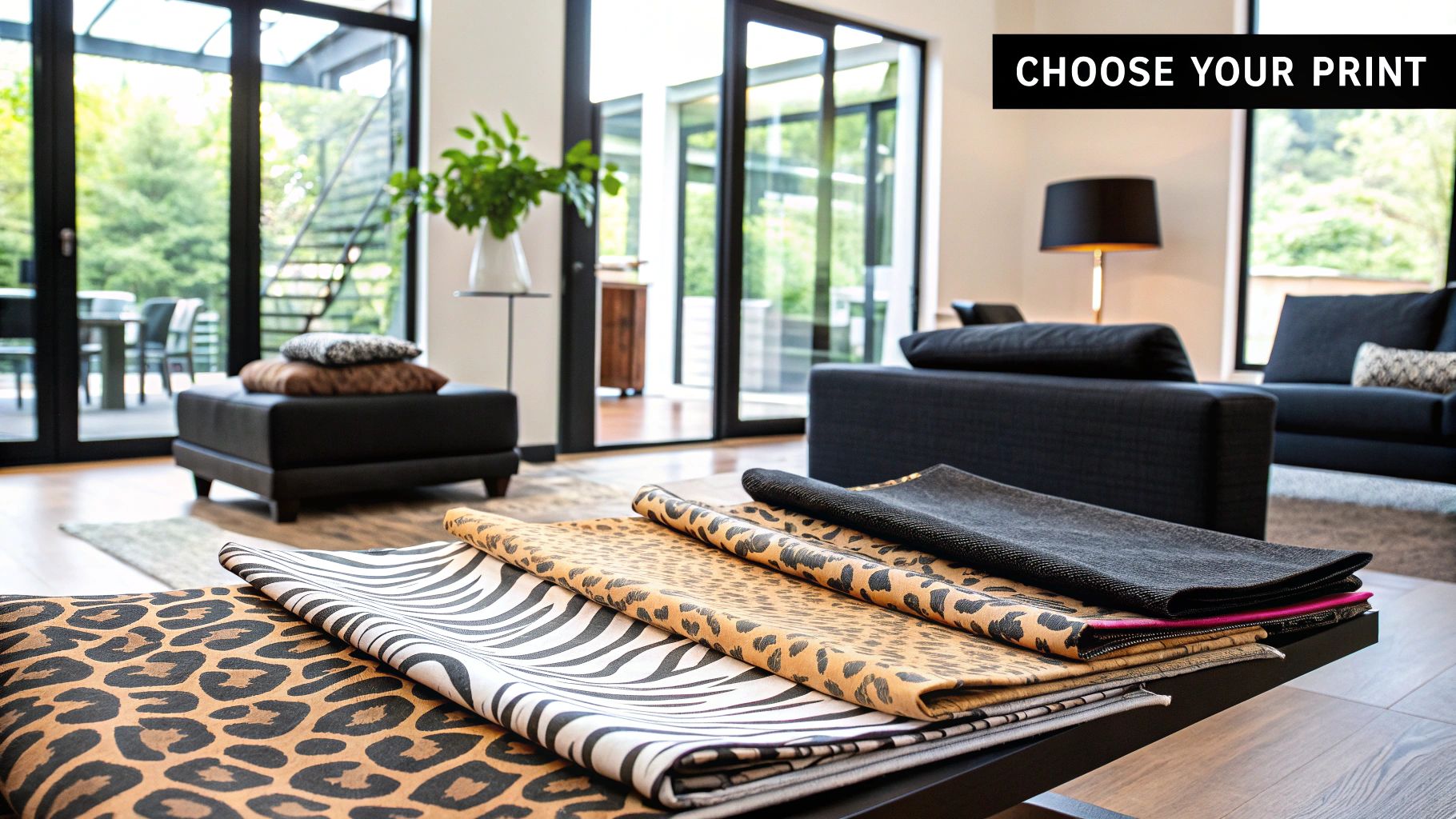
Picking Your Print
While the animal kingdom offers endless inspiration, a few patterns consistently rule the interior design landscape.
So, how do you choose the right one for your space? It really comes down to the mood you want to create. Here’s a quick breakdown to help you decide.
Choosing Your Go-To Animal Print
| Print Type | Best For | Vibe & Feel |
|---|---|---|
| Leopard | Rugs, accent chairs, throw pillows | Timeless, glamorous, and a bit earthy. A classic for a reason. |
| Zebra | Ottomans, runners, artwork | Bold, graphic, and modern. Adds a high-contrast punch. |
| Snakeskin | Vases, lampshades, trays | Subtle, sophisticated, and luxurious. Great for small, chic accents. |
| Tiger | Upholstery, large-scale rugs | Dramatic, warm, and powerful. Makes a confident statement. |
| Cowhide | Rugs, armchairs | Rustic, organic, and textural. Perfect for adding a natural touch. |
Each print brings its own unique energy, so think about what your room needs. Are you looking for a classic foundation or a pop of modern drama?
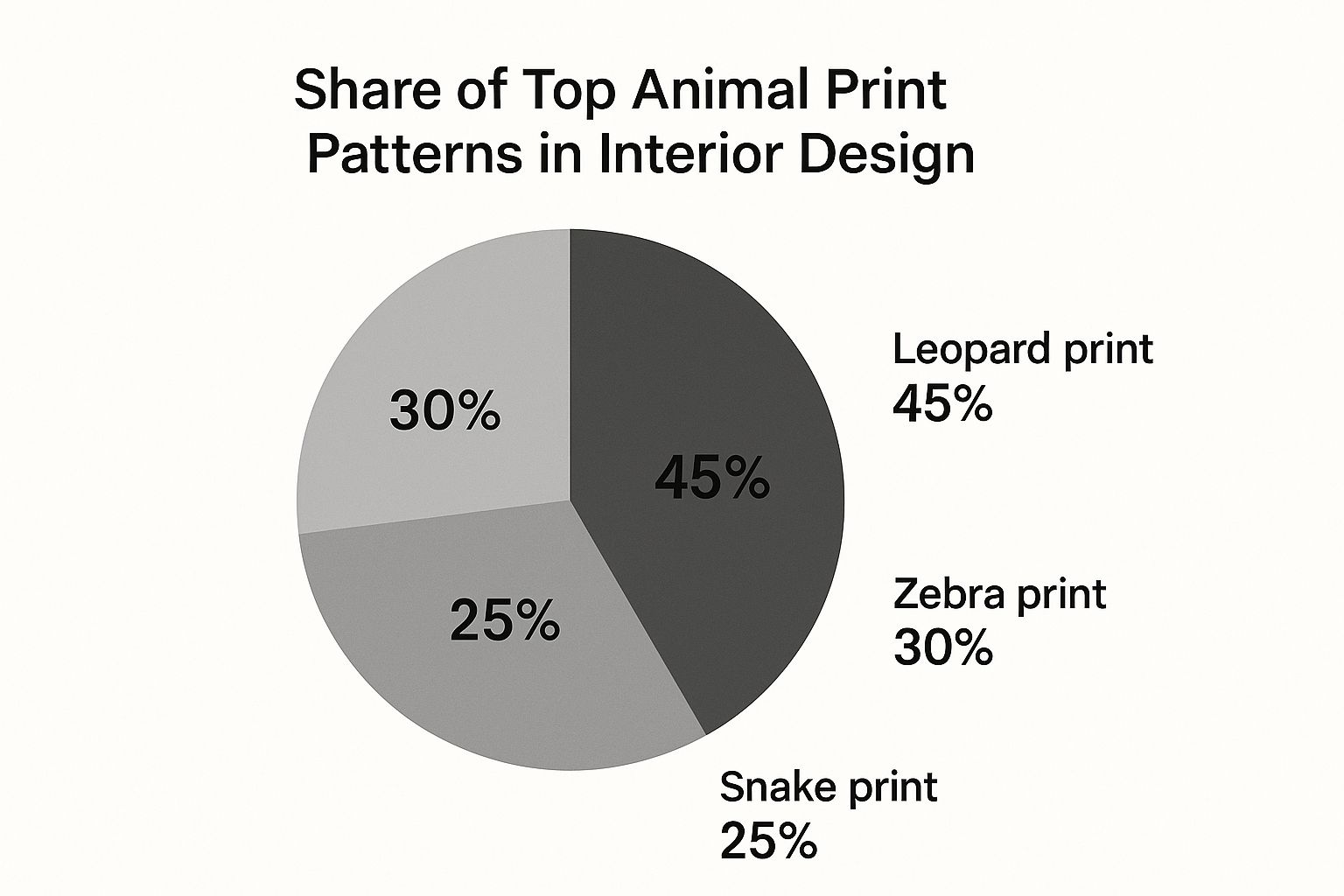
As you can see, leopard print is still the undisputed favorite, loved for its warm tones and incredible versatility. With 45% of the vote, it’s the go-to for designers and homeowners who want a pattern that’s both chic and easy to work with.
Think Small: Starting with Subtle Animal Print Accents
Jumping into the world of animal prints doesn't mean you have to reupholster your entire sofa in leopard. In fact, some of the most stunning rooms I've seen get their wild side from thinking small. Subtle accents are the perfect way to test the waters and add a little personality without a huge commitment.
Think of it like adding a bold spice to your favorite dish—a little bit makes a big difference. A single tiger-print lumbar pillow tossed on a classic armchair can bring instant warmth and character. Or imagine a chic snakeskin tray on your coffee table; it's not just a pretty object, it's a glamorous way to wrangle remotes and coasters. These small touches are incredibly low-risk but offer a huge visual payoff.
How to Choose Your First Accent Piece
When you're just starting out, stick with pieces that are easy to change. This gives you the freedom to play around and figure out which patterns speak to you without any buyer's remorse. These little accessories are often the final touch that ties a whole room together, making it feel complete and thoughtfully designed.
Here are a few ideas that are almost impossible to get wrong:
- Pillows & Throws: This is the easiest entry point, hands down. A pair of leopard print pillows on a solid sofa or a zebra-striped throw casually draped over the foot of your bed is a classic for a reason.
- Rugs & Runners: A small faux cowhide rug layered under a coffee table or an antelope-print runner in a hallway adds incredible texture and helps define the space.
- Decorative Objects: Look for smaller opportunities to introduce a pattern. Think a set of giraffe-print coasters, a tortoiseshell picture frame on a side table, or even a stylish storage box.
- Lampshades: This is one of my favorite tricks. Swapping a boring, plain lampshade for one with a subtle pattern creates an unexpected design moment and a wonderfully warm glow when the light is on.
The real magic of using accents is how they add a layer of sophistication without clashing with what you already own. A well-placed print can make your primary color scheme pop and help the whole room feel more cohesive.
Getting the Scale and Placement Just Right
So you've found the perfect accent. Now what? The key is thinking about its scale and where it's going to live. You want it to be a delightful surprise, not a visual shock. For a balanced look, the size of the pattern should feel right for the size of the object. A tiny, detailed print can get lost on a large rug, while a giant, bold pattern might completely overwhelm a small decorative pillow.
For instance, a single, beautifully upholstered cheetah-print ottoman can serve as the focal point in your living room. It naturally draws the eye without taking over the entire space. Just place it in front of a neutral sofa and let it be the star.
If you're using several smaller accents, a little more strategy is needed. If you have leopard pillows on your couch, try not to put a leopard-print vase on the end table right next to them. Instead, spread that energy around the room. A pillow on one side and a matching picture frame on a bookshelf across the way creates a subtle rhythm that guides your eye through the space. It’s that kind of thoughtful placement that makes a design feel truly curated.
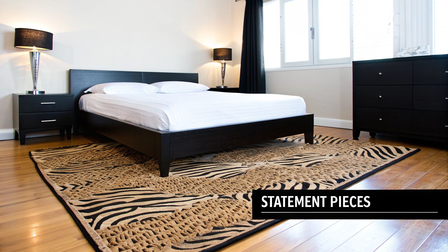
Making a Statement with Bold Furniture and Walls
Ready to move beyond subtle touches? This is where the real fun begins. If you’re itching to make a more dramatic impact, splashing animal print on a major piece of furniture or even a wall can take a room from "nice" to absolutely unforgettable. It’s all about picking one powerful piece to anchor the space and set a confident, fearless tone.
Picture a chic cheetah-print ottoman holding court in the center of your living room. Or maybe a sophisticated zebra-stripe armchair tucked into a cozy reading nook. These aren't just pieces of furniture—they're functional works of art that demand a second look. The trick is to let one item be the hero, allowing it to shine without having to compete with everything else.
Choosing Your Statement Piece
When you commit to a bold piece like this, proportion and placement are everything. A large-scale pattern needs a little room to breathe. I find they work best on furniture with clean, simple lines, like a modern club chair or a streamlined bench at the foot of a bed. This approach keeps the design from feeling cluttered and guarantees the print remains the star of the show.
Here are a few high-impact ideas I've seen work beautifully:
- The Statement Chair: An armchair upholstered in a classic leopard or a bold tiger print is a timeless choice. It adds instant glamour to a living room corner or a quiet spot in a bedroom.
- The Grounding Rug: A large area rug, perhaps in an antelope or zebra pattern, is perfect for defining a seating area. It acts as the foundation for your entire design.
- The Daring Headboard: Upholstering a headboard in a striking print creates a seriously luxurious and dramatic focal point for the bedroom.
The key is to build the rest of the room around your statement piece. Let it dictate the mood and influence your other decor choices, from throw pillows to wall color. That's how you get a look that feels cohesive and intentional.
The Art of Balancing Daring with Calm
I get it—the biggest fear is that a large animal print piece will completely overwhelm the space. It’s a valid concern, but the solution is actually pretty simple: balance. When one element in a room is bold and busy, the surrounding elements should be calm and understated. It’s a classic design principle of push and pull.
If you go for that zebra-print sofa, for example, pair it with solid-colored pillows in neutral tones or a single accent color pulled from your palette. Keep the walls a soft, complementary shade and choose simple, unadorned tables and lighting. This contrast is what allows the print to pop without creating visual chaos.
The same idea applies to wall art. You can explore beautiful fine art zebra prints on paper that deliver a strong graphic punch but in a more contained, elegant format.
Tapping into Current Trends
Bold animal prints are a cornerstone of the maximalist design movement, which is all about celebrating vibrant, layered, and deeply personal spaces. A fascinating trend emerging from this style is the rise of cow print, which has officially moved from rustic novelty to a seriously chic motif. Its popularity has surged globally, and we have social media to thank for much of it.
Believe it or not, TikTok users have posted over 14.2 million videos with the 'modern ranch interiors' tag, showing off cow print on everything from rugs to chairs. That kind of engagement signals a real shift away from minimalism toward more expressive and character-filled design. Whether it's cowhide or cheetah, embracing a bold pattern is a fantastic way to create a room that is truly and unapologetically you.
How to Mix Animal Prints Without the Chaos
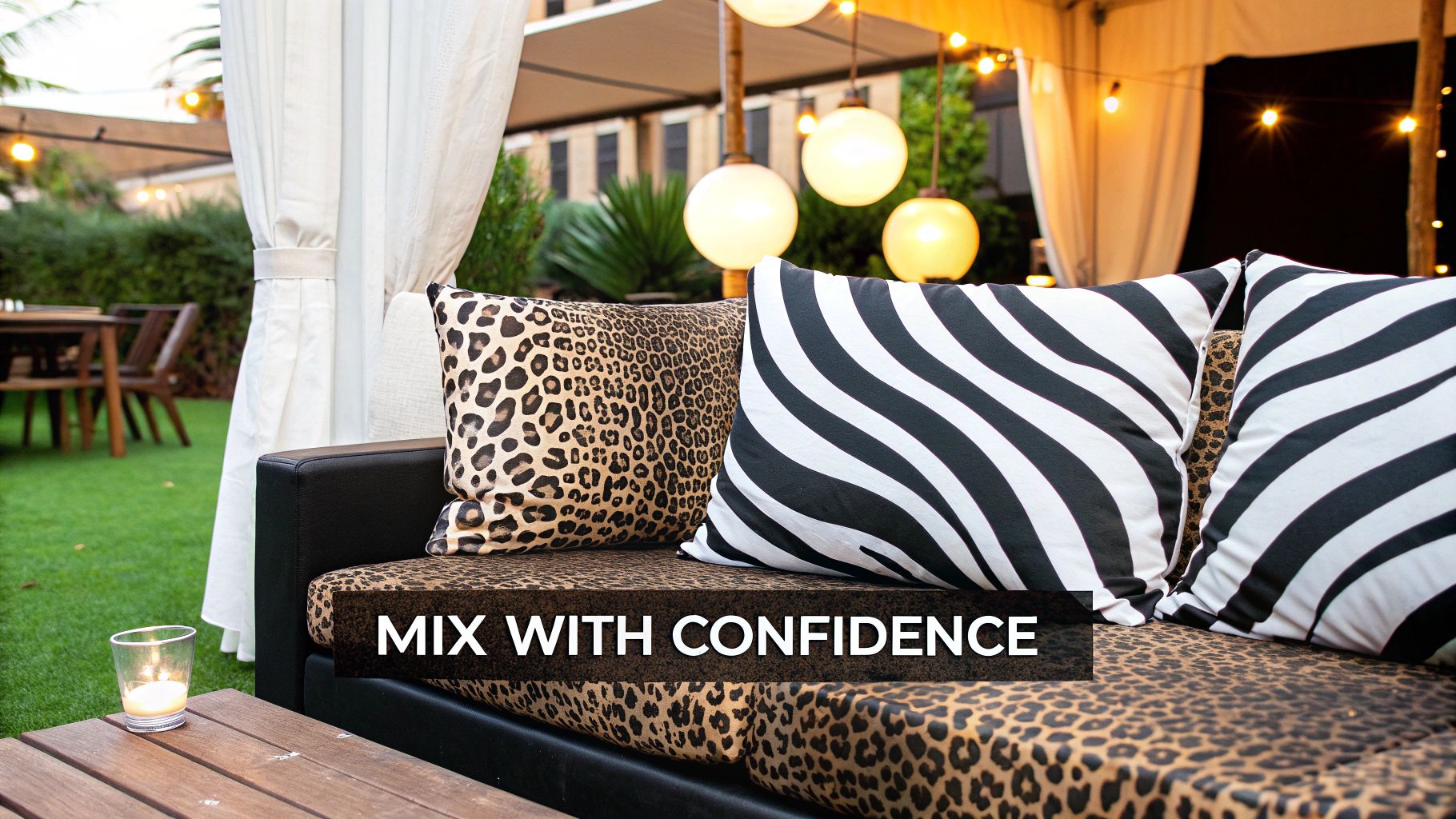
Mixing multiple animal prints in one room can feel a bit like a high-wire act. Done right, it creates that rich, layered, and totally chic look you see in designer magazines. Done wrong? Well, it can get chaotic fast.
The secret isn’t just throwing patterns together and crossing your fingers. It’s all about creating a visual hierarchy. Start by choosing your "hero" print. This is the big one, the pattern that sets the tone for the whole space. Think of a sprawling zebra area rug or a pair of unmissable tiger-stripe armchairs. This piece is your anchor, giving your design a clear, confident focal point.
With your hero in place, every other print you bring in plays a supporting role. These secondary patterns should always be smaller in scale and used more sparingly. It’s this intentional shift in size that keeps the eye moving around the room without feeling overwhelmed.
Unify with a Shared Color Story
The easiest and most effective way to make different animal prints feel like they belong together is to connect them through color. I’ve found that even wildly different patterns, like leopard and snakeskin, can look incredible together if they share a common color thread.
Stick to prints that play within the same family of neutrals—think blacks, creams, tans, and browns. For example, a classic brown-and-black leopard print pillow looks fantastic with a black-and-white zebra rug. Why? Because they both share black as a core color. This common ground makes the mix feel intentional and sophisticated, not accidental. Your shared palette is the glue holding it all together.
The rule of thumb I always follow is this: one pattern leads, the others follow. By giving each print a role and tying them together with color, you create a dynamic conversation instead of a chaotic argument.
The Power of Scale and Separation
This is non-negotiable for a successful mix: you have to vary the scale of your prints. If you have a large-scale hero pattern, your supporting prints need to be noticeably smaller. This contrast is what creates visual balance and stops things from looking too busy.
Let's walk through a real-world scenario I've designed before:
- The Hero: We started with a large area rug featuring a bold, graphic antelope pattern. Its scale commanded the floor space.
- The Supporting Cast: On the sofa, we added a pair of throw pillows with a much smaller, denser cheetah spot.
- The Subtle Accent: A small, snakeskin-patterned tray on the coffee table provided a final, delicate touch of texture.
This combination just works. Each print has its own space and its own job to do. The big rug grounds the room, the medium-scale pillows add a layer of interest, and the tiny accent offers that last bit of polish. You end up with a rich, textured room that reveals its details bit by bit.
Feedback from recent interior design markets shows that designers are getting much more confident mixing patterns like this. The consensus is to use prints strategically on accents like pillows and statement upholstery, which perfectly balances boldness with sophistication. You can read more about how animal prints are prowling into home decor and completely transforming modern spaces.
Finding the Right Balance with Colors and Textures
An animal print is never a solo act. Its success in a room hinges on the company it keeps. The colors and textures you pair with your chosen pattern are what make the difference between a chic, cohesive space and a chaotic one. Think of your bold print as the star of the show; everything else is the supporting cast that helps it shine.
The right color palette can completely change the feel of an animal print. For a grounded, organic vibe, I always lean into earthy tones. Colors like rich cognac, deep olive green, and warm terracotta are perfect for connecting the pattern to its natural roots, making a space feel instantly inviting. This approach works wonders in living rooms and bedrooms where you're going for relaxed yet stylish.
But what if you want to dial up the drama? That's where jewel tones come in. Pairing a classic leopard or zebra print with emerald green, sapphire blue, or a deep ruby red creates an undeniable sense of luxury. This combo is a showstopper in dining rooms or entryways where you want to make a bold first impression.
Don't Forget About Texture
Color sets the mood, but texture is what gives a room its soul. A design can fall flat, even with a perfect color scheme, if you don't bring in a thoughtful mix of materials. Texture is what makes a room feel layered, interesting, and truly complete.
Here's a common mistake I see: letting the animal print be the only textural element in the room. The real design magic happens when a sleek snakeskin pattern is juxtaposed with the rustic warmth of natural wood, or a soft cowhide rug contrasts with the cool gleam of metal.
You're aiming to create a tactile experience. A plush velvet invites you to touch it, while a smooth, hard surface provides a clean visual break. This constant interplay is what keeps the eye moving and adds a sophisticated complexity to your design.
Let's say you've fallen for an antelope-print carpet. Here’s how you could layer in different textures to build a richer environment:
- Smooth & Sleek: Think a leather armchair or a polished marble coffee table.
- Soft & Cozy: Add some velvet throw pillows or a chunky knit blanket.
- Natural & Raw: A woven jute basket, a live-edge wooden shelf, or even some carefully selected artwork can do the trick. If you need some ideas, our guide on how to choose wall art can point you in the right direction.
Putting It All Together in a Real Room
Let's walk through a real-world scenario. Imagine you have a gorgeous zebra-print ottoman you want to feature in your living room.
To make it the hero piece, you could start by painting the walls a soft, warm beige. This creates a neutral backdrop that lets the pattern pop without competing. Next, place the ottoman on a natural fiber jute rug—this introduces a rougher, organic texture that contrasts beautifully with the ottoman's fabric.
Then, bring in a navy blue velvet sofa for a punch of luxurious color and softness. Finish it off with a few brass floor lamps to add a metallic sheen. Suddenly, every element is working together. The color, the texture, and the pattern are all in conversation, creating a room that feels intentional, layered, and incredibly chic.
Your Top Animal Print Decor Questions, Answered
Deciding to go with animal print is exciting, but it's also a bold move. It’s totally normal to have a few questions swirling around before you commit. After all, you want to get it right! Let's walk through some of the most common worries I hear from clients, so you can move forward with total confidence.
One of the first things people ask is if animal prints can really fit into a minimalist design. The answer is a huge yes! The secret is to think of the print not as just a pattern, but as a single, intentional piece of art. Picture a lone zebra-print cushion on a stark, neutral sofa—it provides a powerful graphic punch without adding any clutter.
How Can I Make Sure My Animal Prints Don't Look Dated?
This is a big one. Nobody wants their space to feel like a throwback, and I get that. The "tacky" reputation animal prints sometimes get comes from a bygone era of pairing them with heavy, ornate furniture and way too much fuss. Today’s approach is so much cleaner and more sophisticated.
To keep your prints feeling fresh and modern, here’s what I always recommend:
- Embrace Clean Lines: Marry your chosen print with furniture that has simple, contemporary silhouettes. A sleek, modern frame is what keeps a leopard-print chair from ever feeling old-fashioned.
- Keep Your Color Palette Tight: A controlled and deliberate color scheme is your best friend. A classic black, white, and tan print feels utterly timeless when it's surrounded by calm neutrals and maybe one or two carefully chosen accent colors.
- Invest in Quality Materials: There's no faking this one. A high-quality wool rug or a beautifully upholstered accent chair will always look more luxe and intentional than a cheap synthetic knock-off.
Here's a pro tip: Stop thinking you need to create a "jungle theme." That's the fastest way to a dated look. Instead, treat the print just like you would any other pattern, like a floral or a geometric. It's just one exciting element in your design, not the entire story.
What About Using Animal Print on the Floor?
Go for it! An animal print area rug is one of my favorite ways to anchor a room. It lays down a foundation of pattern and texture that can beautifully tie all of your furniture together. In a big, open-concept living area, a bold rug is perfect for carving out a distinct zone, like your main seating arrangement.
Don't rule out wall-to-wall carpet, either. While it might sound like a lot, it can be a surprisingly brilliant choice in the right setting. I’ve used an antelope print carpet in a large family game room and a chic leopard print in a walk-in closet. Not only is it practical—it’s fantastic at camouflaging spills and wear—but it adds an incredible dose of unexpected glamour to a space. You get all the visual impact of a rug with the wall-to-wall comfort of carpet.
Ready to bring the wild elegance of nature into your home? Explore the William Tucker Art collections for fine art prints that capture the spirit and beauty of wildlife, perfect for complementing any interior design. Discover your next statement piece at williamtuckerart.com.