
You're probably staring at three terrible phone photos right now, one where your dog blinked, one where the cat glared at the flash, and one where the background is your laundry pile. That's normal. A strong Renaissance pet portrait doesn't start with a perfect pet, it starts with a usable reference, a clear approval process, and a real artist who knows how to turn an ordinary animal into something dignified without turning it into a cheap novelty.
The difference between a gallery-worthy commission and a filter joke is simple. Quality comes from control. You need the right pose, the right light, the right surface, and a workflow that lets you approve the piece before the final handoff. That's the standard I'd use if I were commissioning one for my own home.
Defining the Renaissance Aesthetic for Modern Pets
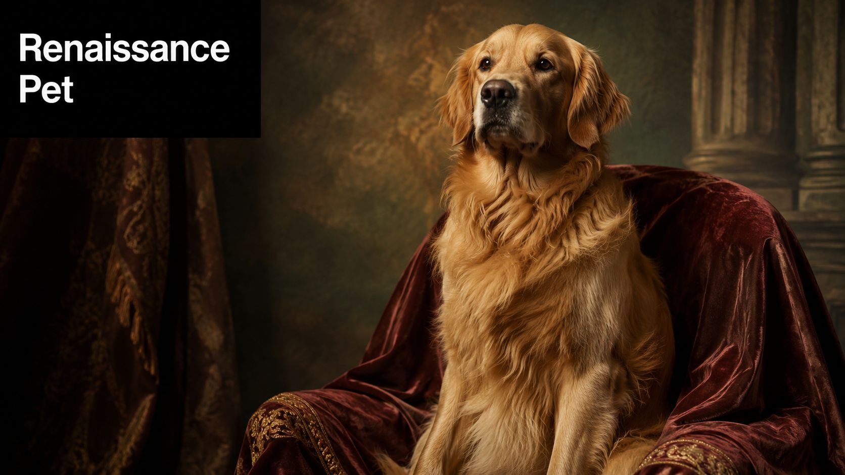
A client usually wants this style for a very specific reason. They do not want a pet in a costume app, they want the animal to feel important, memorable, and almost ceremonial. That is exactly where the Renaissance pet portrait works so well, because it borrows the visual authority of 15th- to 17th-century portraiture and gives a household pet the gravity of an old-world sitter, much like the historical animal imagery discussed by Art UK's account of painting dogs in Renaissance Venice. For a clearer framework, an overview of representational art helps explain why likeness and structure matter more than novelty in a serious commission.
Why the style feels believable
The style works because the pose, clothing, and setting borrow from a familiar historical language. Formal garments, heraldic posture, and courtly backdrops make a dog or cat feel like it belongs in a painted lineage rather than a passing joke.
That is why the strongest commissions do not look overloaded. They look composed, with restrained backgrounds, rich shadows, and carefully placed color doing the heavy lifting. If you are commissioning a piece for a real room, that restraint matters more than piling on props.
Practical rule: if the costume is louder than the pet, the portrait is already off balance.
What separates fine art from novelty
Digital novelty portraits usually flatten everything into the same shiny finish. Fine art portraits rely on value, texture, and light direction. The face still has to read as your pet first, not as a human joke with ears pasted on.
A real artist also thinks in terms of silhouette. The noble feeling comes from clarity, not clutter. The best examples keep the pet recognizable while layering in period styling that feels deliberate, not cartoonish.
The approval process matters too. A good commission should not move straight from a rough concept to a final file with no review. Ask for an early sketch or color check, compare it against your reference, and confirm the costume treatment before the artist commits to the final surface. That is especially important if you are working with portrait photography for professionals standards on the reference side, because a strong source image gives the artist cleaner decisions to make later.
The best buyers know what they are asking for before they commission. If you can say, “I want courtly formality, warm shadows, and a composed posture,” you will get a much better result than if you only say, “Make it Renaissance-ish.”
Capturing the Perfect Reference Photo
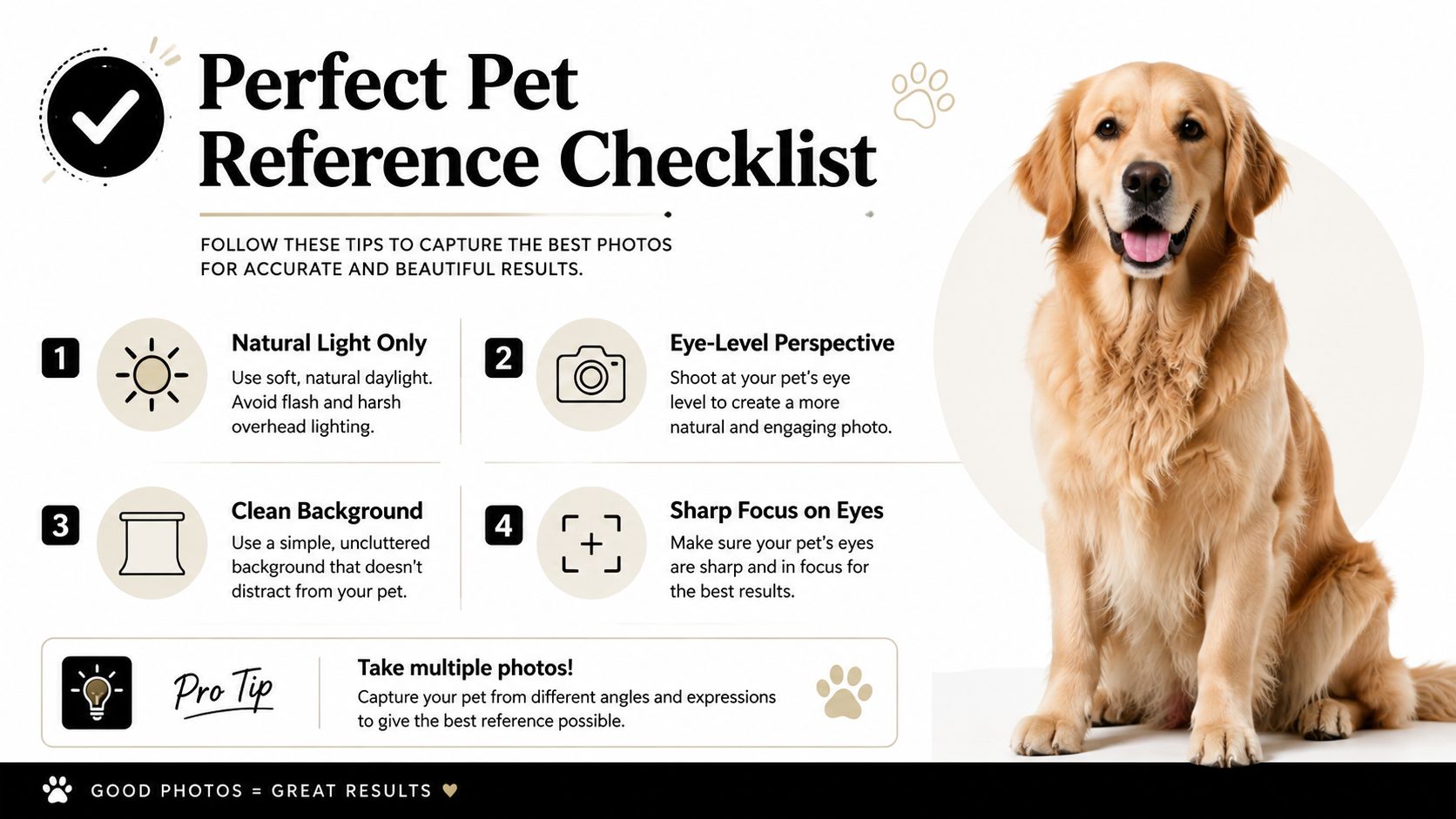
The photo-prep problem is where most commissions go wrong, and it's the part buyers underestimate the most. A portrait can only be as strong as the photo it's built from, especially when the subject won't sit still or the home lighting is unforgiving. The strongest reference is still a high-resolution, front-facing or slight three-quarter photo taken in soft natural light near a window, with the pet's eyes sharp and visible and the background stripped down.
A useful reminder comes from William Tucker Art's tips for photographing pets, which align with the same core rule artists keep repeating, clean light and a readable face beat a technically “cute” snapshot every time.
The photo rules I'd actually follow
Start with the angle. Get down to the pet's eye level or lower. A high-angle shot makes the animal look compressed and timid, while a three-quarter pose gives the artist enough shape to build a convincing head, chest, and shoulder line.
Next, control the light. Side-lit daylight near a window gives you shape and keeps the face from going flat. Flash is a bad trade, because it blows out fur texture and throws harsh reflections into the eyes.
Then fix the background. A busy sofa, toys, or patterned carpet will fight with the costume later. A plain wall or neutral floor keeps the portrait focused on the subject, which matters even more in a chiaroscuro-driven composition.
Here's the short version:
- Anxious pets: take many short attempts, reward calm behavior, and accept a slightly imperfect pose if the eyes are clear.
- Dark-coated animals: use side light, not direct flash, so the fur doesn't disappear into a black mass.
- Glossy fur: move the light source until the highlights stop washing out the face.
- Low-light rooms: open curtains and move closer to a window instead of relying on phone flash.
- Multiple pets: shoot each pet separately unless they naturally sit close together without tension.
Why difficult photos still can work
The hardest cases aren't impossible, they just need discipline. A dark dog with shiny fur can still make a strong portrait if the artist can see the eye shape and the muzzle edge. A nervous cat can work too, as long as the reference captures the head clearly and the body doesn't vanish into motion blur.
What ruins most references is not bad luck, it's bad capture habits. Harsh sun, top-down camera angles, blurry eyes, and cluttered rooms all make the noble styling harder to execute later. If you're serious about quality, don't force the portrait from a bad image. Reshoot.
For buyers who want a polished result, there's real value in thinking like a portrait photographer before the commission begins. Resources such as portrait photography for professionals are useful because the same basics apply here, controlled light, clean framing, and a subject that reads immediately.
The easiest solution is often the one people skip. Take ten more photos, then choose the one with the sharpest eyes and cleanest light. That's the one the artist can build on.
One practical listing buyers sometimes use as a final step is William Tucker Art Acrylic Pet Painting Final Payment, which is described as the point where the commission is finalized after preview images meet expectations. Used properly, that kind of workflow keeps the process from drifting and makes the final approval feel deliberate instead of rushed.
Selecting Canvas Size and Fine Art Materials
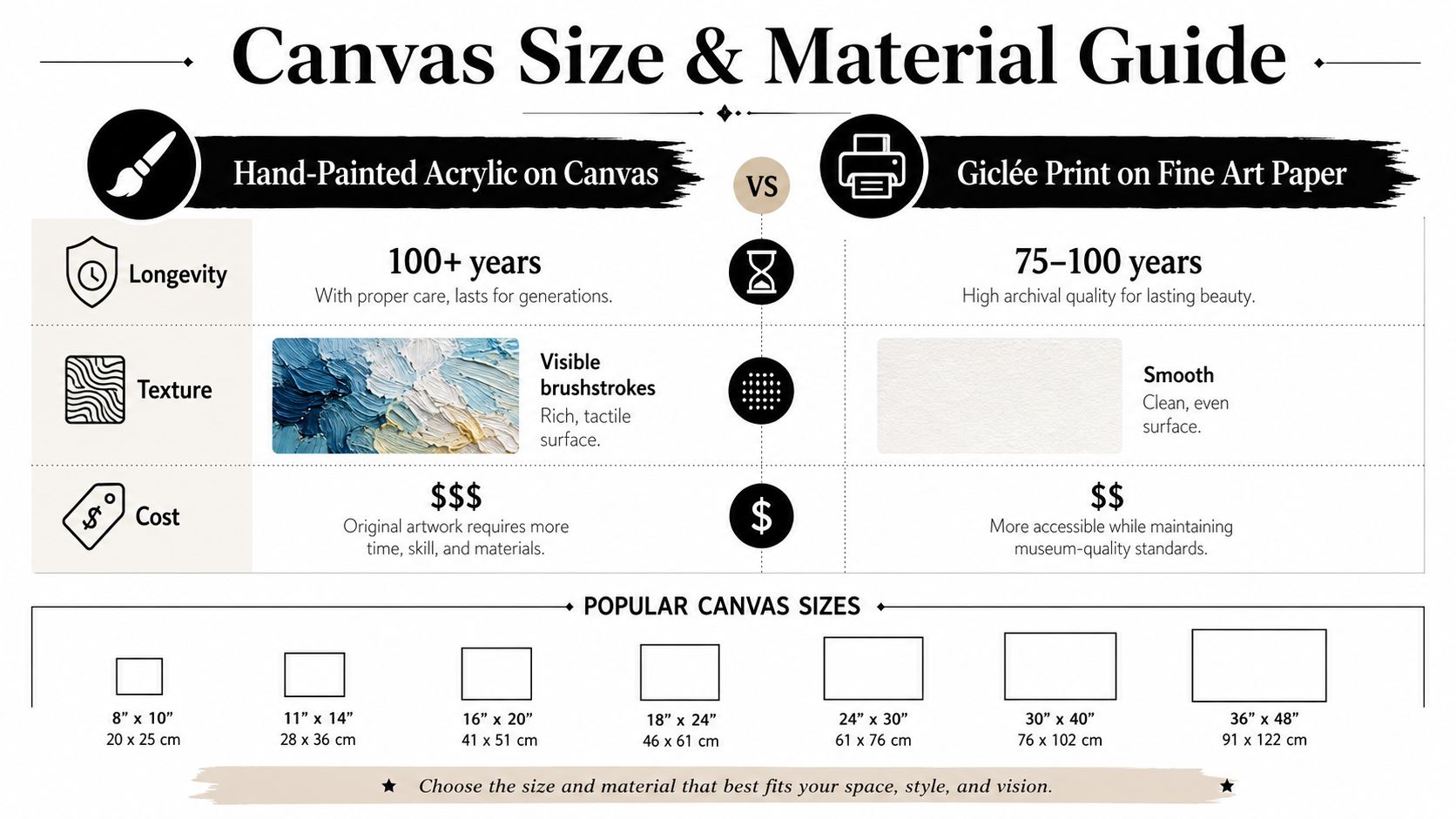
The material decision matters as much as the image itself. A hand-painted acrylic on gallery-wrapped canvas reads like an artwork. A flat print reads like a reproduction, even when the image is attractive. If you want the portrait to feel like an heirloom instead of wall decor, choose the physical object that has visible presence, texture, and depth.
Acrylic on canvas versus print
Acrylic on canvas gives you visible brushwork and a surface that catches light in a living way. That matters for a Renaissance-inspired piece because the whole point is to echo the depth and weight of historical painting. The canvas surface also supports the sense of facture, the feeling that a hand made the image.
A giclée print on fine art paper is cleaner and more uniform. It can look beautiful, but it won't deliver the same physical authority. If your goal is gallery character, print is the compromise, not the ideal.
My recommendation: choose the medium that matches the emotional role of the piece, not just the budget.
How to think about size
Size should follow placement. A small portrait works when it's meant to live on a shelf, in an entryway, or among other framed pieces. A larger canvas belongs where the pet portrait can hold a wall on its own.
Don't oversize for drama unless the room can support it. The portrait should command attention, not crowd the space. A well-proportioned piece looks more expensive than an oversized one that swallows the wall.
The material itself also changes the viewing experience. Acrylics give you a bolder, more tactile surface, while canvas adds depth at the edges and keeps the piece feeling finished from every angle. That's part of why collectors lean toward original works rather than reproductions, they're buying an object, not just an image.
William Tucker Art's commission format is a useful example here because it pairs quality acrylics with a gallery-wrapped canvas finish, which is exactly the kind of construction that supports a more permanent display. If you're comparing options, ask what the portrait is painted on before you ask about style. Surface first, decoration second.
Navigating the Commission and Approval Workflow
First-time buyers usually don't fear the art, they fear the process. They worry about sending the wrong photo, waiting too long, or not knowing how much feedback is too much. A good commission workflow removes that anxiety by making every stage visible, and the most reliable models start with an initial deposit that secures the slot, then move into consultation, preview, and final approval.
A helpful reference point is how to sell art online, because it shows how much trust matters in a custom art transaction. Buyers aren't just purchasing an object, they're entering a sequence that depends on clarity, timing, and the artist's ability to communicate.
What the workflow should feel like
The process should begin with a consultation. That's where style, size, and medium get matched to the pet and the room it will live in. William Tucker Art's personalized pet artwork deposit describes this as a spot-securing step that includes a consultation, which is exactly what I'd want if I were buying a custom portrait.
After that comes the reference check and concept approval. The artist confirms the selected photo, the pose, and any costume direction. If you want a regal collar instead of a crown, or a more serious expression instead of a playful one, this is the moment to say it.
Then the artist sends a preview. Don't nitpick the paint surface at this stage unless something is structurally wrong. Focus on the things that matter most, likeness, pose, costume balance, and whether the overall mood feels right.
A useful approval rhythm looks like this:
- Deposit and booking. Secure the commission spot.
- Photo selection. Submit the strongest usable reference.
- Preview review. Respond with specific, calm feedback.
- Final painting. Let the artist finish without constant course-correction.
- Final payment and delivery. Confirm the piece matches expectations before shipment.
How to give feedback like a good client
Keep your notes concrete. Say “the eyes need to feel a touch softer” or “the collar feels too modern,” not “make it better.” Specific notes protect the painting from endless revision loops.
Also, don't move the target late in the process. If you want a solemn, formal portrait, don't switch to playful halfway through. That kind of drift wastes time and weakens the final image.
The snapshot of William Tucker Art's custom pet portrait artist process fits this model because it treats the commission as a collaboration, not a blind purchase. That's the right mindset. You're not buying speed, you're buying judgment.
I'd also pay attention to final payment timing. A clear final-payment step after preview approval signals that the artist considers the work complete only after your review. That's the kind of structure serious buyers should expect.
Presentation and Long-Term Care Strategies
Once the painting arrives, don't ruin the effect with careless framing. A Renaissance-inspired portrait needs breathing room, not a frame that shouts louder than the subject. Choose something simple, architectural, and balanced so the pet remains the focal point.
For practical framing ideas, Quote My Wall's frame tips are useful because they reinforce a basic principle I agree with, the frame should support the image, not compete with it.
How to present it well
A narrow to medium-width frame usually works better than an ornate one, unless the room is already highly traditional. The portrait already carries the historical language. Too much molding or gilt can push it into costume territory.
Keep the hanging height sensible. The center of the piece should sit at a natural viewing level so the pet's gaze feels direct. That matters in this style because the illusion of presence depends on eye contact and scale.
If you're grouping the portrait with other art, give it room. Renaissance pet portraits do best when they're allowed to read as a statement work rather than a novelty tucked into a collage wall.
How to care for acrylic artwork
Acrylic paintings are sturdy, but they're not invincible. Keep the work out of strong, direct sunlight for long periods, because light can still degrade color over time. Dust it gently with a soft, dry cloth, and never scrub the surface.
Humidity matters too. Avoid hanging the piece in damp or highly variable rooms, because canvas and framing materials respond to the environment. A stable interior wall is always a safer choice than a bathroom or an unventilated kitchen.
A few habits make a difference:
- Dust lightly: use a soft cloth, not a damp one.
- Avoid harsh cleaners: they can dull the surface.
- Keep it stable: don't hang it near heat vents or moisture.
- Handle the edges carefully: oils from fingers can mark the frame or canvas.
- Inspect occasionally: look for dust buildup or shifting hardware.
Don't treat an original portrait like a poster. It's a painted object, and it deserves the same respect you'd give any other fine art.
The better you present it, the more the portrait does its job. Good framing and ordinary care keep the colors strong, the surface clean, and the whole piece feeling intentional for years.
Why Original Art Outlasts Digital Trends
Digital pet portraits are easy to buy and easy to forget. Original work sticks because it carries evidence of choices, pressure, revision, and hand skill. The brushwork is real. The surface is real. The slight irregularities that come from a human hand are the very things that make the piece feel alive.
That's why the Renaissance pet portrait keeps resonating. It doesn't rely on novelty to stay interesting. It borrows from a visual tradition built to signal status, memory, and permanence, then redirects that language toward the animals people live with and love.
The strongest commissions also age well because they're built with discipline. Good reference photos, honest approval stages, and fine art materials create a portrait that won't collapse the moment the internet moves on to the next trend. Digital styles can be fun, but they rarely carry the same emotional weight once the joke fades.
If you want the portrait to matter, ask for the authentic piece. Ask for visible brushwork, a thoughtful approval process, and a composition that makes your pet feel important without turning them into a gimmick. That's the standard worth paying attention to.
William Tucker Art offers custom pet portrait commissions built around the same priorities covered here, clear photo selection, thoughtful review, and an acrylic finish on gallery-wrapped canvas. If you want a portrait that feels deliberate instead of disposable, visit William Tucker Art and look at the options for turning your pet into a lasting piece of fine art.