
Before you can bring an animal to life on canvas, you have to get your hands on the right gear. And I'm not just talking about a generic shopping list—it’s about understanding why certain tools make all the difference when you're painting animals in acrylics. Think of your supplies as your creative partners. The right ones feel less like obstacles and more like a natural extension of your hand.
It's no surprise that so many wildlife and pet artists gravitate toward acrylics. The global acrylic paint market was valued at a whopping USD 3.65 billion in 2024, and it's only getting bigger. That number really shows how many artists, from seasoned pros to weekend painters, rely on this medium's incredible versatility. For a deeper dive, you can check out this market research on acrylic paints.
Choosing the Right Tools for Your Animal Art

Getting a Feel for Your Acrylic Paints
Here’s the thing: not all acrylics are the same, especially when your goal is to paint a convincing animal texture. The consistency of your paint—its body—plays a huge part in the effects you can pull off.
Let's break down the main types you'll find on the shelf:
- Heavy Body Acrylics: These are the thick, buttery paints that feel a lot like oils. They hold their shape beautifully, which is perfect for creating visible brushstrokes or thick, impasto textures. Think of the rugged coat of a bison or the rough scales on a reptile—this is your go-to.
- Soft Body Acrylics: With a consistency like smooth yogurt, these are fantastic all-rounders. They level out a bit more than heavy body paints, making them ideal for blending colors smoothly and laying down those initial base layers.
- Fluid Acrylics: These paints are thin and flowy, almost like cream. They are an absolute dream for fine detail work. You can paint delicate whiskers, the tiny glint in an eye, or the intricate pattern on a feather without having to thin your paint down with water and lose pigment intensity.
My favorite trick? Don't be afraid to mix different paint bodies. Sometimes I'll blend a heavy body and a fluid acrylic to get that perfect custom consistency for a specific texture I'm chasing.
Picking Your Go-To Brushes
Your brush is where the magic happens, and while the sheer number of options out there can feel overwhelming, you really only need a handful of trusty workhorses to get started.
Here’s a quick-reference table I put together to show which paints and brushes are my essentials for painting animals.
Essential Acrylics and Brushes for Animal Artists
| Tool | Recommended Type | Best Use for Animals |
|---|---|---|
| Paint | Heavy Body Acrylic | Creating thick textures like coarse fur, scales, or bark. |
| Paint | Fluid Acrylic | Painting fine details such as whiskers and eye highlights. |
| Brush | Filbert (Size 6, 10) | Versatile for blocking in color and creating soft edges. |
| Brush | Round (Size 2, 4) | Ideal for precise lines, small details, and outlining. |
| Brush | Flat (1-inch) | Covering large areas for backgrounds or underpaintings. |
| Brush | Rigger/Liner | Essential for long, thin lines like fur strands & whiskers. |
This little toolkit covers just about every texture you'll encounter, from the softest fluff to the sharpest claw.
If you want an even more detailed breakdown of what to get, I've covered brushes and more in my guide on the top 10 must-have art supplies for beginners.
Other Studio Essentials
Beyond just paints and brushes, a couple of other items will make your painting sessions so much smoother.
A stay-wet palette is an absolute game-changer for anyone working with acrylics. It keeps your paints workable for hours, sometimes even days, so you don't have to remix your colors constantly. For your surface, a pre-primed stretched canvas or a cradled wood panel gives you a sturdy, professional foundation to build your masterpiece on.
Getting Your Canvas Ready for a Lifelike Painting
Every great animal painting I’ve ever created started long before a brush even touched the paint. This early prep work is everything. It's your roadmap for the entire piece, and it's what sets the stage for a painting that feels alive.
If you jump straight into color without this foundation, it’s like trying to build a house without a blueprint. You might end up with something that looks okay, but it won't have the structure, depth, or intention that makes a piece truly compelling. From picking the right reference to establishing a solid value structure, these early decisions guide every single brushstroke that follows.
Finding That Perfect Reference Photo
Your whole painting journey begins with a single image. A dynamic, well-lit reference photo is probably the single most important tool in your arsenal. I always look for photos with strong, clear lighting that creates obvious highlights and deep shadows. It's this contrast that truly carves out the animal's form and gives you a map for rendering fur or feathers.
Try to avoid photos that are blurry or have flat, head-on lighting (like from a camera's built-in flash). That kind of light just flattens everything out. The best references have a clear light source coming from the side, which really sculpts the subject and gives it a powerful, three-dimensional feel. And here's a pro tip: pay special attention to the eyes. A photo with a crisp catchlight—that tiny glint of reflected light—brings your subject to life instantly.
Transferring Your Sketch With Accuracy
Got your reference? Great. Now it's time to get your drawing onto the canvas. The goal here is more than just copying; it's about capturing the animal's posture, energy, and proportions correctly. If the initial sketch is off, the final painting will always feel a little wonky, no matter how beautifully you render the details later on.
Here are a few methods I’ve relied on over the years:
- The Grid Method: This is a classic for a reason. Just draw a grid over your reference and a proportionally larger one on your canvas. By tackling the drawing one square at a time, you break down a complex subject into simple, manageable chunks. It’s a fantastic way to nail your proportions.
- Carbon Transfer Paper: This is my go-to for a clean, precise transfer. You just sandwich a sheet of graphite paper between your drawing and the canvas, then trace the lines. It leaves you with a perfect outline to start painting over.
- Freehand Drawing: If you trust your drawing skills, sketching directly onto the canvas with a light pencil or some thinned-down paint is a great option. It helps keep the energy of a sketch. Just remember to keep your lines light enough that they won't peek through your final paint layers.
While a good old stretched canvas is always a solid choice, I’ve become a huge fan of the rigid, smooth surface you get from a wood panel. If you’re curious about making the switch, we have a complete guide on mastering the art of preparing cradled wood panels for acrylic painting that walks you through the whole process.
The Underpainting: Your Secret Weapon
Once your sketch is on the canvas, it's time for the underpainting. This is simply a monochromatic layer of paint where you map out your entire light and shadow pattern. By figuring out your values—the lights and darks—right at the beginning, you build a foundation of form and depth that will make your final colors sing.
An underpainting is the key to creating realistic depth. It forces you to solve all your value problems before you ever start thinking about color. This frees you up to focus purely on hue and temperature in the later stages.
To get started, I usually grab a neutral color like Burnt Sienna or Ultramarine Blue and thin it out a bit with water. With this wash, I block in all the shadow shapes on my subject and in the background. The areas I want to be the brightest highlights, I just leave the white of the gessoed canvas showing through.
This simple value map immediately makes the subject look three-dimensional. It's an indispensable guide that you'll be thankful for when you start laying in all those rich, colorful layers on top.
Building Form and Texture with Acrylic Layers
You’ve laid down your underpainting, which is like drawing a map for your painting. Now for the magic. This is the stage where we start building form and texture, bringing your animal to life one layer at a time.
Think of it as sculpting with paint. Each new layer refines the shapes, deepens the shadows, and pulls out the highlights. Your flat sketch is about to become a three-dimensional creature right on the canvas.
Blocking In Your Mid-Tones
First things first, we need to establish the animal's local color—the true hue of its fur or feathers before shadows and highlights come into play. We do this by "blocking in" the main areas of mid-tone color. Don't worry about tiny details just yet; we're focusing on painting large, simple shapes of color that follow the value map you created.
Let's say you're painting a red fox. You'd mix a medium orange-brown and lay it down as a thin wash over all the main areas of its coat. For a black panther, you might use a dark gray instead of pure black. This leaves you room to add much deeper, richer shadows later on. Keeping this first color layer thin is key, as it lets the underpainting peek through and guide your next moves.
This whole process really starts before the first brushstroke of color.
Moving from a solid reference photo to a sketch and then to a good underpainting is the foundation. Nail these early steps, and building color and texture becomes so much more intuitive.
Creating Realistic Fur and Feathers
With your mid-tones dry, it's time for the really rewarding work: rendering texture. The secret here is to work from general to specific and from dark to light. I always start by adding the darker values first, which helps define the shadows and carve out the larger clumps of fur or groups of feathers. From there, it's all about gradually adding lighter layers on top to build up form and highlights.
When it comes to realistic fur, the biggest mistake is trying to paint every single hair. Don't do it! Your goal is to suggest texture. You can achieve this by painting the fur in clumps and sections, always making sure your brushstrokes follow the natural direction of its growth.
- Mix up your brushes: A small round brush is perfect for those fine, stray hairs. A filbert is my go-to for creating soft clumps of fur, and a fan brush works wonders for gently feathering in soft textures.
- Vary your strokes: Are you painting coarse fur? Use short, choppy strokes. For silky, long fur, use long, flowing strokes. The movement of your hand should mimic the texture you're trying to create.
- Follow the flow: Fur and feathers grow in very specific patterns. If you spend time observing these on your reference photo and replicate them in your painting, the result will be far more believable.
Painting feathers works on the same principle. Block in the main shape of a wing, then begin layering the individual feather shapes on top, starting with the ones that lie underneath and working your way up to the top layer.
Exploring Unconventional Texture Tools
Your brushes are your best friends, but they're not your only tools! Stepping outside the box can lead to some incredible, organic textures that are nearly impossible to get with a brush alone.
For example, I love using a natural sea sponge dabbed lightly in paint to create the mottled look of a deer's coat or the rough hide of a rhino. A palette knife can scrape on thick, rugged paint, perfect for rocks or tree bark in the background. You can even use crumpled-up paper towels or plastic wrap to lift wet paint off the canvas, creating subtle patterns you just can't plan.
My Two Cents: Always test a new tool or technique on a scrap piece of canvas or paper first. It gives you a feel for the effect and helps you figure out how much paint to use before you commit it to your main piece.
The True Power of Layering
Acrylic's fast-drying nature is what makes it such a powerhouse for layering. Each layer can be opaque, completely covering what's underneath, or it can be a transparent glaze that just tints the color below. This is how you build incredible depth.
Interestingly, the push for durable, layered paints in industrial applications has driven innovations that we artists benefit from. The thermosetting acrylic paint market hit a value of USD 2,429 million in 2024, and its continued growth means we get access to incredibly robust, high-performance paints. These are pigments that can truly stand up to the rigorous layering that detailed animal art demands. You can check out some of the market trends driving this innovation on openpr.com.
By patiently building your layers—from the darkest shadows to the mid-tones, and finally to the brightest highlights—you create a powerful illusion of three-dimensional form. With each new layer being a bit smaller and lighter than the last, you gradually work your way to the finest details. Trust me, this methodical process is the secret to creating a rich, lifelike animal portrait that feels like it could walk right off the canvas.
Getting the Details and Edges Just Right
This is where the magic really happens. We've built up the form and roughed in the texture, but it's this last 10% of the work that breathes life into the painting. The details and edges are what will convince someone they're looking at a living creature, not just a picture of one.
These final touches are what separate a decent painting from a truly captivating one. It’s not just about painting every single hair, but about making smart, deliberate choices that guide the viewer’s eye and tell the animal's story.
Bringing Key Features to Life
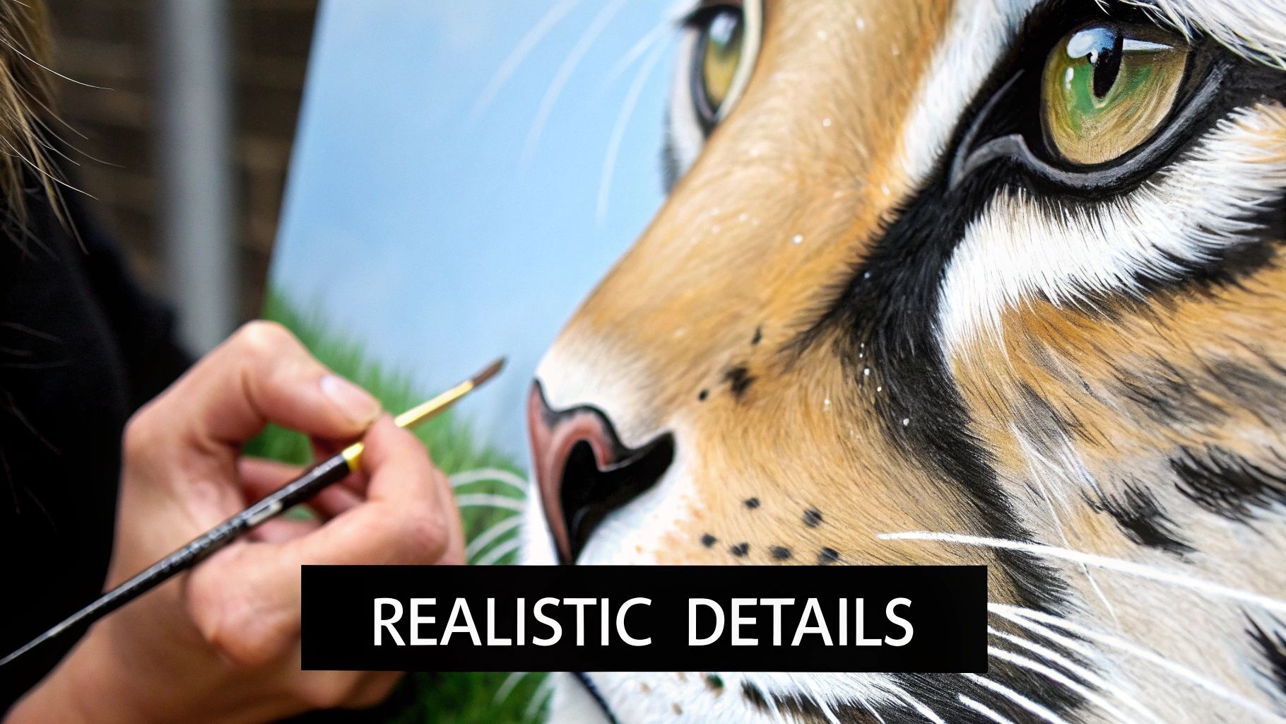
The eyes, nose, and whiskers—these are the absolute heart of the painting. If you can nail these, you've captured the animal's spirit. It’s time to switch from your broader brushes to your finer ones and focus on precision.
The Eyes:
The secret to a living eye is all about layering and light. I always start with the darkest dark for the pupil, then block in the main iris color. The real soul of the eye, though, is the catchlight—that tiny speck of bright, reflected light. Its placement is everything; it tells you exactly where the animal is looking. Don't forget to add a subtle shadow just under the top eyelid to give the eyeball that crucial sense of roundness.
The Nose:
An animal's nose is never a single, flat color. Take a moment to really look at your reference. You’ll see subtle shifts from cool to warm tones and notice its unique texture. To get that classic "wet nose" look, I use small dabs of slightly lighter paint mixed with a bit of gloss medium for the highlights. A few tiny, well-placed highlights are far more convincing than one big white splotch.
The Whiskers:
Whiskers can feel a bit scary to paint, I get it. Your best friend here is a rigger or liner brush. Load it with fluid, thinned paint and use a quick, confident flick of the wrist. My advice? Practice on a scrap piece of canvas or paper first to get a feel for the motion. And remember, whiskers are never perfect—vary their length and thickness to keep them looking natural.
The Artist's Secret Weapon: Edge Control
If I could give one piece of advice, it would be to master your edges. Edge control is how you handle the transition between shapes and colors, and it’s what creates a believable sense of depth and atmosphere in a painting.
-
Hard Edges: Think of these as sharp, defined lines that grab attention. I use them for my main focal points, like the crisp edge of an eyelid or the glint in an eye. They pull things forward and scream, "Look at me!"
-
Soft Edges: These are the blurred, blended transitions that let things recede. Use them for fur that's turning away from the light or where your subject meets an atmospheric background. Soft edges create a feeling of movement and keep the painting from looking stiff.
Here's a pro tip: By pairing sharp, focused details on the animal's face with softer, more suggested textures on its body, you naturally guide the viewer's gaze right where you want it. It's a simple trick with a huge impact.
Sometimes, a blurry reference photo can make it tough to see those crucial details. If your source image is a bit low-res, you might want to try using AI image upscaling tools to sharpen it up and reveal the fine details you need.
Going the Extra Mile with Glazing and Scumbling
Every now and then, a painting is almost finished but just needs one final tweak to pull it all together. This is where I turn to glazing and scumbling.
Glazing is simply applying a thin, transparent layer of paint over a dry area. For example, a whisper-thin glaze of yellow ochre over a shadowed area of fur can introduce a beautiful, warm reflected light. It’s a fantastic way to add luminosity and subtle color shifts that you just can't get with direct painting.
Scumbling, on the other hand, is about dabbing or scrubbing a thin layer of opaque paint with a dry brush. It's perfect for creating atmospheric effects like fog or suggesting the soft, downy texture of feathers. It both adds texture and softens what's underneath.
We're lucky to be painters today. The acrylic emulsion market, which is the very foundation of our paints, hit a staggering USD 12.3 billion in 2024. This investment drives innovation, giving us the incredible pigments and stable formulas needed for these delicate final layers. These finishing techniques are the final polish that unifies the entire piece and makes your animal portrait truly complete.
Creating Expressive Backgrounds and Finishing Your Art
You’ve poured hours into rendering your animal, capturing its spirit in every detail. But the painting isn't quite finished. Now it’s time to think about the space around your subject—the background that will give it context, create a mood, and truly complete the piece.
A great background doesn't just fill empty space; it supports the star of the show. It should feel intentional, turning a simple animal study into a complete, professional work of art. This is where you can really let your creativity shine and elevate the entire painting.
Designing a Supportive Backdrop
The most successful backgrounds often come from a simple, harmonious color palette. An easy trick I use all the time is to pull muted versions of colors directly from the animal itself. Painting a brown bear? Try working soft umbers, siennas, and ochres into the background for a beautifully unified and natural feel.
On the other hand, you can make your subject pop by using complementary colors. A fiery orange fox, for example, looks absolutely stunning against a cool, atmospheric backdrop of blues and greens. This contrast creates a powerful visual separation that pushes the fox right off the canvas, demanding the viewer's attention.
I'm also a huge fan of abstract backgrounds, which can inject so much energy and emotion into a piece. My own work often pairs a hyper-realistic animal with a loose, textured environment. This approach suggests a natural setting—a forest, a field—without painstakingly painting every single leaf, which keeps the focus right where it belongs: on the animal.
A pro tip: Use soft, out-of-focus edges where your animal meets the background. This creates a much more natural sense of depth. If all your edges are sharp and crisp, your subject can end up looking like a sticker slapped onto the canvas.
The Final Polish: Applying Varnish
Once your painting is completely, totally dry—and I mean bone-dry—it's time for the final, crucial step. Depending on how thick your paint is and the humidity in your studio, this could take anywhere from 24 hours to a full week. Be patient! Rushing this can ruin your hard work.
So, why varnish? It does two incredibly important things. First, it acts as a protective shield against dust, UV light, and grime, ensuring your masterpiece lasts for generations. Second, it magically evens out the sheen of your acrylic paint, making the colors pop and the darks look incredibly rich and deep. It’s the final touch that makes the artwork truly sing.
To get started, you’ll need a high-quality, artist-grade acrylic varnish and a clean, wide, soft-bristled brush. Find a well-ventilated, dust-free spot and lay your painting flat.
- Apply the varnish in long, even strokes, moving in one direction across the canvas.
- Be careful not to overwork it—just lay it down and leave it be.
- Let that first coat dry completely (check the manufacturer's instructions).
- Apply a second coat in a perpendicular direction (e.g., up-and-down if your first coat was side-to-side) to guarantee full, even coverage.
Choosing the Right Varnish Finish
The varnish you pick will dramatically change the final look of your painting. There's no right or wrong answer here; it’s all about your personal taste and the story you want the artwork to tell.
To help you decide, here’s a quick rundown of the most common finishes.
Varnish Finish Comparison
| Varnish Type | Visual Effect | Best For |
|---|---|---|
| Gloss | Creates a highly reflective, wet look. Deepens darks and saturates colors. | Pieces with rich, dark colors or when you want a vibrant, high-impact finish. |
| Satin | Offers a subtle, low-lustre sheen that's somewhere between gloss and matte. | A versatile, all-purpose finish that reduces glare while still boosting color. |
| Matte | Provides a completely non-reflective, flat finish. Softens colors slightly. | Artwork with a subtle, gentle mood or pieces that will be photographed often. |
Ultimately, the best way to figure out your preference is to experiment. Try each finish on a few small test pieces. This final decision is the last creative brushstroke you'll make, sealing your vision and protecting your art for years to come.
Common Questions About Painting Animals in Acrylics
As you get deeper into painting animals with acrylics, you’re bound to hit a few roadblocks. It happens to everyone, whether you're just starting out or have been painting for years. Let's tackle some of the most common hurdles with real, practical advice to get you painting with more confidence.
How Do I Keep My Acrylics From Drying So Fast?
Ah, the classic acrylic dilemma! This is probably the number one question I get, especially from artists trying to nail those tiny details in fur or feathers. The fast-drying nature of acrylics can feel like a race against the clock, but you can definitely learn to tame it.
One of the easiest fixes is to mix a medium right into your paint. An acrylic retarder or a slow-drying medium will extend your working time significantly. Another game-changer is a stay-wet palette. It’s a simple tool—basically a sponge under special paper—that keeps your paint workable for hours, sometimes even days.
A light mist of water from a spray bottle over your canvas and palette also works wonders. The key word is lightly. You’re just trying to raise the humidity, not create puddles that will make your paint run. I also find it helpful to work in smaller, more focused sections. That way, you can get all your blending and details just right before the paint has a chance to lock in.
What Is the Best Way to Paint Realistic Animal Eyes?
The eyes are everything in an animal portrait. They’re where the soul of the piece lives, and the secret to making them pop is all about layering and understanding light. A believable eye isn't just a flat circle; it's a living, breathing sphere that reflects the world.
I always start by blocking in the darkest values first, then the main iris color. From there, it's a process of building up subtle shifts in tone to create that sense of depth. But the real magic? It comes down to one tiny detail: the catchlight.
That single, tiny dot of bright white paint is what instantly breathes life into an eye. When you place it correctly, it tells the viewer where the light is coming from and gives the eye that essential sparkle and wetness.
Don’t stop there, though. Little details make all the difference. A soft shadow cast by the upper eyelid will help sell the roundness of the eyeball. For an extra touch of realism, try adding tiny, subtle reflections of the surrounding environment on the cornea.
Can I Accept a Pet Portrait Commission as a Beginner?
Taking on a commission when you're new to painting feels like a huge step, but it's absolutely doable if you're smart about it. The most important thing is to manage expectations—both for your client and for yourself.
Be completely upfront about your experience level. This isn't the time to fake it 'til you make it. Price your work fairly for where you are in your journey, and your clients will appreciate the honesty.
The absolute make-or-break factor for any commission is the quality of the reference photos. I can't stress this enough. Blurry, dark, or poorly lit images are a recipe for frustration. You have to be firm with your client about needing clear, detailed pictures to work from.
Here are a few tips to help you succeed:
- Do a practice run. Before touching the final canvas, paint a smaller study of the pet just for yourself. It’s a low-pressure way to figure out tricky fur patterns or expressions.
- Aim for likeness, not perfection. Your goal isn't necessarily photorealism. It's to capture the unique character and spirit of that specific animal.
- Keep the conversation going. Send a quick progress photo now and then. This keeps the client involved and happy, and it prevents any big surprises when you deliver the final painting.
How Do I Choose Background Colors for My Animal Painting?
The background is your supporting actor—it should make your star shine, not steal the spotlight. A great background can set the mood, create depth, and push your animal subject right to the forefront.
A simple trick I love is using complementary colors. If you're painting a golden retriever with lots of warm oranges and yellows, a background with cool blues or greens will make that fur pop right off the canvas. Another solid strategy is to pull muted, neutral tones directly from the animal’s fur or its environment. This creates a really beautiful, cohesive look.
Often, less is more. An abstract, soft-focus background with blurred edges usually works much better than a super-detailed scene. This approach keeps the viewer’s eye exactly where you want it: on your incredible animal subject. Think about the feeling you want to convey—warm colors can feel high-energy, while cooler tones create a sense of peace and calm.
At William Tucker Art, we believe every brushstroke tells a story, capturing the wild spirit and unique personality of each animal. Explore our collections of wildlife and pet portrait art to find a piece that speaks to you. Discover more at https://williamtuckerart.com.