When it comes to making prints of your artwork, getting the photography right is everything. The whole point is to capture every single brushstroke, texture, and color with absolute precision. You're aiming for a digital file that's a perfect, color-accurate replica of your original piece—this is the secret to making your prints look flawless. It all comes down to meticulously controlling your lighting, your camera settings, and your editing.
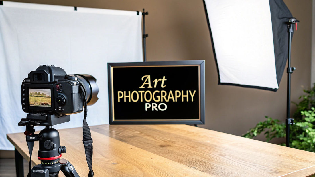
Why Pro-Level Photos Are a Game-Changer for Art Prints
Before we even touch on camera settings or lighting rigs, let's talk about why this matters so much. Taking high-quality photos of your art isn't just a technical checkbox; it's the very foundation of your print business. Think of it as the bridge between the physical art you poured your soul into and the stunning reproductions your customers will hang on their walls. A blurry, poorly lit photo doesn't just misrepresent your talent—it actively kills sales.
Picture someone scrolling through countless art prints online. What makes them stop? A crisp, vibrant image that lets them see the subtle texture of the canvas or the true, deep hue of a specific color. That's what grabs them. This first impression is what turns a casual browser into someone who has to own your work. It builds trust and screams professionalism, promising them the print they receive will be just as breathtaking as the original.
Protecting Your Artistic Vision
Your art is a direct expression of your vision. You chose every color, every line, every texture for a reason. Low-quality photos completely betray that vision. Colors can look muddy, tiny details get swallowed up, and the whole emotional punch of the piece just fizzles out.
Excellent photography ensures that the print faithfully represents the original artwork. It’s about more than just documentation; it's about preserving the integrity and spirit of your creation for every single person who buys a print.
The Business Case for Quality
This dedication to quality pays off in real, tangible ways. The global art photography market is valued somewhere between $1.7 and $2 billion, a figure built entirely on the expectation of high-fidelity reproductions. With the market growing by 5-10% each year, thanks to online galleries and auctions, the bar for image quality is only getting higher. If you want to maintain the value of your work and actually sell it, accurate photos are non-negotiable. For a deeper look, you can discover more insights about the photo art market on tipa.com.
Ultimately, when you master how to photograph your artwork for prints, you create products that truly honor your hard work. It's what allows you to scale your business, connect with a bigger audience, and build a reputation for quality that will keep collectors coming back for more. You can see how professional images translate into a compelling final product by exploring collections of high-quality art prints.
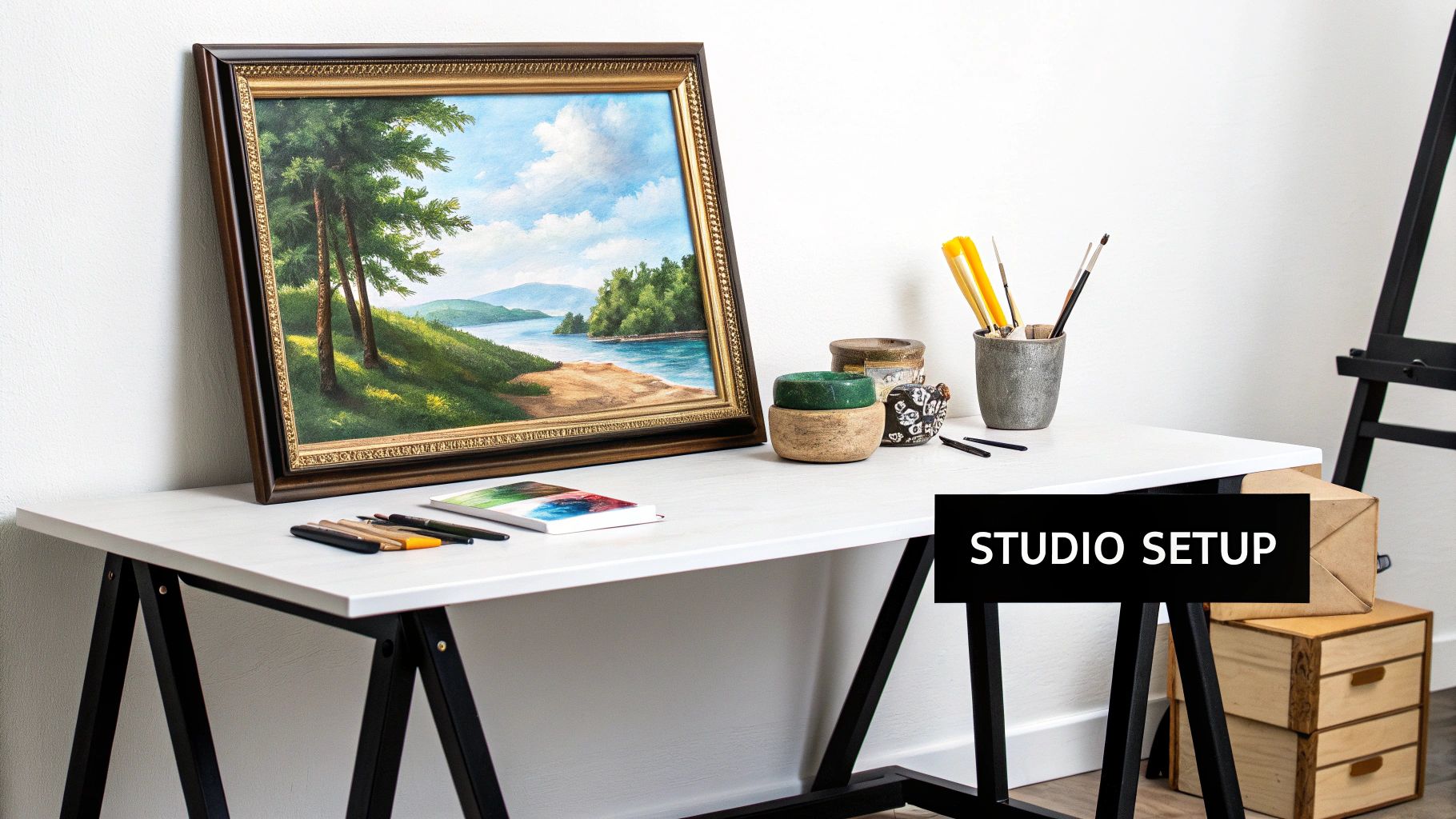
Setting the Stage for a Perfect Shot
The secret to a fantastic photo of your artwork actually starts long before you even pick up your camera. I can't stress this enough: solid preparation is the foundation for everything that follows. If you skip this part, you'll create headaches that even the best editing software can't truly fix. Trust me, a little work upfront saves you hours of frustration later.
First thing's first: give your artwork a thorough inspection and cleaning. Even the tiniest speck of dust or a faint fingerprint can show up as a glaring flaw in a high-resolution image, especially on prints. If your piece is under glass, grab a microfiber cloth and a gentle cleaner to make sure there are zero smudges. For paintings on canvas or wood, a soft, dry brush is perfect for gently whisking away dust.
Pro Tip: For heavily textured paintings, like those with thick impasto, I like to use canned air. Hold it at a safe distance and blow gently across the surface. It’s a great way to get dust out of all those little nooks and crannies without ever touching the paint.
Creating the Ideal Shooting Environment
Where you shoot is just as important as what you're shooting. You need a space with enough room to move around, set up your lights, and get your camera at the right distance. But more importantly, you want neutral surroundings.
A brightly colored wall will absolutely throw its color onto your artwork. That red wall in your studio? It will subtly tint the whites in your piece and throw off all the colors you worked so hard to get right. This is why a neutral background—think white, gray, or black—is a non-negotiable when you need to photograph artwork for prints with true color accuracy.
This idea of a clean, well-prepared surface is something artists understand deeply. For those of you who build your own panels, you know that the final result depends on the prep work. If you're interested, we have a whole guide on mastering the art of preparing cradled wood panels for acrylic painting that dives into this.
Positioning Your Artwork for Precision
Alright, the final and most critical prep step is getting your art positioned correctly. Your goal is to have the artwork perfectly flat and parallel to your camera's sensor. If you're hanging it, use a level to make sure it's dead straight. If it's on an easel or leaning, check that it isn’t bowing or warping, as that will cause some weird distortion in the photo.
- For Canvas: Check that the stretcher bars aren't warped. A warped canvas is a real pain, but you might need to re-stretch it or find a way to flatten it just for the shot.
- For Works on Paper: To prevent annoying curls or waves that create shadows, mount the piece to a rigid board using acid-free tape or clips.
- Wall Mounting: A sturdy easel is great, or you can hang the art right on the wall. Just be sure it’s hanging perfectly vertical—not tilting forward or backward even slightly.
Getting this alignment right prevents an effect called "keystoning," where your rectangular painting starts to look like a trapezoid in the photo. It’s so much easier to fix this now, in the real world, than to try and wrestle with it in Photoshop later.
Mastering Light to Eliminate Glare and Shadows
Light is, without a doubt, the most critical element in photographing your art. It’s also where things most often go wrong. I’ve seen countless artists get frustrated with terrible glare, harsh shadows, or colors that look nothing like the real piece. But getting the light right isn't about buying expensive equipment; it’s about learning how to control and shape it to show off your art's true character.
Your main goal is to bathe the entire piece in soft, even illumination. Think of it less like a harsh spotlight and more like a gentle, consistent wash of light. This is how you avoid those distracting shiny spots and ensure the beautiful texture of a brushstroke is visible without casting a dark, ugly shadow right next to it.
Let's walk through the two best ways to get this done.
Harnessing Natural Light the Right Way
Natural light is a fantastic, and free, resource, but you've got to be smart about how you use it. Direct, blasting sunlight is your worst enemy—it's way too harsh and will only give you deep shadows and blinding glare.
The absolute best natural light comes from a large, north-facing window on a bright but overcast day. Why? The clouds act as a giant, free softbox, scattering the sunlight and wrapping your artwork in soft, neutral light. It's the gold standard.
- Positioning is Everything: Place your artwork on a wall or easel so it's directly facing the window, not angled off to the side. Your camera and tripod should then be set up right between the window and your art. This way, the light hits your piece head-on.
- Avoid Mixed Lighting: This is a big one. Turn off every single lamp and overhead light in the room. When you mix the cool, blueish tones of daylight with the warm, yellowish tones of most indoor bulbs, you'll completely confuse your camera's white balance and create a color-correction headache later.
Building a Controlled Artificial Light Setup
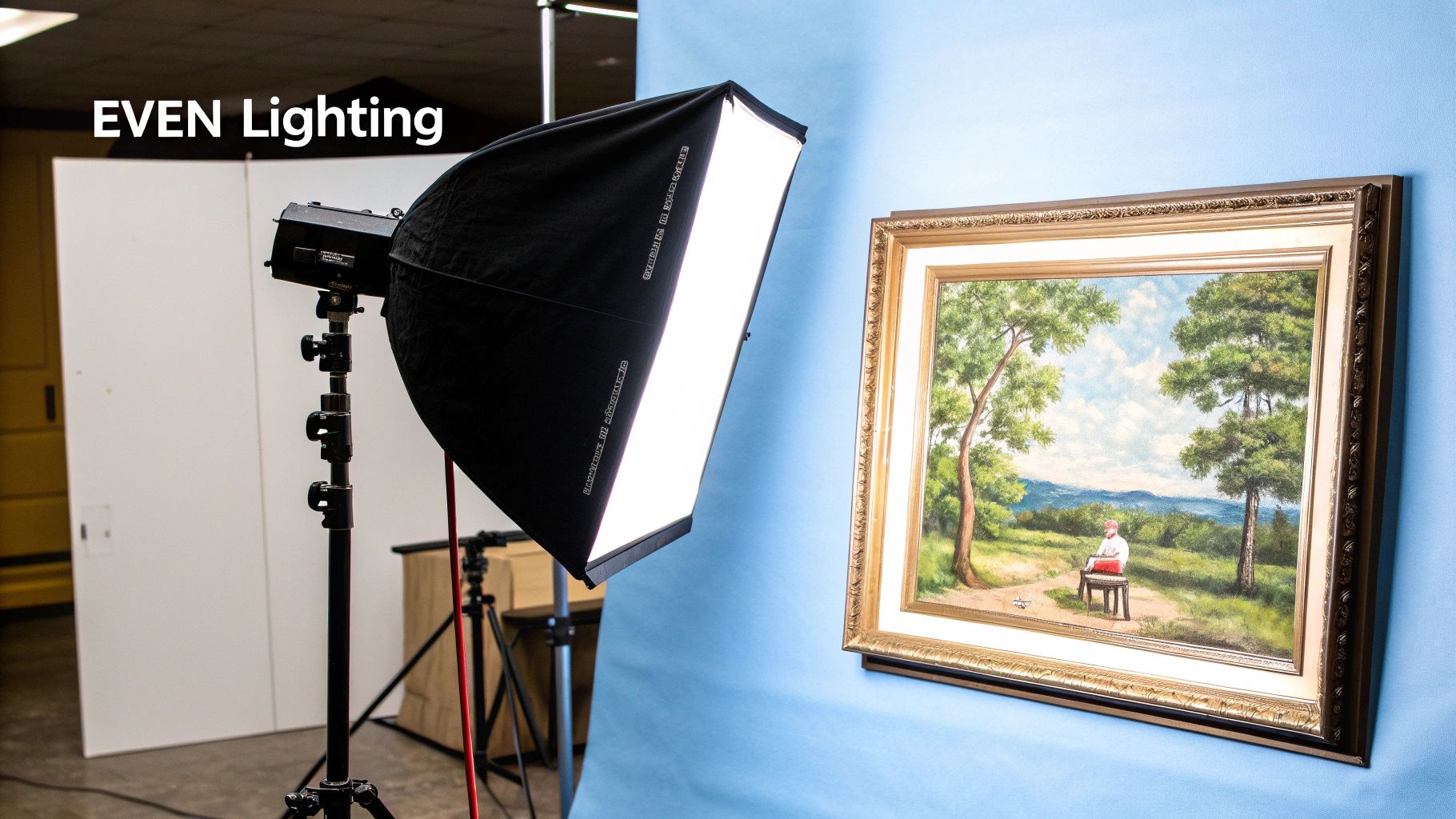
For absolute consistency, nothing beats an artificial lighting setup. It means you can shoot whenever you want—day or night, rain or shine—and get the same professional results every single time. The classic, foolproof method is the two-light setup.
This involves placing two identical lights (softboxes are perfect for this) on either side of your artwork. The magic is in the angle: position each light at a 45-degree angle to the surface of your art. This specific angle is the secret sauce. It illuminates the artwork evenly from both sides, which cancels out shadows and dramatically reduces glare because the light bounces away from your camera lens instead of directly into it.
By positioning lights at a 45-degree angle, you're creating what's called "cross-lighting." This technique is essential for anyone learning how to photograph artwork for prints because it brings out subtle textures without creating the distracting shadows that would otherwise make the image look flat.
Once your lighting is perfect, you can move on to your camera settings. This simple workflow is the best way to approach it.
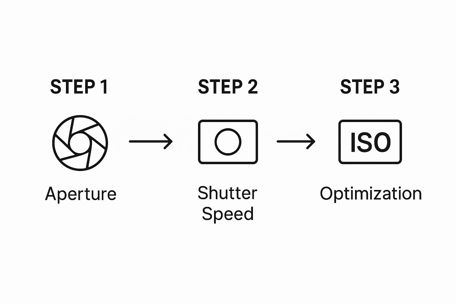
This process has you set your depth of field first (aperture), then manage any potential blur (shutter speed), and finally adjust the overall brightness (ISO). It’s a logical sequence that helps maintain the best possible image quality.
Deciding between natural and artificial light really comes down to your needs for consistency and control versus simplicity and cost. Here’s a quick comparison to help you choose.
Lighting Setup Comparison: Natural vs. Artificial
| Lighting Factor | Natural Light (Overcast Day) | Artificial Light (Two-Light Setup) |
|---|---|---|
| Pros | Free! Creates beautiful, soft, neutral light. Simple setup with minimal gear. | Perfectly consistent results every time. Shoot anytime, day or night. Full control over light intensity and direction. |
| Cons | Dependent on weather and time of day. Light changes throughout the day. Can be difficult to find a suitable space. | Requires an initial investment in lights and stands. Takes more time to set up and get right. |
| Best For | Artists starting out or those on a budget. Shooting pieces with minimal texture or gloss. | Professional artists selling prints. Anyone needing repeatable, high-quality results. Photographing glossy or textured work. |
Ultimately, a two-light setup gives you professional-grade control, but you can get absolutely stunning results with a well-placed window on the right day.
The Secret Weapon for Glossy Artwork
So, what happens when you’re shooting a piece with a high-gloss varnish, something framed behind glass, or a painting with metallic leaf? This is where glare goes from being a nuisance to a serious problem. The 45-degree lighting setup is a huge help, but the real solution is a polarizing filter.
A circular polarizing filter (CPL) is a special filter that screws onto the front of your camera lens. As you rotate it, it works like magic, cutting out the reflected light that causes glare. Just look through your camera's viewfinder or at the screen, slowly turn the filter, and you’ll literally watch the reflections vanish from the surface of your art.
It's an absolute game-changer for those tricky, reflective pieces, revealing the pure color and detail hidden underneath the shine.
Dialing in Your Camera Settings for Flawless Art Prints
Alright, your artwork is prepped and the lighting is looking beautiful and even. Now for the fun part: getting your camera settings just right. The single most important thing you can do right now is switch that camera dial from 'Auto' to 'Manual' (M). This is where you take control and move from taking snapshots to creating professional, print-ready files.
Shooting in manual gives you direct command over the "exposure triangle"—aperture, ISO, and shutter speed. Nailing these three settings is the secret to a final image that’s sharp, clean, and perfectly exposed. It’s the foundation for a truly stunning print.
Lock in a Low ISO for a Clean Image
First things first, let's talk about ISO. Go into your camera’s menu and set the ISO to the lowest possible native setting, which on most cameras is ISO 100.
Think of ISO as your camera sensor’s sensitivity to light. Cranking it up is great for dark concert venues, but it comes with a nasty side effect: digital noise. That’s the ugly, grainy speckle that can ruin a beautiful shot. Since you've got a tripod and have complete control over your lighting, there's absolutely no reason to use a high ISO. Locking it at 100 guarantees the cleanest, most detailed, and noise-free image your camera can produce.
Choose Your Aperture for Edge-to-Edge Sharpness
Next up is your aperture. This setting controls your depth of field, or how much of the image is in sharp focus. When photographing a flat piece of art, the goal is simple: you want every last bit, from the center right out to the corners, to be tack sharp.
The trick is to find your lens's "sweet spot." This is usually in the middle of its aperture range.
- My Go-To Aperture: I almost always start at f/8.
- The Golden Range: Anywhere between f/8 and f/11 will give you fantastic results for this kind of work.
Using an aperture in this range maximizes sharpness across the entire painting. Stay away from the extremes like f/1.8 or f/22. Wide-open apertures can make the edges of your art look soft, while very narrow ones can actually reduce overall detail due to something called lens diffraction.
Set Your Shutter Speed for the Perfect Exposure
With your ISO and aperture locked in, shutter speed is the last piece of the puzzle. This is what you'll adjust to get the exposure just right. Because your camera is firmly on a tripod, you don't have to worry about a slow shutter speed causing blur from shaky hands.
Just look through your viewfinder or at your screen. You’ll see a light meter—a little scale with a needle or indicator. Adjust your shutter speed until that indicator sits right at zero. This tells you the camera thinks the exposure is perfectly balanced. Take a test shot, look at it on your screen, and tweak the shutter speed up or down if it looks too bright or too dark.
My Non-Negotiable Tip: To completely eliminate any risk of camera shake from pressing the shutter button, use your camera’s two-second timer or a remote shutter release. That tiny delay ensures the camera is perfectly still when the photo is taken, guaranteeing maximum sharpness.
Two Final Checks for Color and Detail
Before you start shooting for real, double-check these two critical settings.
- File Format: Always, always shoot in RAW. A RAW file is like a digital negative; it holds all the unprocessed data from the sensor, giving you incredible flexibility in post-processing. JPEGs are compressed files that throw away data you can never get back.
- White Balance: For dead-on color accuracy, you need to set a custom white balance with a gray card. Just place the card in front of your artwork (in the same light) and take a picture of it. Then, dive into your camera's menu and use that picture as the reference for a custom white balance. This tells your camera exactly what neutral gray looks like under your specific lights, ensuring every color is captured true to life.
The demand for high-quality digital reproductions is a big reason the global photography services market was valued at $55.6 billion in 2023. More and more, artists are empowered by technology to create these professional results themselves. You can find more details on photography industry growth and trends and see just how big this space has become.
Editing Your Photos for Print-Ready Perfection
Alright, you've snapped the photo, but we're not quite at the finish line yet. Now comes the digital darkroom—the post-processing stage where you turn a great RAW file into a flawless, print-ready image. This is honestly where the magic happens, ensuring the photo is a perfect twin of your original creation.
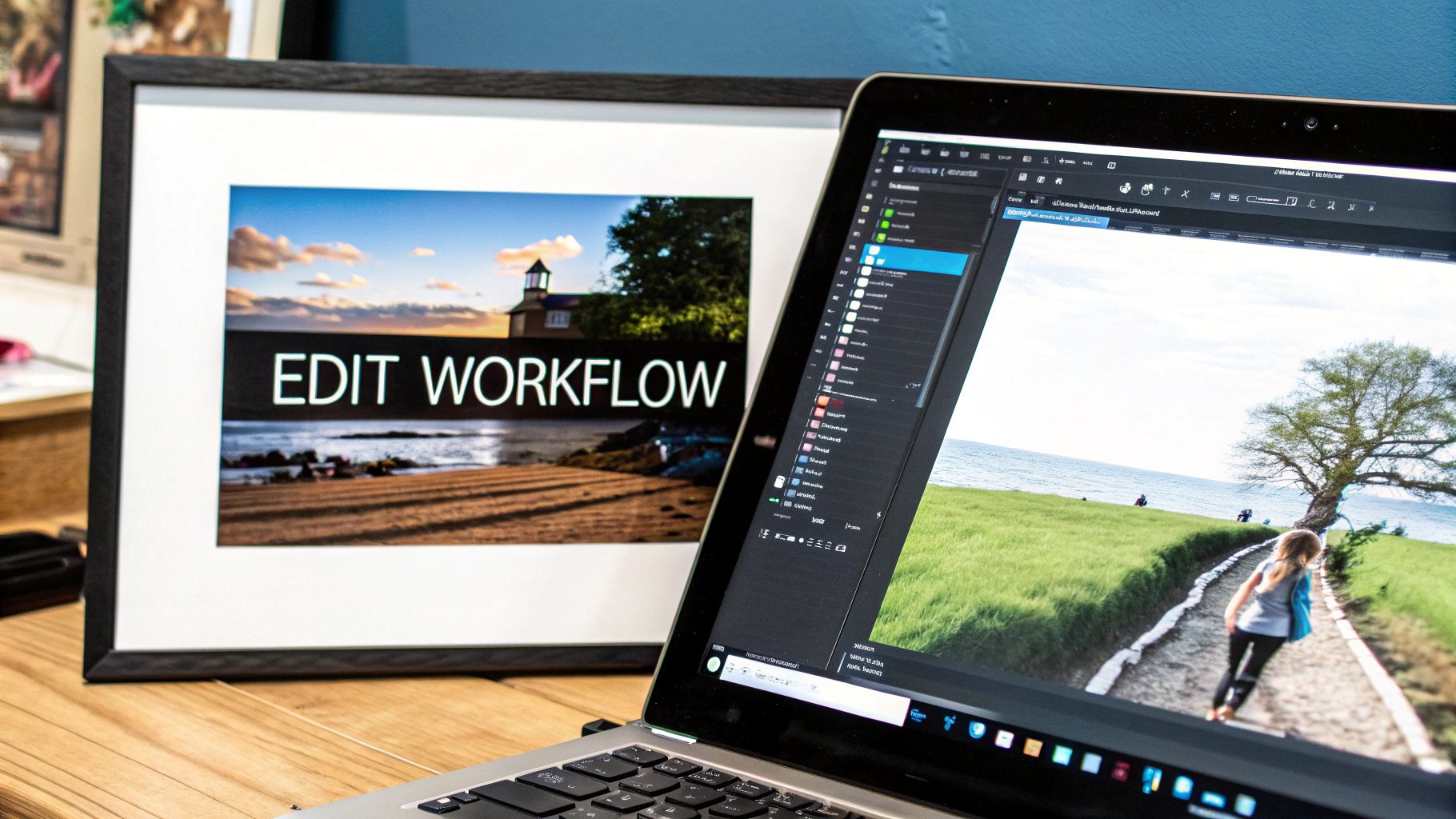
The goal here isn't to get creative with filters or dramatic effects. It's all about accuracy. You want the photograph to be an exact match of the artwork sitting next to you. For this, I almost always start in a program like Adobe Lightroom because its tools are powerful yet intuitive, and the non-destructive editing means you can always go back.
Getting the Fundamentals Right: Initial Adjustments
Before I even think about color, I handle the basics. These first couple of tweaks create a clean, solid foundation for everything else.
First up is lens correction. Most modern editing software has built-in profiles for your specific lens. Just check a box, and it will automatically fix any subtle distortion or vignetting (those slightly darker corners) that the lens naturally creates. It’s a small thing that makes a huge difference in getting the geometry right.
Next, I grab the crop and straighten tool. This is where you trim out any distracting background and make sure the artwork is perfectly square. I find the easiest way is to use the straighten feature and drag it along one of the artwork’s edges—top, bottom, or side. The software will instantly rotate the image to be perfectly level.
Nailing the Color and Exposure
This is the most critical part of the whole editing process. The end goal is simple: to be able to hold your physical artwork next to your calibrated monitor and not be able to tell the difference between them.
Remember that photo you took of the gray card or color checker? Now's its time to shine. Use the white balance dropper tool and click on the neutral gray patch. In one click, you’ll neutralize any color cast from your lights and establish a true-to-life color baseline. It's a game-changer.
From there, it's a process of making small, careful adjustments to the exposure, contrast, highlights, and shadows. I constantly glance back and forth between the screen and the real artwork, tweaking the sliders until the brightness, depth, and feel are identical.
A Quick Note on Why This Matters: Getting the color and value spot-on isn't just for aesthetics; it directly impacts the perceived value of your work. When you're selling prints, buyers expect absolute fidelity. Superior photography that captures every nuance can set your work apart. Considering prints are a huge slice of the $7.2 billion art market for prints and multiples, this is one area where you really don't want to cut corners. You can see more on how photography impacts the art market on artnet.com.
The Final Polish: Sharpening and Exporting
Once the color and exposure are perfect, the last step before exporting is a touch of sharpening. And I mean a touch. The goal is simply to restore the crispness that's naturally lost in the digital capture process, not to create harsh, artificial-looking edges.
My advice? Zoom in to 100% on the image. Add just enough sharpening so the fine details, like the texture of the canvas or the nuance of a brushstroke, look clear and defined. If it starts to look crunchy, you’ve gone too far.
Now, you’re ready to export the file for your print shop. These settings are pretty much non-negotiable if you want professional results.
- File Format: Always go with TIFF. It's a lossless format, which means it preserves every single bit of data. JPEGs compress files and throw away information, which is the last thing you want for a high-quality print.
- Color Space: Choose Adobe RGB (1998). It has a wider gamut (range of colors) than the standard sRGB, which is essential for getting vibrant, accurate colors in print.
- Resolution: The industry standard is 300 DPI (Dots Per Inch). This ensures your image is sharp and detailed when printed.
- Bit Depth: If you can, export in 16-bit. This gives your printer the absolute maximum amount of color information to work with, resulting in smoother gradients and richer tones.
With a file prepared like this, you're giving your printer exactly what they need to produce a stunning, gallery-quality reproduction of your artwork.
Got a Question? Let's Talk Specifics
Even with the best game plan, you're bound to run into a few tricky situations. That's just part of the process. Let's dig into some of the most common questions I get from artists trying to get that perfect shot for their prints.
Can I Really Just Use My Smartphone?
You absolutely can, but you have to be smart about it. Look, a DSLR or mirrorless camera is always going to give you more fine-tuned control, but the cameras on today's phones are genuinely impressive. The trick is to stop using it like a point-and-shoot and start treating it like a serious tool.
Your first step is to download a camera app that gives you full manual control. You need to be able to dial in the ISO, shutter speed, and white balance yourself. Even more important is finding an app that lets you shoot in a RAW format (you might see it called DNG or ProRAW). This is non-negotiable because it saves all the image data, giving you way more flexibility when you edit.
And please, don't skip the tripod. It’s the only way to guarantee a tack-sharp image.
How Do I Get Rid of That Awful Glare on My Glossy Paintings?
Ah, glare. It’s the absolute worst when you're shooting anything with a glossy varnish or a resin finish. It can completely wash out details and just ruin the shot. While setting up your lights at a 45-degree angle is the first line of defense, sometimes you need to bring in the big guns.
The secret weapon here is cross-polarization. It sounds complicated, but it's pretty straightforward in practice.
- You'll start by covering your lights with polarizing gel sheets.
- Next, you'll screw a circular polarizing filter (often called a CPL) onto your camera lens.
Now for the magic. As you slowly turn the filter on your lens while looking through the viewfinder, you will literally see the glare melt away. It’s an incredible technique that lets you capture the deep, true colors and textures of your work without any distracting hotspots. This is how the pros do it.
Glare isn't just an ugly distraction; it actively hides the very details you spent hours creating. Learning to eliminate it is a critical skill for making prints that truly honor your original artwork.
What’s the Best Way to Photograph 3D Art, Like a Sculpture?
Photographing a sculpture is a whole different ballgame compared to a flat painting. You're not just trying to reproduce an image; you're trying to communicate form, depth, and texture. One single, head-on shot is never going to capture the essence of a three-dimensional piece.
You have to use light to sculpt the form. Instead of the flat, even lighting we want for a painting, you'll want to think more dramatically. A classic three-point lighting setup is perfect for this. It breaks down like this:
- Key Light: This is your main, brightest light. It defines the sculpture's primary form.
- Fill Light: A softer, less intense light positioned to soften the harsh shadows created by the key light.
- Backlight: Placed behind the sculpture, this light creates a subtle highlight around the edges, helping it pop from the background.
And don't just take one photo. Plan on shooting a whole series: a straight-on shot, a three-quarters view, profiles from each side, and definitely some close-ups on any intricate details. This gives people a real sense of what it's like to experience the art in person.
At William Tucker Art, we believe every print should be a perfect reflection of the artist's original work. Explore our collections to see how professional art reproduction brings wildlife and pet portraits to life.