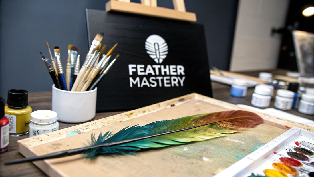
Welcome, fellow artist! If you've ever found yourself completely mesmerized by the delicate, intricate design of a single feather, you know that translating that natural beauty onto a canvas can feel like a monumental task. But I promise you, learning how to paint bird feathers is a deeply rewarding skill built on a few core techniques.
It all comes down to understanding layering, creating those whisper-soft edges, and patiently building up complex patterns.
From Ancient Inspiration to Your Easel
Think of this guide as your friendly studio companion. I'm here to walk you through the entire process, from gathering the right supplies to adding those final, breathtaking details that make a painting come alive. We'll dive into how to really see your subject, mix believable colors from a limited palette, and build up layers to create feathers that feel real enough to touch.
My goal isn't just to show you what to do, but to help you understand the why behind each brushstroke. This way, you'll gain the confidence to tackle any kind of feather, from a simple, downy tuft to the most complex and iridescent wing feather.
A Rich Artistic Tradition
When you learn to paint feathers, you're not just picking up a new technique; you're connecting with a long and meaningful artistic legacy. This is far from a new pursuit. In fact, featherwork has incredibly deep historical roots.
In Mesoamerican cultures, especially during the Aztec empire, creating art with feathers was a highly revered and specialized skill. These artisans, known as amanteca, would meticulously arrange vibrant, precious feathers to create stunning portraits and religious scenes, packing their work with profound symbolic power. (Source)
This ancient practice—carefully selecting feathers for their natural color and texture—is a principle that still echoes in how we approach painting them today.
More Than Just a Feather
Understanding the history and context behind your subject can add so much depth to your creative process. Painting a feather connects you not just to this rich history but to the broader, beautiful world of nature and animal art. If you're drawn to capturing the wild, exploring the captivating world of wildlife art can spark endless inspiration for your next masterpiece.
Ultimately, mastering the art of painting feathers is a fantastic skill. It sharpens your eye for detail and enhances your ability to capture the delicate, intricate textures you find all throughout the natural world. Let's get started by building a solid foundation for your success.
Getting Your Feather Painting Gear Ready
Before we can dive into the fun part—bringing those beautiful feathers to life on the canvas—we need to get our supplies in order. Trust me on this: having the right tools is half the battle. It lets you get lost in the creative process instead of wrestling with your materials.
The first big decision you'll make is your paint. What you choose here will really define your entire workflow.
- Acrylic Paints: These are a fantastic choice, especially if you're newer to painting. They dry fast, which is a lifesaver for building up layers and adding those delicate, hair-like textures. You can paint over mistakes without a long wait, making the process much more forgiving.
- Watercolor Paints: Watercolors offer a completely different experience. They're perfect for capturing the soft, translucent quality you see in so many feathers. This medium requires a bit more foresight since you have to work from light to dark, but the glowing, luminous results are absolutely worth it.
Ultimately, it comes down to personal preference. Do you want the buildable, opaque nature of acrylics, or are you drawn to the delicate transparency of watercolor? There's no wrong answer.
The Right Brushes and a Good Surface
Now, let's talk about the real workhorses of feather painting: your brushes. You don’t need to buy out the art store, but having a few specific brushes will handle 90% of what you need to do.
I always start with a small, flat brush to lay down the initial base colors. For creating the fine, individual barbs, nothing beats a fine-liner or a rigger brush. And here’s a little secret weapon: a small fan brush. It’s absolutely brilliant for blending soft edges and creating those downy, fluffy textures near the feather's base.
Your painting surface is just as important. For watercolors, you'll want heavyweight watercolor paper to prevent buckling. If you're using acrylics, a gessoed canvas or a smooth wood panel works like a dream. Of course, you'll also need a simple palette for mixing your colors and a jar of clean water. If you're building your kit from scratch, looking over a list of the top 10 must-have art supplies for beginners is a great way to make sure you have all the essentials covered.
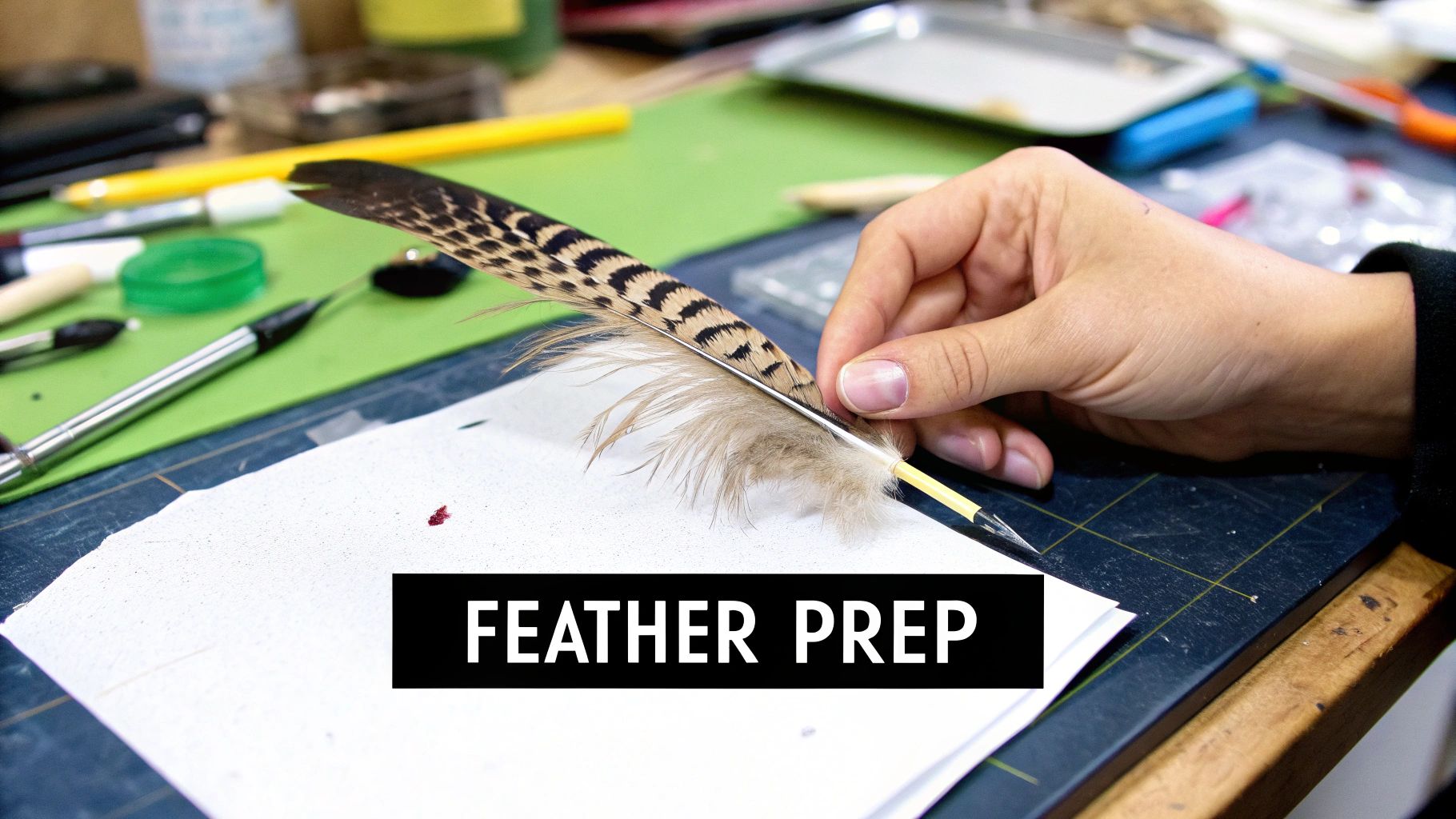
Never underestimate the power of a good reference photo. A high-resolution image is your roadmap. It shows you all the subtle color shifts, the way the light hits, and the tiny imperfections that make a feather look truly real. Keep it close and consult it often.
Essential Supplies for Realistic Feather Painting
To give you a clearer picture, I've put together a quick table of the supplies I recommend most often. Think of it as your cheat sheet for getting started on how to paint bird feathers.
| Material | Recommended Type | Why It's a Game-Changer |
|---|---|---|
| Paints | Artist-grade acrylics or watercolors | The higher pigment load gives you richer colors that are far easier to control and layer effectively. |
| Brushes | Fine-liner, small flat, fan brush | This trio gives you the versatility to handle everything from base coats and fine details to soft, blended textures. |
| Surface | Heavy paper, canvas, or wood panel | A quality surface won't absorb paint unevenly and can handle multiple layers without falling apart. |
| Reference Photo | High-resolution digital or print | This is your guide for accuracy in shape, color, and texture. It eliminates guesswork and makes your work more believable. |
Once you have these items laid out, you'll feel prepared and ready to go. You've built the perfect artist's toolkit for the job. Now, let's move on to the next step: really understanding the structure of a feather.
A Painter's Look at Feather Anatomy
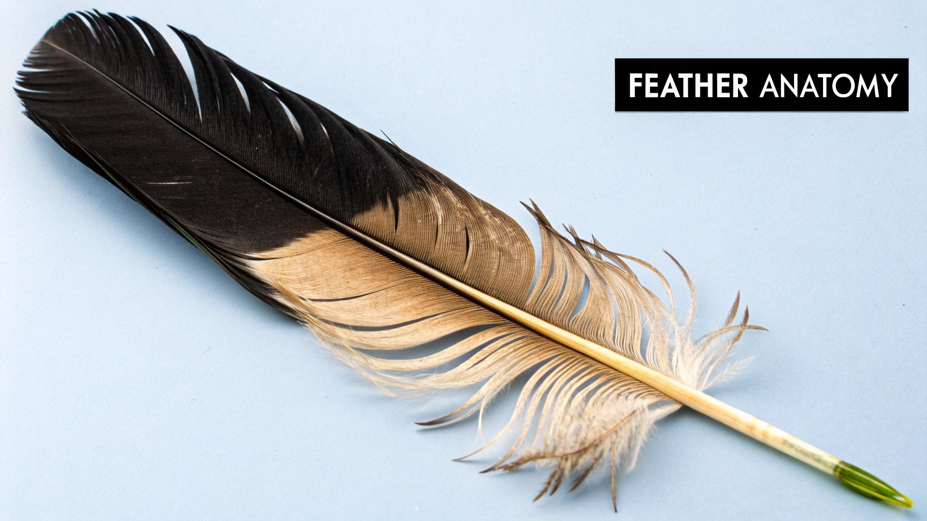
Before you can paint a feather that feels like you could pick it up, you have to really see it. I mean, look past the general shape and appreciate its incredible architecture. It’s so much more than an oval with a line down the middle.
Every feather is built around a central spine, the rachis, which gets thinner and thinner until it disappears at the tip. Coming off that spine are all the tiny filaments we call barbs. What's amazing is that these barbs are locked together by even smaller, microscopic hooks called barbules. This is what creates that smooth, sleek surface of a healthy feather.
Once you start seeing these individual parts, you stop painting a "feather" and start building one with your brush. It changes everything.
Different Feathers, Different Strokes
It makes sense that not all feathers are the same, right? A big, powerful wing feather has a very different job than a soft, fluffy one, and your painting technique needs to reflect that.
- Flight Feathers: Think of the long, stiff feathers on the wing or tail. They're built for business—strong, often asymmetrical, with a very prominent rachis and a tightly "zipped" edge. Your brushstrokes here should be crisp, confident, and defined.
- Downy Feathers: These are the little powder puffs of the bird world, found close to the skin for insulation. They barely have a rachis, if at all, and their barbs are long and wispy, floating free. To capture this, you’ll want to use softer brushes, gentle scumbling, and blurry, blended edges.
When we paint feathers, we're tapping into a tradition that goes back thousands of years. Artists have always been mesmerized by them. In fact, there's evidence that people were using feathers in art over 5,000 years ago! You can learn more about this rich global history of featherwork on Wikipedia. From peacocks to hummingbirds, cultures have long celebrated their stunning colors and patterns.
My Two Cents: Don't get caught up trying to paint every single strand. That’s a fast track to a stiff, overworked painting. The goal is to suggest the texture. Focus on the big picture—the direction of the barbs and the overall flow—and let a few key details create the illusion of complexity.
Sketching Your Roadmap
With this anatomy lesson in mind, let’s get a sketch down. This isn't about creating a perfect drawing; it's about making a simple map to guide your paint. Seriously, forget about rendering every little detail.
Just grab a light pencil and block in the feather’s main shape. Define the curve of that central rachis and the outer silhouette. Then, add a few light lines to show which way the barbs are flowing, and maybe mark where you see any interesting patterns or splits.
This simple outline gives your painting a strong foundation. It’s the key to making sure your feather feels authentic right from the very first brushstroke.
Bringing Feathers to Life with Color and Form
This is where the real magic happens. If you want to paint a feather that looks like it could lift off the canvas, you have to create an illusion of depth. The secret? Patiently and methodically building up layers of paint. This process is what transforms a simple, flat sketch into a convincing, three-dimensional form.
First things first, let's get a base coat down. Think of this as the foundation—the underlying color and value for the entire feather. It doesn't need to be perfect. Its main job is to kill the stark white of your canvas and establish the darkest tones. From there, we'll build up our highlights.
For instance, if I'm painting a blue jay feather, I won't start with a bright sky blue. Instead, I’ll mix a much darker, almost grayish-blue to serve as my base.
Finding the Form with Mid-Tones and Shadows
With the base coat dry, we can start to sculpt the feather's form. This is all about adding mid-tones, which are simply the colors that live between your darkest shadows and your brightest highlights. I'll take a slightly lighter version of my base color and gently paint in the main planes of the feather, always making sure my brushstrokes follow the natural direction of the barbs.
This stage is absolutely crucial for creating that feeling of shape. By adding these mid-tones, you immediately start to define where the light is hitting and where shadows are falling. It's what makes the feather feel rounded and tangible, not like a flat cutout.
This image gives a great visual breakdown of how this color-building process works in practice.
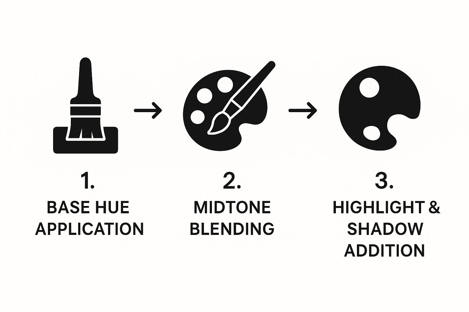
As you can see, realism isn't a single step. It's a sequence, moving from that general color foundation to those final, specific details of light.
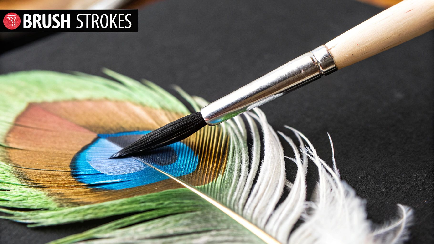
Capturing Iridescence with Glazing
Have you ever looked closely at a raven or peacock feather? That captivating shimmer they have is called iridescence. The trick to painting this isn't reaching for metallic paint, but mastering the art of layering thin, transparent glazes of color. A glaze is just paint thinned down significantly with a medium (like an acrylic gloss medium or even just a bit of water) until it's see-through.
My Go-To Technique: For an iridescent black feather, I'll start with a solid black or dark gray base. Once it's dry, I'll apply a very thin glaze of pthalo blue over one area. Then, I might add another glaze of violet or even a deep green over another section. These subtle, overlapping colors create that rich, color-shifting effect that perfectly mimics how light plays across a real feather.
This layering technique is what gives your colors complexity and vibrancy. Instead of one flat hue, you create a surface that seems to change as the viewer moves, which is a massive part of learning how to paint bird feathers with true-to-life accuracy.
Using Your Brush to Sculpt the Form
The way you apply your paint is just as important as the colors you mix. Your brushstrokes should always follow the natural form of the feather.
- The Rachis (Shaft): Use a fine, controlled stroke to define that central shaft. I always make it just a touch lighter on the side facing my imaginary light source.
- The Barbs (Vanes): For the base coats and mid-tones, I use broader, directional strokes that sweep outward from the rachis, just like they grow in nature.
- Blending It All Together: While the paint is still a bit wet, I use a soft, clean brush to gently blend the edges between my layers. This avoids those harsh, unnatural lines and creates a smooth transition.
These deliberate brushstrokes reinforce the feather’s structure. You’re essentially sculpting the feather with your brush, building it from the inside out, one thoughtful layer at a time. The result is a richer, more dynamic painting that truly feels alive.
Adding Lifelike Texture and Finishing Details
Alright, this is where the magic really happens. You've patiently built up your colors and established the basic shape, and now it's time to bring your feather to life with those tiny details that make it look real enough to touch.
The goal here isn't to paint every single strand you see. That would be maddening! Instead, we're going to suggest that complexity.
Your best friend for this part is a fine-liner or rigger brush. Get a little paint on there, thinning it just a touch so it flows smoothly off the bristles. Starting from the central shaft (the rachis), pull your brush outward in quick, confident strokes. This mimics the way the barbs naturally grow.
Vary the pressure as you go to create a mix of thicker and thinner lines. It’s this slight variation that keeps the feather from looking stiff or fake. Honestly, trying to be too perfect is what often ruins the effect.
Creating Authentic Imperfections
Think about it—real feathers have character. They've been through things! They get ruffled, separated, and a bit worn. Capturing this is what will make your painting truly believable.
I like to intentionally paint a few "splits" by leaving small gaps between clumps of barbs. It's a simple trick, but it immediately gives the feather a more natural, lived-in feel. These little imperfections are what make a piece sing.
For the soft, fluffy texture you often see at the base of a feather, dry brushing is the perfect technique. Grab a stiff, dry brush, load it with a tiny bit of paint, and then wipe almost all of it off on a paper towel. Gently scuff the nearly-dry brush over the canvas. This leaves behind just a whisper of pigment, creating a beautiful, fuzzy effect.
A Pro Tip: I often grab a fan brush to soften the feather's outer edges. The shape is perfect for gently blending the transition into the background so it doesn't look like a hard, pasted-on cutout.
This focus on the tiny textures is what makes all the difference. It’s what transforms a painting of a feather into a painting that feels like a feather.
Final Touches That Make It Pop
With the main textures blocked in, you're on the home stretch. A few last-minute details will add that final layer of polish and dimension, making your artwork truly stand out.
Here are a few finishing moves I never skip:
- Highlight the Rachis: With a tiny bit of your lightest color (or pure white), run a clean, crisp highlight along the side of the shaft that's catching the light. This one stroke adds instant 3D form.
- Dot in Subtle Patterns: If your reference feather has any spots or bands, now is the time to add them. Use a small, pointed brush and be mindful of how the markings curve with the flow of the feather.
- Check Your Values: Take a few steps back from your painting and squint your eyes. Are the darks dark enough? Are the highlights bright enough? Making these final tweaks ensures the entire piece has a strong visual impact.
It’s fascinating to think that while we work so hard to paint feathers, some artists have moved beyond paint altogether. In contemporary Chinese feather painting, for example, artists in places like Lanling County are creating incredible works using actual feathers, relying only on their natural colors. After a meticulous preservation process, the feathers are arranged on scrolls, blending traditional art forms with the inherent beauty of the feathers themselves. You can explore more about this modern approach to feather art to see how this craft is evolving.
These final, thoughtful touches are what will elevate your painting from good to great. They show you've really looked at your subject and know how to bring it to life on the canvas.
Got Questions About Painting Feathers? Let's Talk.
https://www.youtube.com/embed/_Q5_pbTJv8s
As you get deeper into painting feathers, you're bound to hit a few snags. It happens to every artist, so don't sweat it! Let's walk through some of the most common challenges I see people face and get you past them.
What's the Best Paint for Feathers?
This is the big one, and honestly, there's no single "best" answer. It really comes down to the look you're after. Both acrylics and watercolors can give you stunning results, but they behave in completely different ways.
Acrylics are a great place to start, especially if you're still building confidence. They’re forgiving—if you make a mistake, just let it dry and paint right over it. Since they dry quickly, you can build up those essential layers of texture and detail without a long wait. If you’re tackling iridescent feathers, like a starling’s, you can mix in a bit of gloss or interference medium to get that beautiful, color-shifting shimmer.
Watercolors, on the other hand, are the undisputed champions of softness and light. They’re perfect for capturing that delicate, almost see-through quality you find in downy feathers. The trick with watercolor is to work from light to dark, carefully preserving the white of the paper for your brightest highlights. It takes a little more planning, but the luminous, airy results are truly worth it.
How Do I Stop My Feathers from Looking Stiff?
If your feathers are looking stiff or flat, the culprit is almost always hard edges and uniform lines. The secret to softness lies in your edge control and brushwork.
Instead of outlining the feather with a hard, dark line, try using a dry brushing technique. Grab a stiff, old brush, get a tiny bit of paint on it, and gently scuff it along the feather's edge. This will create a fuzzy, broken line that feels much more natural.
For the individual barbs, use a fine-liner or rigger brush with thinned paint. Pull your strokes outward from the central shaft in a gentle curve.
A little pro tip: Never use the same pressure for every stroke. Varying the pressure creates lines of different weights and thicknesses, which is key for a realistic look. Let some barbs overlap and look a bit messy or "fluffed up." These little imperfections are what make a painting feel alive.
How Do I Paint a White Feather on a White Background?
Ah, the classic white-on-white challenge! This is all about seeing and painting subtle values. A "white" feather is never just pure white; it’s a beautiful landscape of soft grays, cool blues, and even hints of cream or yellow in the shadows.
First, decide on your light source. The part of the feather facing the light will be your brightest highlight—this might be the literal white of your paper or a touch of thick titanium white paint.
The real magic happens in the shadows. Mix a very light gray (black plus a lot of white). To make it more interesting, add a tiny speck of blue to create a cool shadow, which often looks more natural than a flat gray. Use these subtle tones to define the shape of the feather and the delicate cast shadow from the central shaft (the rachis) falling onto the barbs. That tiny shadow is what will make your feather lift right off the page.
My Feather Colors Look Flat. How Can I Add Depth?
Flatness almost always comes from using a single, unmixed color. If you look closely, even a simple brown feather is packed with a surprising range of different tones.
To instantly create depth, start with a darker base color than you think you need. Then, you can build up lighter colors in thin layers, allowing little bits of that dark underpainting to show through around the edges and between the barbs. This simple trick immediately creates a sense of shadow and form.
When it comes to iridescence—like on a raven or peacock feather—it's all about layering unexpected colors. A feather that looks black is often built on a base of deep indigo or dark purple. Then, you can add incredibly thin glazes of green, bronze, or even magenta on top. Use your iridescent paints sparingly, just on the final layers where the light would hit. Depth comes from layering multiple transparent colors, not one thick, opaque one.
At William Tucker Art, we believe every brushstroke connects us to the fragile beauty of the natural world. From vibrant wildlife prints to custom pet portraits that truly capture the soul of your companion, our art is a celebration of life.
Come explore our collections and find a piece that inspires you.